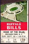
Friday, May 12, 2017
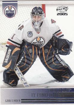
Year: 2004-05
Set: Pacific (Rate)
Card: #100 Ty Conklin
“ Another uncentered and uncut image. ” -carthage44
“ Overall an OK card. My gripes about the front the player and team name in the silver foil lettering on a dark gray background "box" That is one of the big reasons I prefer regular printing and CONTRASTING colors for the text font and the background it is against. Ever notice how hard it is to read WHITE lettering against a photo not a background color? OK the back too much blank space. They seem to show the entire pro experience in the stats, with players like this guy who has only played a few seasons there is plenty of space below to list some career highlights, or a brief career history or scouting report on the player. Don't like the left hand vertical read from top to bottom personal ID info. I forget if I have any of my Caps from this set. ” -captkirk42
“ He was supposed to be a great goalie. Besides being marooned on "Edmonton rebuild island", I wonder what happened... Foil scans terribly, but I realize it works for hockey cards (blades of steel and all). Plenty of blank space on the back. ” -dilemma19
“ As the father of a high school hockey goalie (my daughter) I say yes. I don't think the back of this card could be more boring though. They couldn't use the space to write a little something. "Ty hates hockey pucks" ” -cnangle
“ Is this the scan, a poorly centered card, or was the slight angle by design? You see the angle more on the back than on the front. Pacific always had cards that were close to great, but came up just short. This one isn't too bad. ” -muskie027
“ Love the classic goalie pose, but the bottom info bar needed more thought. ” -Sportzcommish


")