Sunday, September 2, 2018
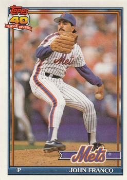
Year: 1991
Set: O-Pee-Chee (Rate)
Card: #510 John Franco
“ Topps/OPC was phoning it in at this point. Didn't even bother to change the logo on the front to OPC. At least the French is still on the back ” -Splinter_9
“ I remember really liking this set after the 1990 one. This design was really nice. ” -muskie027
“ OPC the original hard to determine parallel set. I own several cards from this set and it is always a bother now to check whether my card is the real set or the OPC. You have to find it written very small on the back. ” -davidhandberry
“ They really cheaped out that year not bothering to change the Topps logo. Good photo though. ” -Billy Kingsley
“ I always liked this design. ” -cjjt
“ Under appreciated set, In my opinion. I like the Topps, but I'm not sure I have any of the lookalike OPC. ” -switzr1
“ A '91 Topps Mets card with an '87 Mets Mustache. I suppose all those years playing for Marge Schott in Cinci made him think he was missing out on the whole facial hair thing. ” -kents_stuff
“ Being a Canadian kid and going out of the hobby at the time, it really annoyed me that the O-Pee-Chee logo or wordmark disappeared from the front of OPC cards for a couple of years at this time frame. ” -rmpaq5
“ Nice overproduced, wait was OPC overproduced during these years? Can't tell since they were using the Topps logo and the only way to tell it is an OPC card is the "printed in Canada" line. Sheesh I had forgotten there were some later years when they did that. I know in the early years of OPC they used the Topps name and logo, but in the 1990s? The more I know about this hobby the less I know about this hobby. ” -captkirk42
“ Really like this set. Especially the full stats on the back. ” -KMack


")