Thursday, August 8, 2019
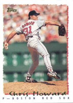
Year: 1995
Set: Topps (Rate)
Card: #177 Chris Howard
“ I get tired of the white borders but I miss this era where Topps actually tried. The front besides the border is very nice. The back is probably one of, if not the best back Topps has ever done. You get two pictures, a headshot and action shot. You get full stats and his info and a little blurb at the bottom. Every company should look at this card to learn what a back could be with proper use of space. ” -davidhandberry
“ Isn't it just a week or so ago Joshua nabbed somebody on ebay for selling cards from this set as "Special Gold Foil Parallel", even though all the cards have gold foil? ” -rmpaq5
“ In my opinion, probably the worst Topps design in my lifetime. Too plain and blah. ” -suomibear8
“ Nice full-frame action shot and minimalist white border. The torn edge photo framing and handwritten-style font scream 90's, but otherwise a nice looking card. ” -clallseven
“ Although I like the design concept, I think '95 Topps suffers -- more so than other years -- from not having the team logo somewhere on the front. Just too plain. The backs of these cards, on the other hand, are among the best every crafted by the Topps team. ” -mkaz80
“ 1995 Topps one of my least favorite 1990s Topps designs. The script-like foil lettering for the player name is often hard to read, especially when the foil has flaking, fading problems. Other than that the front design is OK. Back is OK. I'm not a huge fan of full color backs, or color player pictures on back at least the background color is white. ” -captkirk42
“ Love the back of the card. I don't particularly love the rugged border, but it was the 90s, so it seems fitting. An improvement over the 1994 base design. ” -vanstryland
“ Might be the most boring card ever on RCOTD, from the design, to the back, to the player, to the photo, to the overproduced year.... and yet somehow it all works. ” -Brimose
“ Nice set ” -cjjt
“ 95 topps in all sports was just I great classic simple design, gotta special spot in my heart for them cause that's when I started collecting ” -Thunderfoot
“ Reminds me of the last NBA set I collected from the 90's before my hiatus from the hobby. ” -muskie027


")