Tuesday, September 3, 2019
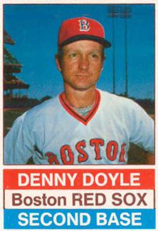
Year: 1976
Set: Hostess (Rate)
Card: #107 Denny Doyle
“ All my criticisms of this card should have this disclaimer, for a 70's card made by a food card it is very well done. That being said, the font on the front and the stats on the back are way too large. Why is everything capitalized on the front besides Boston? Why is the most prominent thing on the back the card number? How do you know it's a Hostess card? I don't see any mention of Hostess anywhere. My last comment is more on the player and the Red Sox. Who would think a guy whose career high batting average was .273 and who the year before had 1 hit for a .075 batting average would hit .310 the next year. That is an amazing comeback. ” -davidhandberry
“ "Their back Hostess got'm Here on the bottom" ” -cjjt
“ I suppose the Red/White/Blue makes sense for the 200th birthday of our country, but why doesn't the white go to the edge? Overall though, not a bad card for a bakery. ” -vanstryland
“ I like the simplicity of the Hostess sets. The photography also seems more vibrant than some of the Topps releases during that time. Somewhere I have quite a few singles from 1976-79, unfortunately a lot of them have Ding Dong and Twinkie stains. ” -DocOso
“ Yummy Hostess Cupcakes, Twinkies? Ding-Dongs? HO-HOES? Who cares which snack cake box they were cut off of these cards are GREAT! Oops wrong slogan wrong food stuff. Again WHO CARES? ” -captkirk42
“ Doyle Rules ” -sahal694
“ Love the Food Cards. Maybe kids would eat healthier if they put cards in bags of carrots and broccoli and not only in cake boxes. ” -NJDevils
“ It could be worse..... ” -parsley24
“ I miss these and the 3D Kelloggs. ” -UKboogie
“ Basic, boring, and yet, somehow, nice all at the same time. ” -muskie027


")