
Random Card of the Day |
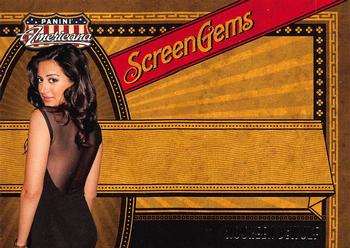
Monday, October 14, 2019Year: 2011 Set: Panini Americana Retail - Screen Gems (Rate) “ Why is the picture limited to one little part and the rest is basically blank space? The back at least has writing on those spaces but the front is as bland as I have seen on a card. I like the coloring and the design but it should have had her name or credits or something on the front. ” -davidhandberry
“ wow so much unused space what a boring card ” -aussiewayne
“ Never heard of her or the movie mentioned on the card back. At least I have heard of her fiance. This card was obviously designed for an autographed parallel. ” -Billy Kingsley
“ Ahh the old Panini creates another parallel by not putting in a relic or an auto trick, leaving a crap load of empty space and dead trees for no good reason whatsoever. ” -rmpaq5
“ The back is Perfect and Fantastic..... ” -parsley24
“ They should have told her to stand still before she walks out of the picture. 80% of nothing on the front. Another fine Panini job ” -NJDevils
“ Nice looking base card, but really obvious they intended to have an autograph in the blank space, and/or some "used on screen" relic. ” -captkirk42
“ Wow, what a terrible, bland card with gaping chasms of blank or weirdly-filled space. Heck, at least let me see the front of that dress.... ” -Vvvergeer
“ Perfect example to argue about not creating a card around an autograph and then having a non-autographed version. Bonus points for Noureen DeWulf, her character in the Anger Management television show was hilarious. ” -Corky
“ There is too much blank space on this card. Clearly it was designed for an autograph ” -ketchupman36
“ This looks like they forgot the auto. ” -muskie027
|
Additional Comments
| Posted By | Message | ||||
|
Joined: Jun 2013 |
| ||||
|
Joined: Nov 2014 |
| ||||
|
Joined: Aug 2017 |
| ||||
|
Joined: Sep 2008 |
| ||||
|
Joined: Mar 2018 |
| ||||


")