Friday, January 6, 2017
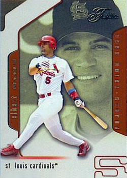
Year: 2002
Set: Flair (Rate)
Card: #55 Albert Pujols
“ At first, I thought, this looks a lot loike everything else that is modern, but after really looking at it, I like it. I like the color contrast on the front that really shows the team colors. Also, I think the backs have a nice look as well. I don't have any Flair, I didn't even know they were a company, but this would have been fun to collect. ” -muskie027
“ These cards actually had a metallic sheen to them that doesn't really capture in scans. ” -Billy Kingsley
“ If not for Pujols' smile the background photo would seem like a giant peering through a window at an unsuspecting victim. This card should be classified as an oddity. ” -Sportzcommish
“ Poorly placed front logo makes it look like he plays on team flair, and the obligatory grumbling about the use of foil, but all in all a good design and a legendary player. ” -dilemma19
“ Flair ? More like Flub ! ” -uncaian
“ Yay, a Cardinals card! I was confused at first with the Flair logo on the ball cap, it made it look like a minor league logo for a moment. Decent set, though. ” -Brimose
“ The card - not a fan. The player - I'm a fan. And he never played for a team I like. ” -vrooomed
“ Seems like he has been around forever! His rookie year was in 2001 when I was a senior is high school!!! ” -carthage44
“ I'm still a little mixed on if I like 2002 Flair or not. The back is pretty much standard so no real problem there, well the card number has a funky font style is that card fifty-five or ess-ess? ” -captkirk42
“ This is good stuff. Would love to acquire more flair cards. They are amazing. My only problem is the orange back. Pretty out of place. ” -DarkSide830
“ This card is really sweet ” -Bargunmaster
“ Overall I like the card. Not fond of the multiple fonts for his name on the back. Not sure why they would do that. In general a cool card of a great player. ” -Mitch
“ He should have stayed with the Cards. He would have been right up there behind Musial and Gibson. ” -NJDevils


")