Monday, January 30, 2017
Year: 1997-98
Set: Pinnacle Inside (Rate)
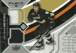
Card: #60 Kirk McLean
“ That's the best photo they could get for the front? Not a bad design for the card, but the photo choice is a bit odd. I believe these came inside of actual cans, just like a soup or drink. And you had to cut the can to get at the card inside. Bad choices all around here. ” -Billy Kingsley
“ Horrible photo. "Goalies are always masked so why don't we put a pic on front where he is covered with big white towel? What a great idea!" Stick guy behind McLean is main character of this card. Thumbs up for classic Canucks logo and colors. They should switch back. ” -Duke
“ Cannot get more inside than this. Let the guy blow his nose in private! ” -Sportzcommish
“ I actually real like this set , simple design & fun facts. ” -uncaian
“ Great photo selections, can't even see the guy's face. ” -CluelessJoe
“ Not a good photo. The goalie has his mask off and they get a photo with him covering his face with a towel. WEAK! ” -carthage44
“ Front a little busy, the B&W photo far left reminds me of one ot eh Upper Deck years (1994) they would stretch and shrink the side image to weird proportions. Never been a fan of the Last Name only and in HUGE letters design, or having the team name vertical, at least it is there for cards like this where if you don't know team colors would have no clue who he played for. Back really really plain. Reminds me of the front of one of the years for Pinnacle. OH and WooHOO a fellow Kirk. OK so I'm not into the Canucks but I probably should put this card on my "players named Kirk" RADAR. I've got one or two McLean cards already somewhere from a couple of bulk purchases a few years back. ” -captkirk42
“ The facts on the back of this card are neat, but boy that wasn't a good picture on the front. His face is covered with a towel! ” -jasongerman9
“ Is there a hockey player somewhere on the front of this card? ” -C2Cigars
“ Awkward photo. Still, can't accuse it of being staged. ” -Brimose
“ Decent enough design, but why did the folks at Pinnacle pick this picture? Wouldn't the picture on the back be a better front pic??? ” -hphillips
“ Uh, this one is tough. I liked Pinnacle, and it isn't bad. I never saw this set, but I HATE the black and white extra picture on the side, and the reverse color background on the "M". Also, is the "M" slightly higher? I love those Canucks sweaters though, so extra points for that. Why don't they bring these uniforms back? They are awesome!!! ” -muskie027


")