Agree with almost all of that. I do like blurbs when there's room, which there would be for about 1/3 or more of the cards. It's only the 10+ year veterans where all blurb space would be lost. I honestly just don't get it. But there's nothing else I can say. I'll buy the factory set like I always do, ignore the inserts and parallels, focus on building my vintage sets, and maybe a write a useless letter to Topps.
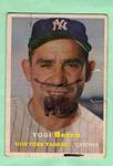
Although, about the fronts... I like them. They're sharp and that's fine. But the fronts are really starting to blend for me. Go look at, say 1969 through 1981 or so. Every front just looks completely different from the year before. Now, for some reason, it feels much less so. Perhaps that's why people like heritage cards so much.
v3
pistonfan wrote:
Love the fronts, hate the backs.
My suggestion (since they seem to think the Twitter/Instagram info is necessary) would have been to get rid of the logo and ribbon before the name on the back, move the name and team name up, move the number to the other side of the card, put the social media stuff in the upper right corner, dump the little blurb they have, and add all their stats. Done and done.
NJDevils wrote:
Non-Rookie base: http://www.tradingcarddb.com/ViewCard.cfm/sid/155909/cid/10708065/2018-Topps-38-Danny-Salazar?PageIndex=1


")