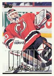
1995-96 Topps
Total Cards: 385
Rating: 6.3 (33 votes)
Rate this set...
Set Links
- Overview
- Checklist
- Teams
- Errors / Variations
- Hall of Famers
- Rookies
- Inserts and Related Sets
- Comments
- Packaging
- Pricing
- Sell Sheets / Ads
- Trivia
- Videos
- Forum
- External Links
- Change Log
- Contributors
- Glossary
- Gallery
- Card Rankings
- Collection Summary
Set Links
Overview | Checklist | Teams | Errors / Variations | Hall of Famers | Rookies | Inserts and Related Sets | Comments | Packaging | Pricing | Sell Sheets / Ads | Trivia | Videos | Forum | External Links | Change Log | Contributors | Glossary | Gallery | Card Rankings | Collection Summary
1995-96 Topps
User Comments |
This is a far cry from the nice looking sets of the 1960s and early 1970s. I had no idea what they were thinking when they made this design. | ||
The photos are pretty nice in this set, but I don’t really like the large semi-transparent team names on the front. They’re just too large and go over too much of the picture. The backs are nice, giving a complete list of stats that Topps and O-Pee-Chee has always done so well. The O-Pee-Chee parallel is a nice nod to Canadian collectors who still wanted to see the long running brand continue in some form. |


