Random Card of the Day
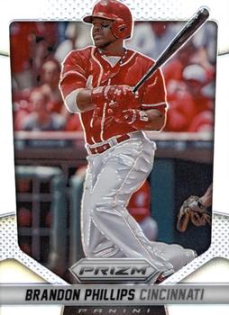


Thursday, December 27, 2018

Year: 2014

Set: Panini Prizm - Prizms (Rate)

Card: #87 Brandon Phillips


“ I am unfamiliar with Prizm, but it looks like there is an effect that is not coming through in the scan. If so, this could look pretty cool in hand. ” -muskie027

“ I really like this card/set. Very unique border and design. The only two drawbacks are no position on the front and the same picture on the back. I know people are going to complain about the lack of logos but that is MLB doing that not Panini. ” -davidhandberry

“ The early Prizms scanned so well. Then they changed how they do them and not do much. ” -Billy Kingsley

“ Good scan. I could tell it was a Prizm. Say what you will, I LOVE Panini Prizm sets and all the parallels that are easy to distinguish due to different SNs. ” -switzr1

“ Personally I am very tired of all Chrome Prizm. Part of it the lack of official licensing. I am beyond tired of the exclusive stuff. The Unlicensed cards look like generic wannabees. ” -captkirk42

“ I've always had a soft spot for Panini Prizm, more so for their hockey product than the baseball. ” -rmitchell6700


Additional Comments

Posted ByMessage

Billy Kingsley

Posts: 7512
Joined: Aug 2011
Thursday, December 27, 2018 12:22 AM

My comment was supposed to say "Now, not so much" at the end. No idea how I messed that up. I don't even drink alcohol so I can't blame that. 


-------------------------------

VERY slow trading due to health problems. Not transferrable so safe to trade with, just moving is painful and can't always access the cards. 

Cardboard History  My COMC

New Collection Website: Cardboard History Gallery  (Still under construction)

Tips on how to make your scans look like the card does in hand (No more washed out, fuzzy scans!):


spazmatastic

Posts: 5905
Joined: Dec 2014
Thursday, December 27, 2018 2:56 AM

I knew what you were saying, Billy. I agree with you too. I wish the Prizm parallels would scan with some colors now as well. They just show up as a silvery color now. Topps Refractors used to show some color blurs too when scanned. Now they just show up silvery as well.

I like the Prizm base designs overall, but the parallels get ridiculous. Too many of them and some just aren't good. The 2018 Camo Prizm cards look horrible in-hand and nothing like the ones from past years. They are obvious (and look good) in scans, but are so hard to see when in-hand.

Billy Kingsley wrote:

My comment was supposed to say "Now, not so much" at the end. No idea how I messed that up. I don't even drink alcohol so I can't blame that. 


-------------------------------

NO PWE's EVER!!! PLZ PM me 1st before sending any offer. ONLY selling cards as of March 2024. No trades or purchases right now.

_______________________________________________________________________

Largest total PC card collections by Team, then Athlete (as of 3/22/24):

STL Cardinals (MLB) - 8810; Carolina Panthers - 2888; GB Packers - 1790+ cards

Mark Martin (NASCAR) - 2038 cards; Jimmie Johnson (NASCAR) - 1875 cards; Jeff Gordon (NASCAR) -  1594; Ricky Rudd (NASCAR) - 839; Ozzie Smith (MLB) - 707


Billy Kingsley

Posts: 7512
Joined: Aug 2011
Thursday, December 27, 2018 4:04 AM

This set, the 2013-14 NBA and NHL sets, they look like they are glowing from within in scans. After that they don't scan anywhere near as bright and with lines across them that don't appear in hand. They seem to have gotten better with 2017-18 NBA Prizm and 2017 Select NASCAR, but I don't have enough to really be sure. I got a blaster of 2018 Prizm NASCAR for Christmas which gave me 7 Prizm parallels. I'll find out how they scan tomorrow...six of them need to be posted here. 

The Camos are kind of subtle, but the three guaranteed in each blaster are the first in my collection so I don't have much to base them on. Two of the three were my all time favorite driver so I can't complain either way.


-------------------------------

VERY slow trading due to health problems. Not transferrable so safe to trade with, just moving is painful and can't always access the cards. 

Cardboard History  My COMC

New Collection Website: Cardboard History Gallery  (Still under construction)

Tips on how to make your scans look like the card does in hand (No more washed out, fuzzy scans!):


pjdionne12

Posts: 161
Joined: Aug 2017
Thursday, December 27, 2018 5:31 PM

The layout is fine but I am not a fan of Chrome, Prizm, etc. The surface of the card is not conducive to condition sensitive collecting. I am not a card grader guy but these things are a nightmare straight out of the pack. You breathe on the cards wrong and they are scratched. They also can barely hold an auto thus; the need for stickers. Though I own my fair share of these cards, I like good old rough paper cards. 


Log in or register to continue.


Copyright © 2024 Trading Card Database LLC
Designated trademarks and brands are the property of their respective owners.