Tuesday, February 5, 2019
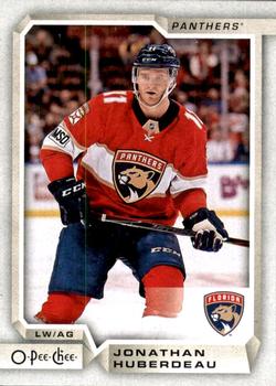
Year: 2018-19
Set: O-Pee-Chee (Rate)
Card: #80 Jonathan Huberdeau
“ Brand new hockey card, cool! I only started watching in November 2016- due to a post on this very forum- but hockey has pretty much taken over my life. I watch as much as I possibly can every chance I get, and am watching a repeat of the Devils-Penguins game as I type this. ” -Billy Kingsley
“ Oh, a current-year card. That doesn't happen often. Looks nice. I do like those Panthers sweaters. ” -switzr1
“ I like the front design, but there's too much blank space on the back. ” -olerud363
“ Upper Deck usually does a very nice job with O-Pee-Chee, this set is no exception. ” -Gunny
“ Too much border. Not a fan of the picture, the mask obscures his face too much almost like the witness protection bars on TV. This isn't a bad card overall just a really boring card. It has everything you want on a card but nothing extra to make it memorable. The back is even more boring, awful greyish background and black writing makes me want to go take a nap. O-Pee-Chee needs to stick to just copying Topps like they did in the 90's if this is the best they can do. ” -davidhandberry
“ This is a fantastic design in my opinion, but the best part is that Panther's uniform! Those are tremendous! ” -rmpaq5
“ I liked O-Pee-Chee as a kid for the little blurbs that appeared in both English and French on the back. It made the cards unique. This version does not offer that so it feels like just another set. ” -AirPete
“ "Husker do" means "do you remember". ” -NJDevils
“ Gotta admit, this is a good looking card. ” -parsley24
“ Not a bad looking set , I just wish there was a bio.instead of an empty space in the back. ” -uncaian
“ Nice set.Got to look for my Caps in these. I wonder when the box breaking group I belong to will get around to these? I think soon. ” -captkirk42
“ I'm not a hockey collector but I like this card. The front has all that I look for. Clean design. Name and position on the front and clear to read. Team name and emblem are also there and fit well. This is a solid front. The back is pretty good too. Only complaint would be all the dead space in the back. I would have liked to have seen them add some information to fill the dead space. ” -BSwagger
“ Pretty nice card. ” -cjjt
“ Excellent card. Only gripe is the blank space in the back. Could have benefited from a little blurb about the player. ” -muskie027
“ Nice to see a modern card as a cotd for awhile. But it has kind of 20s Art Deco feel though. And hockey cards are always fun to watch. That Panthers logo matches great with the card design. 5/5 ” -Duke
“ Huby duby dooooo!!! Having a great season so far but it's going largely unnoticed outside of S. Florida. ” -rmitchell6700
“ Starting now, I'm going to write the person who made the scan. Today's scan was by 'nicksang'. ” -Kirbythedodger


")