
Random Card of the Day |
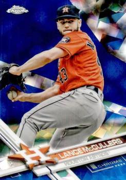
Friday, February 22, 2019Year: 2017 Set: Topps Chrome Sapphire Edition (Rate) “ Apparently not a parallel insert of Topps Chrome, but a unique release of it's own, if I'm reading right. They must really be proud of this design to make so many similar-looking cards. ” -switzr1
“ Pretty blurry. ” -ShoTime
“ This is a perfect example why I am turning away from Topps more and more. The same basic design as 2016, 2018 and 2019. I hate all the parallels, and this is a double parallel, Chrome and Sapphire, which makes it even worse in my opinion. This card would be a 10 if it weren't for these complaints and those complaints drop it down to about a 2. ” -davidhandberry
“ I don't get excited about Topps Chrome, since it's just the same image as the regular Topps series, so I certainly don't need a sapphire edition on top of that. ” -vanstryland
“ Scan by ‘carthage44’. ” -Kirbythedodger
“ I like topps chrome cards and this is pretty solid. It could be the scan but I do find the player background distracting. The back is well laid out and space is used well. ” -BSwagger
“ Not a Chrome fan, nor a fan of refractors/crystal/gem type designs. ” -captkirk42
“ as I've said before I love the 17 topps design, but I hate when they use fancy names like sapphire for parallels, just call it blue so I don't have to look up what sapphire means ” -Thunderfoot
“ Looks like he's pitching inside Magic Screen at PeeWee's Playhouse. ” -mkaz80
“ I feel like we have had a decent spattering of the last 3 years of Topps and the bunch of parallel sets issued off it. Haven't ever bought or looked at the Chrome in hand. Wonder if it looks good? ” -muskie027
|
Additional Comments
| Posted By | Message | ||||
|
Joined: Aug 2011 |
| ||||
|
Posts: 1 Joined: Apr 2018 |
| ||||
|
Joined: Jan 2019 |
| ||||


")