
Random Card of the Day |
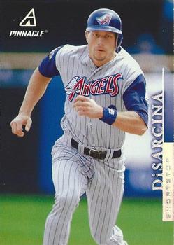
Wednesday, March 6, 2019Year: 1998 Set: Pinnacle - Away Stats (Rate) “ Nice cards. Really like the full player photo. Not too crazy about the upper right corner on the back though. ” -KMack
“ DiSarcina was having a great year in 1995 but got hurt at the beginning of August. The Angels had an epic collapse, going 22-34 after his injury, got caught by the Mariners, then lost a 1 game playoff to Randy Johnson. ” -Splinter_9
“ This is a nice set. Great photo. Awesome uniform. ” -switzr1
“ I like the design. ” -Billy Kingsley
“ The card front is good. I can't tell what it says next to DiSarcina but hoping it is either team name or position, otherwise I would like those on the front. The back would be great except for some reason they threw in a duplicate picture of the front in the top right of the back and that dropped it from a solid 9 to a 7. ” -davidhandberry
“ One of my favorite Angels uniforms. I wish they would change their name back to either California Angels or The Mighty Angels of Anaheim Orange County. ” -Gunny
“ I like the simple design on the front and the stats on the back. Good design. I have never liked the foil text on the cards. It can be very difficult to read. ” -jayoneill
“ Never have been a fan of vertical text, and a useless parallel. ” -IfbBirdsCards
“ Scan by Euklid. ” -Kirbythedodger
“ Mets bench coach Gary DiSarcina! I liked this set for Pinnacle Hockey and it looks clean for Pinnacle Baseball. ” -Tylergallo
“ As much as I can't stand these uniforms, they are unique...they should maybe pull it out of the closet for something like Thursday day games. Found this interesting too as I went down the rabbit hole of Angels uniforms... "When have you ever heard 'angel' and thought of the color red? Red is usually connected to Hell, the exact opposite." https://medium.com/@jbrooksyy/angels-all-time-uniform-ranking-c9bc252dd1b9 ” -vanstryland
“ Interesting that Pinnacle made parallels for Home and Away stats. This is also a time that I was no following baseball very much. It wasn't until about 5 or 6 years ago that I recall seeing this incarnation of the Angels uniform logos. At first I hated it, but I actually kind of dig them now I guess because they are so much different than their classic design. ” -captkirk42
“ A different concept with just the road stats on the back. As an insert, why not? I’ve seen worse things to make an insert set of. The picture is cool. Not a bad looking card. ” -muskie027
“ Dislike sideways names. ” -NJDevils
“ Do like those Angels Uniforms. ” -kirkscards
|


")