
Random Card of the Day |
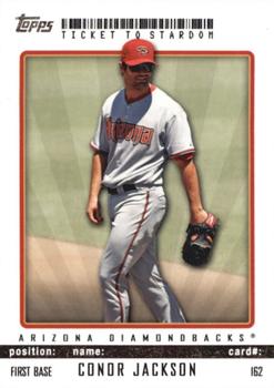
Wednesday, July 17, 2019Year: 2009 Set: Topps Ticket to Stardom (Rate) “ I see nothing inherently wrong with this card, but it doesn't jump out to me either. It looks more like a mid-2000s design than a late 2000s design. Does the bar code mean anything, or just a decoration? ” -Billy Kingsley
“ I like the fact that Topps was trying to do something different with this set. Design is not too bad and the set has a consistent theme ” -ketchupman36
“ A Topps card with a plain white border. Could it be? Another boring card from Topps. Put a bar code at the top and we have another set. I like the star for a day on the back but besides that this is just another reason why I dislike that Topps has exclusivity in baseball. ” -davidhandberry
“ The front looks like a back. That's where barcodes usually are right? It's also got the card # on the front, also usually on the back. The fine print legal crap on the back bottom takes up more space than the stats. Not a good formula for a baseball card. ” -chvlDm
“ Conor Jackson has a solid few years in Arizona before struggling after hitting .300 in the 2009 season and never really hit the same again. ” -Tylergallo
“ Topps Town. Love hate this design. Cool concept to make it look like a game ticket, but makes it pretty boring. Nice that the back has an interesting stat on the back instead of just some lame statement telling about how wonderful this particular insert is and congratulations on pulling such a special card. ” -captkirk42
“ Interesting that the card number is listed on the front. It really doesn't need to be there. Although, now I see the card number is part of the ticket theme. I'm not sure the ticket theme needs to be so literal. To me, using a barcode and listing titles like "position" and "name" doesn't add appeal to the card. ” -vanstryland
“ Looks like something I printed out at home ” -Lennoxmatt
“ Never saw these before. Don't want to again. A UPC code? There is a lot wrong with this card ” -NJDevils
“ too much wasted space , lacks a real ticket feel and look yet otherwise just looks sloppy , not a fan ” -dtowncards
“ Not crazy about this one. ” -switzr1
|
Additional Comments
| Posted By | Message | ||||
|
Joined: Aug 2015 |
| ||||


")