Thursday, February 16, 2023
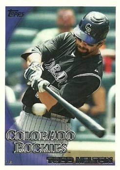
Year: 2010
Set: Topps (Rate)
Card: #509 Todd Helton
“ Say all you want about the stadium he played in, in my opinion this guy should be a HOF'er. ” -jdogg1228
14
“ See you in the HOF next year, Todd. ” -mrackar
5
“ This card exhibits what I really hate about 2010 Topps. The word logo is WAY too big. It is especially bad for the Rockies. ” -hiflew
3
“ I really like how this set used the teams different word marks. This is a great picture of Mr. Helton just about to smash the livin' daylights out of this baseball. Nice lookin' back on this set as well. ” -Gunny
1
“ Those statistical splits are what keep him out of the Hall of Fame. Lifetime .345 at home and .287 on the road. And his 369 lifetime homers are nice, but not clearcut for Cooperstown. Given the seemingly lowered standards- why can't Steve Garvey, Dale Murphy, and Dave Parker get in before they die? ” -Dave Sosidka
3
“ This guy had great power at the plate! ” -tinyshogun
“ The cornerstone of consistency for the mile high franchise. Nicely designed card front, and the back is spaced out and clean for easy viewing of stats. Solid! ” -CollectingAfterDeath
“ Nice card. I like the 2010 set. Helton seems poised to be voted into the HOF next year. ” -tenlbpain
“ Not a bad design, but the name creates visual issues. and for the love of pete can you please increase the font size of the card year and codes on the back for us with aging eyes. ” -parsley24
“ I always found it odd that some of the team names in 2010 Topps included the city/state while some only had the team nickname. I have never bothered to try to figure out the pattern or reason for it. ” -captkirk42
1
“ That's a HOF swing, I don't care what your home field is/was. ” -jackal726
“ Great card. Awesome pic, great centering and focus. Well balanced front and back. ” -pjdionne12
“ I think I like this. Topps generally does a good job with base set designs. ” -muskie027
“ Pure hitter ” -nkandy11


")