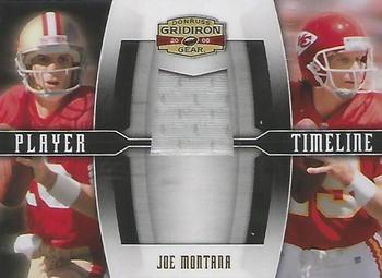
Chiefs fans would naturally like this card and Niners fans probably snub it. Two thoughts arise.
1. This design is butt ugly. Joe Cool deserves better.
2. We've seen cheesy phrases, sports cliches and sometimes puns tacked on to cards and a lot of times I groan, but this shows me how those also make for cooler cards that tell more of the player's stories. This Player Timeline is such a missed opportunity (anyone Seeing Red!?) to creatively tag each card in an insert series. Naming an insert after some concept and then repeating it every season in order to build up some brand identity is obviously what drives the cards, and it takes away from what collectors like me are in this for: the athletes, teams, history and love of sports. Immaculate this, Prestige that. Don't get me started on Panini's Season Ticket, too. (Playoff ticket, MVP candidate, blechh.) It's all about making a bunch of cookie cutters, putting in the dough, and spitting out crap.
But this card does capture my fancy. It's got content. Come on, designers and writers/editors, think! Look at individuals. Here we have an all-time great QB Joe Montana in the same color jersey for two different franchises. The elite franchise where he became a legend, and the scrappy team from the heartland where he closed out his career nicely. Yes, the pre-1996 San Francisco 49ers red was the exact same as what the Kansas City Chiefs have flashed since their beginning. The Chiefs' founder Lamar Hunt liked the Niners' interlocking SF and their bold red, so he modeled those parts of his franchise's identity when moving the team to Kansas City. The 49ers switched in 1996 from Pantone 186 C red to 187 C red, which is just a subtle shade darker on the color scale.
When I look at this card I want a design using that Pantone 186 C red of both teams back then to harmonize with the identical red Montana jerseys. Also, embellish with the Niners gold and Chiefs yellow. Before I even peek at the rest of the cards in the series, I know I'm going to be disappointed by other similar opportunities to play the timeline theme in strong design with franchise colors like this -- colors that practically match like these two franchises, and also some wickedly sick clashes and contrasts.
But no. Just keep spitting out a template with a dumb black bar and the boring-ass PLAYER TIMELINE reversed out. Every season there are cool opportunities to use a series or subset theme like this but actually make it cool. And I love this site because I can see the ones that work well and which ones suck royally.
(Speaking of Royals. I can't forget KC-SF baseball history. The 2014 World Series was thrilling... maybe Madison Bumgartner can finish his career in Royal blue? LOL now that could be a cool player duo, maybe weave in Salvador Perez.)


")