This can often just be "which sets did I collect when I was a kid", but...
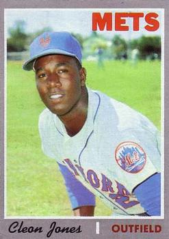
10) 70. Bleccch. Like moving into a concrete slab apartment building. What were they thinking?
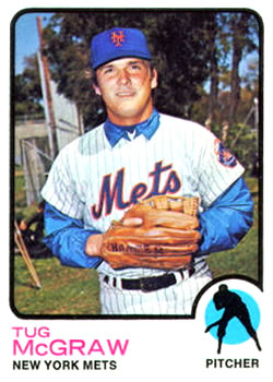
9) 73. Really boring, and still stuck in the era of lame posed pictures.
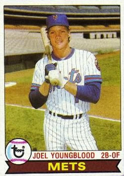
8) 79. Agreed, kind of boring, but still not bad.
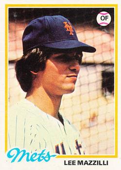
7) 78. Agreed, kind of boring, but still not bad. I like the script team names.
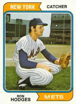
6) 74. I love this set, which says a lot about the rest of these. The colored banners above and below the picture frame are nice.
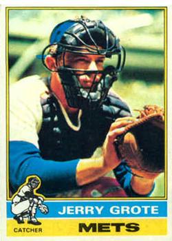
5) 77. The colorful blocked-letter team names look great and the All-Star banners make it better.
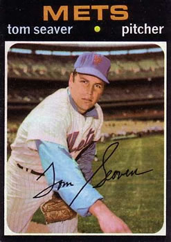
4) 71. Damn black borders. But the lower case lettering is cool.
3) 76. Great use of color, and the little images for each position are cool.
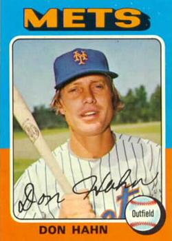
2) 75. Even better use of color. Iconic.
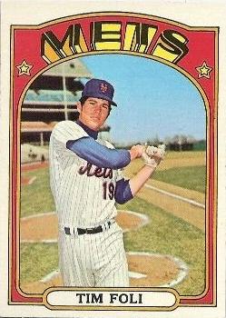
1) 72. Like a Peter Max acid-drenched concert poster.


")