I'm not even halfway down the list of what makes '86 Topps great, all of its joys and wonders. I can totally see why later generations can't see anything in it -- its like trying to get a 10 year old to appreciate Scotch. It probably does take a little too much effort and imagination to enjoy; yes, its hard to like, but something being hard, standing alone, isn’t a reason to not do something or that it isn’t worth it.
And lets not forget about the back of the card and the fun facts -- they can be pretty hilarious how for some players they couldn’t apparently come up with anything interesting or unique, "[Player X"] attended a school when he was younger." I think sometimes they include random things about completely unrelated players, which I am not the biggest fan of; its way more interesting to say something uninteresting about someone in my book. But regardless, it checks off something important for me in any card – on the back there has to be something written about the player in at least one complete sentence.
A non-silly awesome thing this card does is it tells you how many game-winning RBI’s a player had in the most recent season plus his career. I don’t know if Topps had this stat in other sets, but this is a very important piece of information to know about a player and we should be thankful they did the work to find and give it to us.
I think this set is full of hidden treasures I have yet to even discover. For example, as tcdb points out, 47% of the players have mustaches in their pictures. Yes! I would like to say I would have eventually figured this out, but honestly I’m not sure. But it makes me believe that there are even more things to find if you take the time to look carefully and the set will continue to amaze for years and years to come; its like the Da Vinci code or something.
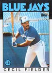
One thing I am interested in is the font at the top with the team names. The card from afar looks really serious, tough but when you look closely at that font, it’s a cartoonish, circus-like font. Does anyone know if Topps created this font, or if they ever create their own fonts for cards? Where did they get it? Despite its cartoonish, childish quality, its still kind of scary – it makes me think of the scene in Pee-Wee’s big adventure when he has the nightmare that his bike is being destroyed in a circus with the scary circus music. Absolutely bone-chilling stuff.
Ok, there is more, but I will stop and take a break for now. One reason I created this thread was because I was hoping others could chime in on some of the great aspects and I wouldn’t have to write it all myself.
I will end with this link to the PSA pricing on their web page. Here: https://www.psacard.com/priceguide/baseball-card-values/1986-topps/1296
Just look at the depth of that roster, and the prices too. Wow. Just wow.


")