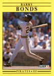
1991 was a weird year for Fleer. Their 1991 flagship wasn't even a product of it's time. I don't know what was going on in the company, I have no insider information. Maybe they were distracted by the new Fleer Ultra premium set, which was also a slapped-together dud in my opinion. There weren't any real design risks taken, nor does it appear much thought went into it. Weird yellow background, plain black striping, pedestrian typeface. The back side (outside of the color) may as well have been a totally different card. Here's the base Griffey for that set:

We have the player of a generation known for excitement and youthful energy, and on the front, he looks like he just popped out. I wanted to see if I could make an improvement to the design, maintain a 90's vibe, and still keep the spirit of the original design.
For 91 Fleer, that circle with a stripe coming off of it seemed to be a repeated motif, visible on the back of the base, and then on the All-Star cards, so I put that circle on the front and dropped a logo in it. Instant personality. The black stripe is still there in spirit, this time reversing out the position of the player (For me, a good card front has player name, team logo and position). Because of the vibrancy of the yellow, I wanted to take a chance with a font that communicated youth, fun and energy. I got rid of the top stripe because I wanted to let the name be the top boundary. And come on, how about a photo of The Kid's iconic swing, laying into a pitch to give it a ride. So anyway, my crack at a redesigned 1991 Fleer card:

Cards come from a smoke/pet/Subway-bread/patchouli free home.


")