
Random Card of the Day |

Thursday, August 5, 2021Set: 2018 Bowman - Chrome Prospects Atomic Refractor (Rate) “ YAY a Bucco! However, not something I would look to collect. I ain't never been into these newer Bowman cards. I know some fellers go nutsy cuckoo over these cards at the LCS. Buy boxes of them, open them right in the store and leave most of the cards there, never understood that. ” -Gunny
1
“ OK I like the basic design for the Base. I do not, however like the Refractor "Crushed Ice" or "Sparkle Diamond" Prism effect this refractor has going on. It really (multiple really ad-infinitum or at least 3 or 4 multiples of really) Back typical back really wish there was just one background color. Don't get me started on Bowman Prospects card "numbers" with all these "P"s and "C"s they use for their Prospects releases. ” -captkirk42
2
“ I think the Atomic Refractor is one of the better parallels in my opinion just because of how nice they look in person. Parallel aside, I think 2018 Bowman is nice because of how simple it is ” -mkb
1
|

Wednesday, August 4, 2021Set: 1997-98 Pacific Omega - Dark Gray (Rate) “ Busy design and way too much foil. Must be a Pacific product. ” -hamrlik22
1
“ Nice card. I don't like the sideways font for the player's name on the front, nor do I like the "signature" style of it (ditto with the name and position on the back). Back looks OK but having stats would be nice not just a season highlights bio. Also a solid color background works best not one of these fancy design ones. ” -captkirk42
“ Every sportcard I've ever seen where the guy's name is Sergei ... he's wearing skates! ” -BuccaneersDen
“ The more I see Pacific, the more I wish I had been around for them. ” -muskie027
1
“ I am not a hockey collector, but a good looking card is a good looking card. Pacific made some of the best looking cards and this is no exception. ” -YoRicha
2
|

Tuesday, August 3, 2021Set: 2011 Topps - Diamond Anniversary Limited Edition (Rate) “ Great photo. OK design. ” -parsley24
2
“ Nice 2011 Topps card. When did they start stamping Factory sets? Oh wait it was a special Anniversary Year never mind. ” -captkirk42
1
“ A great design that feels like it will be considered a classic from this era of card collecting. IMHO ” -koloth42
2
“ Is there a clinical name for the condition where the right half of my brain sees this and starts ranting about unnecessary, money-grab, slight variant sets, while simultaneously the left half of my brain makes a note to pull up this set and add the Braves cards to my wantlist? More importantly, is there medication? ” -jackal726
2
“ I always liked the really simple design of 2011, I just think it looks nice ” -mkb
|


Saturday, July 31, 2021Set: 2012 Upper Deck Marvel Beginnings S2 - Avengers Die Cut (Rate) “ Nice comic card. ” -captkirk42 |

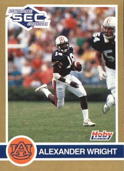
Wednesday, July 28, 2021Set: 1991 Hoby Stars of the SEC (Rate) “ This is an ok design. I like the picture on the front, but the lack of stats on the back reduces my impression of this card. ” -Brendan Barrick
“ Nice 1990s College Football Card. Interesting photo makes him look real small with a GIANT Blocker. ” -captkirk42
|

Tuesday, July 27, 2021Set: 2003 Upper Deck Finite - Elements Game Patch (Rate) “ This is a pretty nice card. One problem is that for some of the other Upper Deck releases, you could barley see the serial numbering on the back because it was so dark. This isn't a problem with this card because where the serial numbering is, it stands out. ” -jdogg1228
2
“ "Up and at them!"--Radioactive Man ” -rmpaq5
8
“ Gross ” -parsley24
2
|

")