
Random Card of the Day |
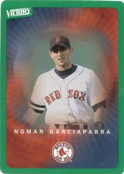
Thursday, July 1, 2021Set: 2003 Upper Deck Victory - Tier 1 Green (Rate) “ NoooMarrrr! ” -Godzilla8you
2
“ Pretty bland. Looks like a deck of playing cards. ” -NJDevils
4
“ Hmm? An Upper Deck Victory set that is a TCG? Interesting. ” -captkirk42
1
“ NOMAH!! ” -domentho
“ This is very mystique looking but the green border ruins it for me. ” -cardcollector65jw
“ The brown acid that is circulating around us is not specifically too good. It's suggested that you do stay away from that. Of course it’s your own trip, so be my guest. But be advised that there is a warning on that, okay? ” -BuccaneersDen
“ Victory cards were the OG walmart packs for me. I could muster up a buck for a pack about every time we went to walmart. Probably have this exact card somewhere still. I remember it oddly enough! lol ” -Kcsportsfan42
|
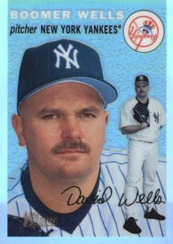
Wednesday, June 30, 2021Set: 2003 Topps Heritage - Chrome Refractors (Rate) “ the hobby loves Topps Heritage Chrome, but I never chased these cards myself, even though I like them very much too. Just noticed this is a nickname card on the front, and a full name with middle name on the back. I guess I'll go check and see if the whole set is like that. ” -abide
2
“ David looks either like he just messed up. Or he is contemplating what to do. ” -cardcollector65jw
2
“ I like Topps Heritage, I don't like Chrome Refractors. Simple as that. ” -captkirk42
2
“ I love the 1954 Topps design ... for 1954 players
Can't quite get accustomed to chrome/parallel/etc on old designs.
Go Yankees! ” -jayoneill
“ I like it!!! ” -muskie027
1
“ Ok Boomer... Sorry, couldn't help myself. ” -Vonnegut37
3
|
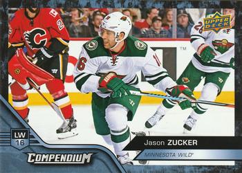
Tuesday, June 29, 2021Set: 2016-17 Upper Deck Compendium - Blue (Rate) “ Compendium was the cheapo set on epack. It takes 10 digital base to then make a physical blue one for this particular year. I thought Compendium was fun and it was easy to trade. Wish they would bring it back. ” -Gunny
1
“ Great shot for a hockey card. Love the close to the ice feel. Great looking set
” -parsley24
2
“ Every time Upper Deck gets an exclusive contract with the NHL, the quality of the product goes down. This is just another example. Mediocre design, produced as cheaply as possible. Ugh. ” -hamrlik22
4
“ All cards should be landscape. Boom. I said it. Good looking hockey card. ” -pjdionne12
“ When I realize I need to start collecting hockey because this looks nice ” -cardcollector65jw
1
“ Nice hockey card. Not familiar with this set. ” -captkirk42
“ Nice design. ” -cjjt
“ Never heard of it, but this card with the landscape view and the colors with the pose and the centering of the player just looks great on the front. ” -muskie027
|

Monday, June 28, 2021Set: 1996 Donruss - Press Proofs (Rate) “ Nice looking 1990s card. But UGH that foil logo bottom dead center I think it is the Donruss Logo. I think the base cards had the same problem that year. Back, I have a problem with full color photos on the back of cards. ” -captkirk42
“ Love the fact that a former Wichita State Shocker is getting this GREAT AWARD!
He will probably rank this award as his greatest accomplishment easily being more important than his homerun to end the World Series.
The card does look better in person than the scans show.
” -goreds00
1
“ Very simple card you can hardly tell it is a Press Proof because the lettering hides well on the card. ” -cardcollector65jw
1
|
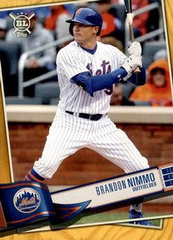
Sunday, June 27, 2021Set: 2019 Topps Big League - Gold (Rate) “ I didn't collect these, but they are not a bad looking set of cards. ” -muskie027
2
“ The word"walk" is not in this guy's baseball vocabulary. ” -domentho
1
“ Big League. I like these cards. I haven't gotten very many but the ones I have gotten I like. I know some don't like the design. ” -captkirk42
1
|
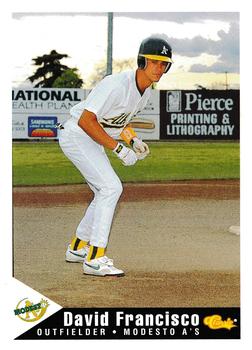
Saturday, June 26, 2021Set: 1994 Classic Best Modesto A's (Rate) “ I like the picture on the front. The back is pretty good too. ” -Brendan Barrick
2
“ For a minor league card it looks nice ” -cardcollector65jw
1
“ Like the interesting choice for the pose on this one. Setting up at second stealing poised to steal third. Hardly see that! ” -muskie027
1
“ Kudos for trying something different with the action pose, but I am not really sure what it is . . . He looks like a runner on third, waiting to take off, but it looks as if that is second base to which he is closest . . . It also looks like he is going to bunt without a bat . . . Nonetheless, it is not a bad-looking card . . . ” -georgecf
“ Francisco...that's fun to say! FRANCISCOOOO! ” -domentho
1
“ Good picture.
” -cjjt
“ Interesting Minor League card. Is he supposed to be "taking a lead" while pretending to be on base? Classic Best UhOH that probably means the base set has a couple thousand cards. ” -captkirk42
|
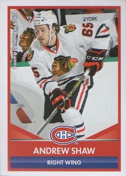
Friday, June 25, 2021Set: 2016-17 Panini NHL Sticker Collection (Rate) “ Nice front for a sticker. ” -Brendan Barrick
3
“ My one big bugaboo is shown here. Different logo and uniform ARGGGGHHH! Please don't do that! ” -Gunny
6
“ Shaw had a hat trick at a Red Wings game I went to. Stickers are cool. ” -pjdionne12
2
“ Nice Hockey sticker. ” -captkirk42
1
“ I wonder how Panini has the license to produce this card. From what I saw is Upper Deck and NHL had an exclusive deal. ” -cardcollector65jw
1
“ Beans Ball card blog will love to see this sticker. He loves stickers ” -parsley24
2
|

Thursday, June 24, 2021Set: 2002 NFL Showdown 1st & Goal (Rate) “ I'm thinking that is a bar code on the left, and I don't get it ” -abide
4
“ Ah NFL Showdown the football CCG/TCG The front is unusual with the barcode on the left there. Looks like a title card in a repack pack. OH Dear that is a feature on ALL the cards in this set. UGH. Not sure if I have any of these for my teams or my players. If Not I have no plans to get any. ” -captkirk42
2
“ The card games based on sports just look dumb ” -cardcollector65jw
4
“ What no logo on the helmet? ” -Brendan Barrick
|


Tuesday, June 22, 2021Card: #59 Gymnastics On The Moon “ I can bench 6000 pounds. ” -domentho
2
“ I'd avoid injury doing a flip, and landing awkwardly on the floor, but would end up cracking my skull from drifting up into the ceiling. DOH! ” -CollectingAfterDeath
“ Gotta admit, looks fun. ” -rmpaq5
1
“ Awesome. I want to do gymnastics on the Moon! ” -cjjt
“ Nice vintage Non-Sport card that almost looks like a sports card. ” -captkirk42
“ This would be an amazing card as a kid for me because I was into the difference in weight and gravity on other planets/moons. In 4th grade we did the calculations of how much we would weigh on each planet and our moon and how it would affect our bodies. This card fascinates me 100%! ” -cardcollector65jw
3
“ I think I see Jeff Bezos and Elon Musk. ” -Godzilla8you
1
“ In 1957, only one house in my town could afford a color TV (not my house). Disney's Wonderful World of Color did not start broadcasting until 1961. So, it was a treat when Topps capitalized on the excitement of the space race and issued these Space Cards featuring full color illustrations of what space travel would be like. ” -IronButt
“ Any card older than me I find cool! There is no exception here! I'd be all over this set! ” -bkklaos
|

")