
Random Card of the Day |

Friday, August 21, 2020Set: 1997 Pinnacle Certified (Rate) “ You think Topps Chrome is bad? These cards curled like nobody's business. A shame because I quite like the look of these cards. As far as Nomar, he was the best pure hitter of the sacred shortstop trio of that era (A-Rod, Jeter, Nomar). An electric player! ” -mkaz80
“ Nice looking card for a high end set. Front OK lookswise needs team name. The brand logo stamp should be much smaller and the player name should be easier to read. Script fonts look fancy but are often hard to read on cards. Back is OK. For rookies minor league or college stats would be nice. ” -captkirk42
“ To peel or NOT to peel is the question. ” -CardFlipper1974
“ Rookie Nomar? That's a neat one. ” -DarkSide830
“ Poor Nomar. Plays at a Hall of Fame level, but gets traded in 2004. Turns out, he was holding the Red Sox back from winning the World Series. ” -cjjt
“ Nice set. Looks 1000x nicer if you peel that dumb plastic off. I've peeled all mine. So much better. ” -switzr1
“ What's not to like, chrome looking with peel off scratch resistant plastic. [to peel or not to peel?] Rookie card of a real good player. Remember in 97 when the debate was: Who will have the best career between Nomar, Jeter and A-Rod? A few years later, all were looking good, and the question became: Will any of them surpass Cal Ripken? Big fan of 97 Pinnacle Certified and chasing the Mirror Red, Blue, Gold. Even a bigger fan of 97 Pinnacle Totally Certified, with all the base cards SN3999, and a Blue and Gold parallel. One of my all time favorite sets. Both sets have the same player check list, and back of cards are the same, but images on the front of the cards are different. ” -abide
“ I like the back, despite the lack of statistics. I reckon Pinnacle decided some of the umpteen competitor brands could cover stats and they'd do something different. But I like that design overall. The front is a bit hard to tell with the "peel off" array, but it seems a bit plain for my tastes. ” -kents_stuff
“ I like certified. I have no idea who this is. ” -dollar guy
“ PEEL IT OFF! PEEL IT OFF! PEEL IT OFF! Oh wait, this isn't a Benchwarmer card. KEEP IT ON! KEEP IT ON! KEEP IT ON! ” -CollectingAfterDeath
“ Nomad was good, the card isn’t bad, but not a fan of the peel off stuff. ” -muskie027
“ I will never understand the purpose of those peek offs. Protection only? ” -hwi5wi
|

Thursday, August 20, 2020Set: 2009 Topps Heritage - 50th Anniversary Buybacks (Rate) “ I like Buybacks. Wish they were more prevalent in my collecting areas. It would be nice to be able to add something new from an otherwise completed set. ” -Billy Kingsley
“ There's a 420 joke in there somewhere for someone that partakes of buds daily. ” -jackal726
“ As a kid, I loved the 1960 Topps, especially the backs where they gave you the highlights of the players good days. ” -NJDevils
“ Horizontal design. Incomplete stats. Color scheme doesn't match team colors. Topps really needs to get back to the basics. These modern Topps designs are all awful. ” -switzr1
“ Some people want a "Bud" daily, others want a Bud Daley. It's all good. ” -bpaul14
“ AH COME ON MAN RCotD! I was super stoked I was seeing a real vintage card, then I saw the title of the card "2009 Topps HERITAGE.." WHHHHHAAAAAAAT. A dang BUYBACK! Yep it's got the condition ruining 50th Anniversary Stamp. I LOVE real vintage cards I like Heritage retro cards that pay homage to the cards, I DO NOT LIKE when a real vintage card is defaced with a stamp to make it a BUYBACK. OK maybe one day for some of these sets a buyback maybe the only affordable copy of a card I can find, but still UGH. ” -captkirk42
“ Well who doesn't love a Daley Bud? Every morning there's a halo hangin' from the corner of my girlfriend's four-post bed. ” -ganondorf666
“ I love the pre-1970s baseball card designs, especially this one. ” -BasketbalHQ
“ I like getting the old cards in packs. Not quite sure how I like the "buyback" stamp. They should all try this maybe....Donruss.....you need to buyback some 88-90's??? ” -Gator415
“ I am not a fan of buybacks. Buybacks reduce the supply of original cards in the marketplace. ” -Brendan Barrick
“ Now, that's a baseball card! I don't like the addition of the foil, though. ” -jayoneill
“ I'm not a fan of re-prints, but let's talk about the original card. Cons: the plain background on left with the live background on the right is a bit awkward to me. Just a single year's stats on the back. Pros: An action photo (okay...it's posed, but still) PLUS a head-shot. I always thought the dual color lettering worked on these cards. Perhaps one of Topps' best ever "card number in a baseball" efforts. And most of all not only do you get a cartoon on the back but also a team mascot on the front! A real winner from my perspective. ” -kents_stuff
“ Looks like a nice card. 2 pictures on the front is kinda nice. ” -dollar guy
|
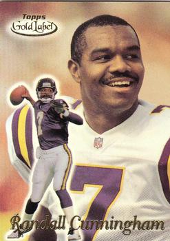
Wednesday, August 19, 2020Set: 1999 Topps Gold Label (Rate) “ The Gold Label cards using this design are so awesome in hand. There weren't enough of them- the NBA set was only 100 cards- but I have loved the concept since day 1. ” -Billy Kingsley
“ I like this set a lot. Cunningham sure was fun to watch in his short time in Minnesota too. ” -switzr1
“ Great card. Great player. ” -parsley24
“ Very nice looking card. I like these cards, but I tend to not like higher end products, mostly because they stop feeling like trading cards. If that makes any sense. Good that they didn't duplicate any of the photos. Backs really should have more stats and the player photo be smaller after all it takes up half the space. ” -captkirk42
“ Cool to see a post-Eagles Cunningham card. Bonus that it looks nice too. ” -DarkSide830
“ I like this design. It is nice seeing three different pictures on the card. ” -Brendan Barrick
“ i didn't really collect these gold label cards when they came out but as time has passed they are a beautiful set ” -Thunderfoot
“ Too many Topps issues. For the diehard collector who needs to get his priorities in life straightened out. ” -Phil
“ Nice 2 shot card. ” -hwi5wi
“ I don't do much with football cards, so I hadn't seen these before. I like the action shot over a portrait type photo, plus a third image on the back. The blurred background is decent, but a shade pastel for my liking. Overall I like it. --Kent ” -kents_stuff
“ I like these cards. My dad actually met Cunningham at a BBQ restaurant, said he was very chill. ” -BasketbalHQ
|

Tuesday, August 18, 2020Set: 2019 Score - Scorecard (Rate) “ Fun fact: I created his PID when he got his first card in SI for Kids. He now has over 3500 listed, which I believe is the most cards for anyone who I created a listing for. And those numbers are surely going to rise for years to come. ” -Billy Kingsley
“ Nice card. I'm sure I don't have it. ” -switzr1
“ Score, the generic looking name brand. ” -CardFlipper1974
“ I hate to say it, but Topps and Panini have essentially destroyed the 'parallel' niche. The joy that once accompanied pulling a parallel has now bee replaced (at least for me) with a sigh or a groan: Another different parallel?! I guess collectors who chase 'rainbows' for their favorite players might disagree, but even for me as an avid team collector I barely bother. If I stumble upon one of my team's guys in a dime box I'll grab it but that's about it. ” -mkaz80
“ Score.... So cheap looking. I think i know the problem. Basic cards on glossy stock frusterate me. They need to be on matte stock. ” -parsley24
“ I like the simplicity of this set. Like the use of the the helmet for the team logo. No major complaints about this design. On back small gripe about one year of stats but hey at least there are stats right? Oh and the same old same old using the same photo on both sides thing. UGH. Let me look at the front some more and forget the problems of the backside. ” -captkirk42
“ I really like 2019 Score cards, very high def pictures, and I like the helmet in the corner. ” -BasketbalHQ
“ disapointed scorecard parrall isn't numbered anymore ” -Thunderfoot
“ leonard fournette is good ” -baylors
“ Straight forward design. A good card. ” -CollectingAfterDeath
“ It's been a year since I've said it (almost since I've said anything), but i hate cards where the same photo is used front and back. Grrr. --Kent ” -kents_stuff
“ Beside Donruss one of the very few NFL sets widely available in Europe. Personally I don’t like the design at all and always would go with Donruss. ” -hwi5wi
“ The gray border makes it seem like it's actually a parallel version. ” -Mscott713
|

Monday, August 17, 2020Set: 2014-15 Upper Deck Trilogy - Tryptichs (Rate) Card: #T-WINGS1 Henrik Zetterberg “ Nice card...based on the set name I'm guessing there are three different kinds of material available for each player. Two Red Wings in one week. ” -Billy Kingsley
“ Meh,I am not a memorabilia fan and this blah card does not make me want to be one. ” -uncaian
“ Interesting when was the last time we had a relic card in the RCotD? Nice looking card. ” -captkirk42
“ This in an ok design. ” -Brendan Barrick
“ I really like memorabilia cards in general, and though I know nothing about hockey, I like the overall design. ” -BasketbalHQ
“ Like it! Crooked scan of back? ” -PunchoutND
“ Not a bad looking card if you like Jersey cards. ” -Phil
“ I feel like this card needs cropped, or the white border on it makes it awful. ” -Mscott713
“ Yesterday Stevie Y...today Henry Z...seems like a conspiracy to me. Decent looking card, and jersey remnants are fun. But I was out of the hobby at the time these came around. Can anyone explain where the name "Tryptichs" comes from? My brain keeps seeing "Try Pitches", which also makes no sense. --Kent ” -kents_stuff
|

Sunday, August 16, 2020Set: 1997-98 Upper Deck - Three Star Selects (Rate) “ Die Cut cards are a lost art. This one is die cut AND etched! Something else that's now rare to see. Both of which I like. ” -Billy Kingsley
“ Steve already in the zone, while focused on the ceremonial first puck...easy dude. Gotta love that intense look. Looks like a die cut type card, but I am probably imagining that. Front is awesome. I could see myself collecting these. ” -CollectingAfterDeath
“ I am not a huge hockey fan, I know how un-Canadian of me, but this is a player that I absolutely respected beyond all measure. ” -rmpaq5
“ I'm not a Red Wings fan by any means, but even I realize Steve Yzerman was a five-star player. For UD to only give him three stars is a travesty. (And then they went and cut them in half, at that!) ” -kents_stuff
“ Great photo and concept insert... Love it. ” -parsley24
“ Great player! I wonder if the cards are worth more if they still have the stars. :) ” -vrooomed
“ This an ok design. The front is a little bit hard to read. ” -Brendan Barrick
“ Not a bad design, though I know nothing about hockey. ” -BasketbalHQ
|

Saturday, August 15, 2020Set: 1988 Topps Stickers (Rate) Card: #41 / 207 Andres Thomas / Julio Franco “ Topps Stickers two days in a row! Consecutive years, too, if I remember correctly. Maybe the 1989 set will come up tomorrow? I do like the yellow borders...my second favorite color. ” -Billy Kingsley
“ Is this 2 days in a row of the same set? Wow. ” -rmpaq5
“ Didn't we just have one of these? I still like Topps stickers. The problem with the card back years is that these two guys don't have their names displayed anywhere. I guess that's why you need to buy the album. Those guys at Topps are pretty smart after all! ” -switzr1
“ I remember stickers from when I was young, putting them all over notebooks. These look real nice. I really like the one of The Hawk on the back. ” -CollectingAfterDeath
“ Stickers two days close together (in a row? I can't remember if Candy and Quisenberry was yesterday or the day before). Possibly coincidence list worthy? ” -Brimose
“ Once again, 80's stickers should bring big money for NMt or Mint condition. ” -CardFlipper1974
“ is this stickers back to back...... ” -parsley24
|

Friday, August 14, 2020Set: 1987 Topps Stickers (Rate) Card: #94 / 257 Candy Maldonado / Dan Quisenberry “ Can't go wrong with SHOULD BE Hall of Famer Dan Quisenberry. ” -jupiterhill
“ Stickers are always great when you're a kid. ” -NJDevils
“ The candyman and the quiz.... Great card. ” -parsley24
“ I wish it had names somewhere on the front of the card, but I do tend to like the Topps Stickers cards in baseball and in basketball. ” -BasketbalHQ
“ One of the greatest names and one of the greatest mustaches on one sticker... nice ” -Brimose
“ I like Topps stickers for the most part. I like the design. Wish the players names were somewhere on the front. The only real complaint I have about Topps Sticker sets is trying to track your collection. The checklists are crazy. Trying to figure out how to organize them in the collection, If collecting by player which player to give priority to if you like both players. Oh and if the "back" has a 3rd player as some of the sets did, what do you do then? ” -captkirk42
“ Once again, I do believe a mint sticker from the 80's should be worth more. I peeled and stuck mine everywhere. I don't think back then we appreciated the sticker game. ” -CardFlipper1974
“ I don`t really like 80s sticker cards. I don`t really collect baseball so I naturally don`t know who these people are. ” -dollar guy
“ I never encountered these stickers before I joined the Database...after seeing all the confusion and the copious amounts of IRs they've spawned, I'm quite happy they were not done in my sports. ” -Billy Kingsley
“ I wish I knew who these guys actually were. The stickers are nice but these are before my time so i am clueless without the names on here. ” -clauzon
“ I used to get the sticker books every year. Seems like the packs were only a dime. Good times. ” -switzr1
“ The "quiz" should come before the "Candy". ” -bpaul14
“ I loved these when I was younger. Haven't gotten back into them as I got back into the hobby recently. ” -muskie027
|

Thursday, August 13, 2020Set: 1995 Ultra - Ultrabilities (Rate) “ I love Ultra, my all-time favorite brand. This one is not a design I've seen before but I would probably have had fond memories of it had I been a football collector. ” -Billy Kingsley
“ I love the mid-90s Ultra inserts, but I don't remember this set at all. Good looking card. ” -switzr1
“ Like the bolts in Frankenstein's neck, Irving comes through with his ultrabilities and Fryars anything in his path with massive bolts of electricity. Miami Dolphins never saw a more shocking play from any other player in the sea. Thank you for listening. ” -ganondorf666
“ could just be the miami colorway, but i am not a fan of this card. ” -parsley24
“ No thank you. ” -Brendan Barrick
“ This is a insanely cool insert. The back of the card is almost as neat as the front. '90s Fleer Ultra strikes again! ” -mkaz80
“ Yep a 1990s design. Odd I saw the huge "Bolts" in the design and thought he was a recent trade since he was wearing Dolphins uni. Thought the "Bolts" was referring to the Chargers. NOPE it is because of his speed which on the back has a huge vertical "speed" . ” -captkirk42
“ The background of this card is jarring and confusing. ” -Blargh
“ Cool career bio on back. Awesome action shot on the front. I like it! ” -CollectingAfterDeath
“ Totally forgot he played for Miami. Not bad for 1995. ” -muskie027
“ Awesome design. Love these. Sidenote: Irving Fryar is the only known NFL football player that received a concussion while he off the field during his team's game.....driving. November 23, 1986. ” -CardFlipper1974
“ Another photoshopped cards. This cards doesn`t seem terrible. No stats kinda sucks. I don`t collect american football so I naturally don`t know who this is. ” -dollar guy
|

Wednesday, August 12, 2020Set: 1993 Bon Air Fire Engines (Rate) Card: #68 1990 Emergency One 110 Foot Aerial “ Pretty sad that a 27 year old card of a 30 year old firetruck is still newer then my town's current main firetruck. ” -jupiterhill
“ Very cool card. I would collect these. ” -switzr1
“ Great Card! Good to see something totally different. ” -NJDevils
“ I know nothing about this card, but its nice and simple, good-looking fire truck ” -BasketbalHQ
“ But the girls like the 150ft ladder. ” -CardFlipper1974
“ Nice Non-Sport card. I'm mixed on the fire engines card sets. I think they often look pretty cool but personally I wouldn't collect them. I have the same sort of love/hate with muscle car card sets some I really like others I don't. Actually I think I'd go for some of the muscle car sets than these fire engine sets. ” -captkirk42
“ I had no idea someone decided to make a fire engine card. ” -dollar guy
“ I love these sets ” -Brimose
“ This is the largest automotive set in history- 500 cards, spread over 5 series of 100 cards each, and it even spans two different card brands! (although it may be one brand that changed names, I'm not 100% sure). I need to work more on adding these to my collection. The later series usually mentioned the town in the card title. ” -Billy Kingsley
“ As good a thing to make a set out of as any. Two thumbs up. ” -muskie027
|

")