
Random Card of the Day |

Friday, July 17, 2020Set: 2012 Press Pass - Blue Holofoil (Rate) “ Nice! Landon is a card collector, his collection was even featured on TV once. I wouldn't be surprised if he's seen our website actually. ” -Billy Kingsley
“ Simply design goes a long way. The bio with the line of stats over top of the driver's race car has a nice clean look on the back. I like this card. ” -CollectingAfterDeath
“ Not a oval track racing fan im more of a street circuit F1 fan . Nice looking card i wish they had these for F1 . The great champion Lewis Hamilton only has 2 Sports Illustrated cards. ” -ericidol1984
“ Driver on one side. His car on the other. That makes a satisfactory racing card for me. ” -switzr1
“ I personally don't like the design very much, and the picture isn't great. Everything is hard to read. ” -BasketbalHQ
“ I have no idea what to say about racing cards.... ” -dollar guy
“ The PressPass logo looks like the Arby's hat. Jim Halpert (aka Landon Cassill) looks very pleased with himself as he waits patiently for Dwight to discover that his Security Benefit has been messed with. ” -BucCollector
|

Thursday, July 16, 2020Set: 2018-19 Upper Deck MVP - 20th Anniversary Colors & Contours (Rate) “ A cool twist on a throwback design. Was the starting goaltender to win the Stanley Cup in my first full season watching the sport. I was not lucky enough to pull any of this insert parallel from my box, but I got it into my collection via COMC. ” -Billy Kingsley
“ Mixing 1998-99 MVP design with Colors & Contours design makes it bit too busy. ” -SharksAttack
“ Not sure if I like the colors on this or not.....seems like a nice mix, but also seems like someone puked....Might be all the red on it ;) Go Pens!!! ” -Gator415
“ Colors and Contours? Lime Jello and Coffee? Sad when a card for my homie team looks better on the back than on the front. ” -captkirk42
“ this card is so busy... i would probably think it was cool if i pulled it, but from a design standpoint there’s just one too many things going on here ” -torald
“ Start with a decent photo of the player, and then add as much garbage as possible to make the card look like a mess . . . It looks as if a graffiti artist did it . . . That may be fine on a subway wall but it's not what I want on a trading card . . . ” -georgecf
“ This set was a copy of the basketball and football sets. Not a fan ” -parsley24
“ Garish would be an understatement. ” -buckstorecards
“ Front is way too busy and of course it is another insert/parallel card. ” -uncaian
“ There's a lot going on here, and some of it is ok. I can't quite figure out the background. But the photo is good. ” -switzr1
“ this card is so busy... i would probably think it was cool if i pulled it, but from a design standpoint there’s just one too many things going on here ” -torald
“ An ok design. ” -Brendan Barrick
“ There is a lot going on, on both sides of this card, but it works quite well. Nice card! ” -CollectingAfterDeath
“ Looks like a really messy card with a lot of things going on. Full career stats are nice though. MVP is a nice set so it would likey be a set I would collect if it was possible ” -dollar guy
“ Ewww. ” -bpaul14
|

Wednesday, July 15, 2020Set: 2007 Upper Deck Spectrum (Rate) “ Another photoshopped card. Why don`t they try to use an action shot and apply the spectrum design??? ” -dollar guy
“ This card must look awesome in hand. I've never encountered any of this set in person, but you can tell it's all holofoil, which is great. ” -Billy Kingsley
“ While I can appreciate the attempt at the design, it's always bad when the notes about the copyright are longer than those about the player. ” -volbox
“ Nice looking card. Upper Deck always got it right with baseball. I know they make hockey but If they would come back and make a baseball set it would be awesome. ” -ericidol1984
“ I expect the floor to light up like the Billie Jean video when he pitches the ball. ” -switzr1
“ Back from vacation. I was looking forward to writing something witty about a card and get this card. I will wait until tomorrow to write something. ” -parsley24
“ The pitcher steps into the crystal box and goes into his wind up... High dislike of chromeness. Don't like the sideways name and team name towers. Back OK but not great much better than the front. ” -captkirk42
“ Wow! what a BORING card....If you are going to change to non-sports back ground at least make it flashy or something....and the back.....ugh...so much empty space with nothing there!!! ” -Gator415
“ Whatever Upper Deck was trying to accomplish with this design - it didn't work. It looks like an action figure inside a plastic cube. Some may find it attractive, but if they do, it call their taste into question. Ironically, there's much they tried to do, if the individual components are broken down. But together, it looks like a lot of nothing. Definitely being a case of the sum of the parts being lesser. ” -georgecf
“ Not really digging the design. I get what they were going for, but--meh. The back is standard late 2000's UD. Not a bad card, but not great either. All that aside, I need this card... :D ” -Vonnegut37
“ Not Upper Deck's better effort but that's what happens when you try and keep up with all the others in a multiple release filled era. ” -baseballcardstoreca
“ I usually hate these designs, but this looks pretty cool. I don’t know about a whole set, but it is a great design for an insert concept. ” -muskie027
“ Interesting design. His first year in the majors being 2004, I can see why the back is a bit empty. This set kind of grows on me the more I look at the gallery. Not a bad looking card. ” -CollectingAfterDeath
|

Tuesday, July 14, 2020Set: 2011 Topps UFC Title Shot - Championship Chronology (Rate) “ I heard the Red parallel of this card is actually red ink made from the blood of his face. Need confirmation. ” -CardFlipper1974
“ I like the front disign of the card. Always like the Title belts. ” -ericidol1984
“ Not a UFC collector, but that's a pretty nice looking card. ” -tenlbpain
“ From the picture I thought this guy was a cyclist. He's MMA guy? I'd make this a gold parallel to a base card Guess it's just a championship insert? ” -captkirk42
“ Beyond my disdain for MMA, this card makes it look as if Edgar is about to be absorbed by a creature (actually a blob) from outer space. A waste of a card on a waste of a sport. ” -georgecf
“ Whoever designed this card must have still been in high school. #ThanksTopps ” -beansballcardblog
“ Pretty much ruined B.J Penn's career ” -Young Kilo
“ Well, another photoshopped card. No stats on the back huh? Well I really don`t want to collect that set and I don`t really like the UFC either. ” -dollar guy
|

Monday, July 13, 2020Set: 2004 Topps All-Time Fan Favorites - Jumbos (Rate) Card: #6 Abdul Salaam / Joe Klecko / Mark Gastineau / Marty Lyons “ Nice multi-player card. Local team, albeit not in a sport I follow, is always a plus. ” -Billy Kingsley
“ Not withstanding the Klecko, the photography is pretty good on this card. B- ” -Phil
“ OH "Fan Favorites" that is why this looks like a retro vintage card. I like it. ” -captkirk42
“ I love this set! I’ve gotten Lyons to sign a card for me before. I should buy this card and see if I can get all 4 to sign it. ” -StarrsCards
“ Not crazy about it, but it isn't terrible. ” -switzr1
“ Don`t know any of them so, fan favourites? ” -dollar guy
“ As weird as this looks, I really like it for some reason. Props for the creativity! ” -muskie027
|
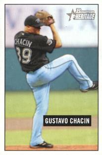
Sunday, July 12, 2020Set: 2005 Bowman Heritage - Mini (Rate) “ Wow, haven't thought of him in years . . . He was pretty good for the few years he was with Toronto . . . He then bounced around to four or five times until his career ended quietly . . . The card is OK, but the picture on the front makes me "uncomfortable" . . . Probably the angle of the shot . . . It seems it would have been better if it was a full front-shot or profile, but it seems to be in-between the two . . . The back is OK for what it is, but it's limited by the original style of the card set . . . By today's standards, it seems rather lame . . . I originally had not known he suffered from alopecia areata, but that explains a lot about his distinctive look . . . ” -georgecf
“ That is a memorable name that I don't remember. ” -cckeith
“ Beautiful card....we need more like this. ” -beansballcardblog
“ Nothing to write home about. Card has a cloudy look to it. ” -Phil
“ Okay action shot, quite plain though. Then of course, that is probabaly the point of bowman heritage ” -dollar guy
“ Mini cards. Ugh. How to store? How to display? So many issues. ” -CardFlipper1974
“ Chacin had a great rookie season, but didn't like up to the potential he showed. I do remember him looking really cool on the mound with his shades on. ” -DanD
“ Terrible choice as to where to put the name, but good picture use ” -BasketbalHQ
|

Saturday, July 11, 2020Set: 2004 Donruss Elite Extra Edition - Draft Class (Rate) Card: #DC-21 Eric Chavez / Roy Oswalt “ Difficult card to scan. Though I do not like the concept. Never did like cards with different players on each side. ” -kirkscards
“ This set looks good. Eric C and Roy O were good players . I wouldnt mine having this card. Nice design. ” -ericidol1984
“ Ugh two player card with one player per side. Or if you like a two front card. ” -captkirk42
“ Oh my eyes! ” -BucCollector
“ I do not like the dark line that goes through the middle at all ” -dollar guy
“ I've never liked two player cards with the players on opposite sides -- something about it just seems wrong. In my opinion, the back should be used soley to expand on the player presented on the front. Additionally, Donruss did a good job to make sure that 70% of the card was taken up by a gigantic graphic with only 3 pieces of information -- Name, draft class, and team. (And the most important of those, name, looks like it was printed with size 10 font) I guess that was just too much for them to condense. smh ” -Slug03
“ Nothing worse to me than a card featuring two different, completely unrelated players on different sides of the card. And then it is ugly, too. ” -bpaul14
“ This doesn't do anything for me. Nothing about it impresses me. ” -Phil
|
Friday, July 10, 2020Set: 2009 Score Inscriptions - Autographs (Rate) “ Interesting design choices here. My first reaction is not a positive one, but it appears the borders are team colored, which is something I like and am a definite fan of. ” -Billy Kingsley
“ Did not even notice the autograph on the front, till I read the congrats note on the back. A card front ill suited for an auto, imo. ” -CollectingAfterDeath
“ Why collectors ever started accepting a card with an autographed sticker attached to it, as an autographed card, is beyond me. You can put steak sauce on Spam, but that doesn't make it a steak. ” -switzr1
“ OH I forgot how much I don't like the 2009 Score design. Plus a stickergraph. Maybe I should just leave the hobby. I'm getting depressed by it more and more. ” -captkirk42
“ I am split about the design, I like it and dislike it at the same time. And the autograph is a sticker auto, I certainly don`t like that ” -dollar guy
|
Thursday, July 9, 2020Set: 1998 SkyBox Premium - Fleet Farm (Rate) “ I really like the foil they used on these cards. It's much more interesting than the single color foil we got in the NBA set. ” -Billy Kingsley
“ Skybox has some pretty amazing cards. This set is one. ” -CardFlipper1974
“ Not a fan of this set. The player I highly respect Had a super career. ” -captkirk42
“ I like the base card. What the heck is a fleet farm? This has to be the most unusual name for a set I have ever heard of. ” -Brendan Barrick
“ Nothing to write home about. Not sure who this would appeal to. ” -Phil
“ Okay action shot, I can`t read the names. ” -dollar guy
“ Loved me some Rocket back in the day. Last pitcher who would pitch inside and claim the plate!!! Deserves HOF ” -cowboyfaninlr
“ Love when the legends show up! ” -muskie027
“ Would the Minister of Defense defend the cringe-worthy design of this card. I believe not. ” -CollectingAfterDeath
|


")