
Random Card of the Day |
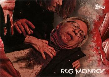
Friday, October 11, 2019Set: 2016 Topps The Walking Dead Survival Box (Rate) “ I tried getting into this show. I failed. I watched the first season and never got around to the second. As for the card, it is a decent looking non sport card. Didn't realize Topps was still doing non sports cards. ” -davidhandberry
“ *Spoiler alert* I don't think he survives. ” -YoRicha
“ Yuck. Just couldn’t get into Walking Dead for some reason. Probably all the yuck. ” -Brimose
“ Lol , the survival box , doesn't look like the subject will survive , nor does anyone on that show. At least once the show is done Topps has given fans enough WD sets to remember something that to me is quite forgettable.RIP Reg! ” -baseballcardstoreca
“ Modern Non-Sport. OK. I don't watch or collect The Walking Dead so I am not interested in the subject matter but the card look is pretty good. ” -captkirk42
“ Is that....Mitch McConnell?! ” -Vvvergeer
“ OPC cards were notorious for being miscut, off-center and rough edges. ” -NJDevils
“ I have no idea what this is. ” -beansballcardblog
“ Is “Survival Box” an oxymoron? ” -IfbBirdsCards
|
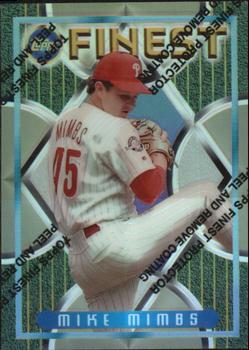
Thursday, October 10, 2019Set: 1995 Finest - Refractors (Rate) “ Always thought Finest was a misnomer. They were not the finest but I guess when you are comparing it to most Topps sets it doesn't take much. The front is decent. The back, I like the picture and that is about it. ” -davidhandberry
“ Fast forward 24 years later and we still have refractors. His identical twin brother was also a pitcher.Never been a fan of a protective coating with words telling me my card comes with a protective coating. ” -baseballcardstoreca
“ Refractors are always awesome. ” -Billy Kingsley
“ As much as I have always enjoyed the earlier years of Topps Finest, I still dislike the protective coating you need to peel off to enjoy how nice the cards actually are. I peeled the ones in my collection. ” -YoRicha
“ Does anyone take the film off? ” -parsley24
“ I thought I had this card, but when I looked, I didn't. Turns out I have the base card, not the refractor. Third year of Finest in baseball, and despite the cheesy background graphics, I really like the set. And then for the RCOTD, it's a Phillies card, and I always like seeing that! ” -vrooomed
“ there is very little about this card or set that I like or can make a positive comment about. I was going to try to comment about the player but I am not familiar with him. I sort of recognize the name so I might have a card of his, or maybe I have a card of his twin brother Mark. Yeah I found out his twin brother also was a player. ” -captkirk42
“ Not crazy about the front - the background detracts from the picture of the player. The back, however, is beautiful. The layout is nice, and the picture of the player looks good. ” -georgecf
“ TOPPS FINEST PROTECTOR PEEL AND REMOVE COATING ” -Tylergallo
|
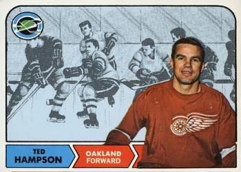
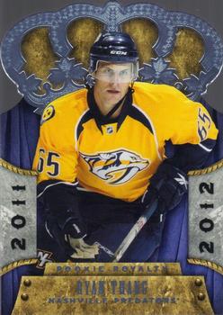
Tuesday, October 8, 2019Set: 2011-12 Panini Rookie Anthology - Crown Royale Rookie Royalty (Rate) “ Panini briefly resurrected Pacific and that was a very good thang(pardon the pun) Nice higher end rookie of a player who never sniffed much NHL ice time ” -baseballcardstoreca
“ I bet he got called Wild Thang often throughout his life... probably still does! ” -Billy Kingsley
“ This is a really sharp looking card. Very nicely done. ” -SandersFan
“ Thang only played one game in the NHL. ” -Tylergallo
“ I am not a huge fan of the Crown Royale Crown die-cut cards. Can't tell if this is one of those regular die-cuts or a regular full non-die-cut card. If it is non-die-cut then I like it a little, if it is die-cut then UGH. ” -captkirk42
“ i dont like the position next to the last name on the back. It makes it look like it is part of his name. ” -parsley24
“ Ain't no thang like a Ryan Thang! ” -muskie027
“ Looks like a throwback to Pacific cards of the early 2000's but not as well done. The writing is barely legible on the front and way too small on the back so they could fit in a way too large team logo. I like the ornate animals on the back crown but they are barely able to be seen because they blend into the crown. Panini at least you tried, failed but tried. ” -davidhandberry
“ I love die-cut cards. I love Crown Royale cards. I don't love hockey, but I still like the card. Nice design on the front and back. I can't complain about the stats since he only played 1 game that year. But a little head shot just above the Panini logo on back would have been a nice addition. ” -spazmatastic
|

Monday, October 7, 2019Set: 2009 Rittenhouse Stargate Heroes - Stargate Atlantis Autographs (Rate) “ Does the good penmanship surprise people? Nice looking card. ” -ShoTime
“ "The Science Guy" nice on card auto , Topps and Panini are you paying attention here ? Not a sticker ! ” -baseballcardstoreca
“ Bill Nye! I want it! ” -Lennoxmatt
“ His TV show is 25 years old....and I still use episodes of it while teaching today! ” -rmpaq5
“ Met Bill at my cousins wedding. A real cool guy and down to earth. My wife was so starstruck meeting him because she is a science teacher. ” -carthage44
“ Wow. Might be my favorite non sports card yet on RCOTD. Can't go wrong with Bill Nye. ” -davidhandberry
“ I only dock this card for not saying Bill Nye the Science Guy on the back. ” -vanstryland
“ BILL NYE THE SCIENCE GUY!!! ” -Jd_sports
“ Nice Bill Nye Science Guy. Hmm I forgot he had been on Stargate Atlantis... I didn't see as many of those episodes as I thought I did I guess. ” -captkirk42
“ Neat ” -parsley24
|

Sunday, October 6, 2019Set: 2019 Topps - 150 Years of Professional Baseball - Greatest Players (Rate) “ I am biased I know, Phil is one of the best Braves players ever and so I obviously love this card. Objectively it is a pretty basic looking card for an insert but it's Phil Niekro and therefore it is great to me. ” -davidhandberry
“ Nice. Uni looks awesome. Love the stadium shot in the background and the blue sky. ” -chvlDm
“ Love these sets with players from the past however they can lead to some heavy debate on who should be in or out , no Mantle no Ruth.Nice set , didn't need the other color variations which is overused in most Topps sets. ” -baseballcardstoreca
“ Nice card, but why does there have to be so many inserts these days? ” -jayoneill
“ Not a fan of this insert set that Topps came up with even though it has many super HOF stars in it. That is a very cool photo of Phil Niekro. ” -captkirk42
|
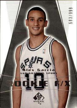
Saturday, October 5, 2019Set: 2003-04 SP Authentic (Rate) “ I like the cohesiveness between the front and back but besides that just a very average looking card. Needs something to make it pop. Reminds me of an old black and white tv on the fritz. Also, why on the back do the black lines makes a coffin shape? ” -davidhandberry
“ Rare player. Very expensive set due to people chasing LeBron autograph rookie. Not a huge fan of SPA but for a rookie photo shoot image, as this is, the "player cutout over nothing" works. ” -Billy Kingsley
“ SN is col. Card is a big meh. ” -muskie027
|


Thursday, October 3, 2019Set: 1994 Panini Stickers (Rate) “ This is a great design. I would like more like this from Panini. ” -Billy Kingsley
“ One of the nicer, and bigger sized Panini sticker offerings. Would be nice to see them return to this size rather than the smaller ones we have been offered all too frequently of late. ” -baseballcardstoreca
“ Not a bad classic basic look for a sticker. ” -parsley24
“ OH it's a sticker. At first glance I thought this was a minor league card of some kind. Looks good for a sticker. Personally I think Panini should still stick with making just stickers (pun may or may not be intended). ” -captkirk42
“ I HATE stickers . . . Therefore, I HATE this set. Making matters worse, many of the pictures in this set are not cropped very well. ” -georgecf
“ Simple Card. ” -kjv63078
“ Great front. Blah back. Then it being a sticker ruins it even more for me. I collect stickers as baseball cards but i try to keep them separate because I have had them stick to other cards before. ” -davidhandberry
|

")