
Random Card of the Day |

Sunday, September 15, 2019Set: 1993 Diamond Marks Bookmarkers (Rate) “ I only remember him as an Angel. Is a bookmark a card? ” -muskie027
“ Interesting. I hate odd shaped cards but if I think of it as a bookmark not a baseball card I really like it. ” -davidhandberry
|

Saturday, September 14, 2019Set: 1995 Post Collector Series 3x5 (Rate) “ I like these oddball cards, the cards you got in different purchases (cereal, tobacco, cracker jacks, etc.) This is a weird one though. The front looks like it should be the back and vice versa, if it was switched i would like it much more. ” -davidhandberry
“ GWYNN! This has been my favorite RCoTD since joining the site. I mean... It's Mr. Padre! The fact that is an oddball card from the 90's makes it great too! Ok ok ok I might be a Gwynn fan boy...but..but it's GWYNN! ” -YoRicha
“ Took me a second to realize it is a fold out card. ” -rmpaq5
“ Is it me, or are the back and front images reversed? Really nice card. I like the multiple action photos of the player. ” -CollectingAfterDeath
“ the batting swing photo is awesome . The back not so much. But for a post card, not bad. ” -parsley24
“ I will let someone else ask my obvious question ” -NJDevils
“ miss the days of companys putting cards in there products ” -Thunderfoot
“ How odd looks to be a folded card or a "book". I would not call it a book. Looks more like a Denny's 1990s card. Not a fan of this. ” -captkirk42
|

Friday, September 13, 2019Set: 2002 Leaf - Clean Up Crew (Rate) “ I'm sure this is supposed to look like two Cs with one going up, but it looks more like CD. Since it's an insert, though, it's fine. ” -Billy Kingsley
“ Thought the big C was for Cleveland but after looking at the rest of the set it must be for Clean up. Don't know what the other design is for. I don't care for this card and can't point out why. ” -davidhandberry
“ I like Thome but is he taking the collar here? ” -NJDevils
“ 1990s Oops a 2002 Leaf insert. The base set is OK this insert set I'm undecided on leaning to not liking. The elements on the front are too big, makes the OK sized team logo look tiny. Back again the elements are a bit big but better for a back. ” -captkirk42
|
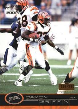
Thursday, September 12, 2019Set: 2001 Pacific - Retail LTD (Rate) “ This is why I am a fan and miss Pacific. Great action shot on the front, headshot on the back. Everything you need, front and back. Numbered, but not impossibly small number. This set is perfection, in my book. ” -davidhandberry
“ A useless parallel from Pacific. Pacific had many interesting insert sets & a few parallels that were good, but the LTD & Premier Date stuff were just nonsense. ” -cjjt
“ NIce looking card even with the foil lettering.Back is OK I like the team helmet ghost image ” -captkirk42
“ I am coming to grips with the fact that I may need to go back and collect Pacific sets. They always look great. Anyone have any cheap unopened boxes for sale? ” -muskie027
|
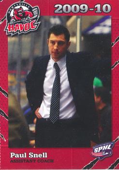
Wednesday, September 11, 2019Set: 2009-10 Huntsville Havoc (SPHL) (Rate) “ Such a nondescript card that the only way to tell it is hockey is the thing holding a hockey puck in the logo. If you got rid of that and told me it was a set for vice principals I would believe you. Has that look like he has just dealt with children for 8 hours and is done with it. Basically the only good thing I can say about this card is I like the border on the front. Guess they ran out of money so they couldn't afford color ink on the back. ” -davidhandberry
“ Minor League Coaches getting some RCOTD love! The front border is a bit odd, but then I looked at some of the cards featuring players in uniform and they match the stripes. or "scratches" of the team uniforms. Nice touch on a minor league team set. ” -rmpaq5
“ Minor league assistant coach. Doesn't get much more obscure than that ” -Lennoxmatt
“ Awesome. Assistant coach on a minor league team set, doesn't get much more obscure than that! ” -Billy Kingsley
“ OH I thought this was a political card. It's a minor league Hockey card. Like the front design, back is OK I guess. Then again it is a coach card so the back can be a bit boring. ” -captkirk42
|
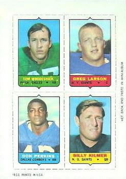
Tuesday, September 10, 2019Set: 1969 Topps - Four-in-One (Rate) Card: #NNO Tom Woodeshick / Greg Larson / Don Perkins / Billy Kilmer “ I love old football cards, they knew that you would identify with the players better if you saw their face. They could have done something with the back instead of blank but fronts the front is a 10. ” -davidhandberry
“ Never saw these before. Pretty neat. Lot of players I haven't thought about in 50 years. ” -NJDevils
“ As much as I hate 4-in-one cards now and cards that rip and separate I love these things. I called them stamps because of the related albums they had to go with them and I think Topps named them "stamps" even though they needed assistance to get pasted into the albums. Had a ton when I was little as I grew and got more into card collecting I only had a handful of these things most pasted into their albums, If I had that team's album, if not the loose "stamp" ended up getting lost to time. Sometime I would love to hunt down more of these. ” -captkirk42
|
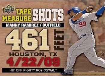
Monday, September 9, 2019Set: 2010 Upper Deck - Tape Measure Shots (Rate) “ Cool concept for an insert, but the scaling seems like a questionable choice. ” -Billy Kingsley
“ I like the idea of this set better than the execution. I don't like the front with almost every word a different color, font, and size. The back is very nice. ” -davidhandberry
“ Don't like this it looks like a promo insert for card supplies or a special by mail order only set. Oh Jeez it looks like this insert set has two of my PC Nationals and one or two of my other PC guys from 10 years ago. UGH. ” -captkirk42
“ This is just a cluttered mess. ” -YoRicha
“ Looks more like a promo card or divider than legit insert. Cheap feeling. ” -Thomas_Kava
“ Roy Oswalt thanks Upper Deck for commemorating him throwing Manny a pitch he could destroy. ” -rmpaq5
“ I do NOT like this type of card, but I collect Manny so it'll eventually be part of the PC because of my hobby addiction. ” -Sportzcommish
“ Roy Oswalt thanks Upper Deck for commemorating him throwing Manny a pitch he could destroy. ” -rmpaq5
“ It's uh, very informative. ” -muskie027
“ Nice subset. ” -cjjt
|

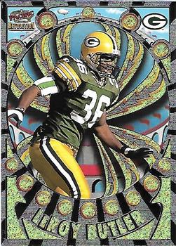
Friday, September 6, 2019Set: 1997 Pacific Revolution - Silver (Rate) “ One butt-ugly card design. It hurts my eyes to look at it. Butler is credited with inventing the Lambeau Leap ” -C2Cigars
“ The Revolution sets are always big on flash, and usually much sparklier in hand than in scans. ” -Billy Kingsley
“ This set is so ugly that if they made it for hockey, I would only pick out my PC players. Nothing more, nothing less lol ” -Mscott713
“ Groovy man, just groovy. ” -Gunny
“ My eyes!! Is this thing trying to hypnotize me? ” -Lennoxmatt
“ The front design is too busy for even me. It looks like an Aztec or Mayan artwork with a football player attached. The back is awful. If you are going to do a headshot of a player at least take the mask off so you can see the person. I hate this, but I love Pacific in baseball but finding out more and more that they weren't great at other sports. ” -davidhandberry
“ If loving crazy Pacific design concepts is wrong, I don't wanna be right! ” -mkaz80
“ It might be the worst card I ever seen. ” -kirkscards
“ Great scan!! ” -cjjt
“ Looks like he's falling into the Mystery Spot Ozzie Smith fell into on the Simpsons. ” -sahal694
“ Good God.....I don't know whether I am looking at a card, medieval art from India, or I'm just tripping out. ” -rmpaq5
“ My eyes. A little too busy and bling heavy for me. ” -vanstryland
“ UGH 1990s TOO BUSY! Not sure what they were going for here. I think they failed big time. Even the back is too busy. That is a shame because Pacific started off on a good foot ” -captkirk42
“ Looks like Audrey from Little House of Horrors is eating him. ” -NJDevils
“ Trading card or carnival ride? ” -DanD
“ This looks like a card Cheech and Chong would design. ” -deporcoruña
|

")