
Random Card of the Day |

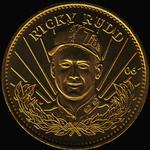
Wednesday, January 4, 2017Set: 1997 Pinnacle Mint Collection - Coins (Rate) “ Technically, this is a medal. A coin is something only issued for monetary purposes. Pinnacle called them coins though so the Database listing is correct...the card company wasn't. Doesn't look much like Ricky. I still remember getting one of these for the first time. The base cards come with a hole you are presumably to put the coin into, but the cards are very thin and the coin is the thickness of at least 8 to 10 of the base cards...so needless to say it didn't work well. While the basic versions like this one are brass, there are also supposedly silver and gold versions, though I have not ever seen any. ” -Billy Kingsley
“ Is a coin a card? I guess if they were part of a card set, then sure. They look cool, but I am honestly not much of a coin collector. Not sure how I feel about it. ” -muskie027
“ This does not interest me. I realize it did come in a pack of cards, and technically belongs here, but no thanks. ” -switzr1
“ Ricky Rudd, defiantly a NASCAR name. ” -carthage44
“ Is this coin legal tender in Talladega? ” -DaClyde
“ It's not a card or a sticker. I'll pass. ” -deporcoruña
“ Wow a NON Card Random "Card" of the Day. A Racing Coin. Ah no wonder I didn't recall this product I don't follow racing. ” -captkirk42
“ My first formal organized collection was a coin collection, so I have always enjoyed the novelty of Pinnacle's combination of cards and medallions in this product. I think the novelty would have worn off if the concept lasted more than two releases though. ” -Lea DeFoote
“ Nice. Fun to see a non-card pop up for the card of the day. I believe these came in packs with cards that they could be placed in. I have some of the football. Didn't know they had sets other than football. ” -Mitch
“ To paraphrase Kipling, "cards are cards and coins are coins; and never the twain shall meet." I believe that sums up my stance on coins in the database. ” -C2Cigars
“ Random COIN of the Day - I guess it was only a matter of time before one of these found it's way in. We got some of the hockey ones. I wasn't too excited about the prospect of card AND coin parallels, especially ones that were so rare. Still not. ” -vrooomed
“ Gee, what a nice "trading card" for the "trading card" database. And yet, schedules aren't allowed unless it's one particular team. Would make a great addition to a trading coin database. ” -hphillips
|
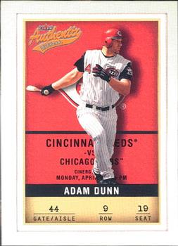
Tuesday, January 3, 2017Set: 2002 Fleer Authentix (Rate) “ OK looking card, but I would probably like it more if the whole ticket stub think hadn't been so completely overdone now. This was probably one of the first sets to use that gimmick. And having the player cover the logo makes the logo seem pointless. ” -switzr1
“ I really loved the concept of the Fleer Authentix sets when they were new, now not so much. But I am still trying to complete the NBA sets. And this post if my tablet doesn't turn itself when I am trying to type! ” -Billy Kingsley
“ Loved this guy until he came to the White Sox and was garbage. ” -carthage44
“ They used a logo that I believe typifies baseball with the ending letter swirled underline. It's a beautifully designed card reminiscent of early Topps/Bowman cards but with a pleasant color scheme. As for Dunn, he belongs with all the other '90s-present all-or-nothing players that fill many MLB squads. ” -Sportzcommish
“ I always like this design. ” -cjjt
“ Cool concept, but only an ok card. I am not a fan of only current year and career stats, I like the entire kit and caboodle. I was never a fan of the quantity of sets each company was putting out back then. ” -muskie027
|

Monday, January 2, 2017Set: 2007 Grandstand Brevard County Manatees (Rate) “ Dig it. Very nice minor league card. ” -marcbrubaker
“ I was never into minor league cards. That said, the more I see the more I like. This card has a simple design with just the right amount of info front and back. ” -engine614
“ MiLB! Love these cards & sets. ” -vrooomed
“ I like the design. The player fills up most of the photo. Not over-designed. ” -joshthurman
“ Great team logo! ” -Billy Kingsley
“ Very nice looking baseball card, minor league or otherwise. ” -switzr1
“ Very nice Minor League card. Like having the team logo on the base. ” -captkirk42
“ One of the nicer minor league cards. It has a cool effect in that it looks like a throwback design with a modern touch. I like it and wouldn't have minded it for a major league set. ” -muskie027
“ I like this card a lot! The baseballs in the back are very nice. ” -702tpr777
|
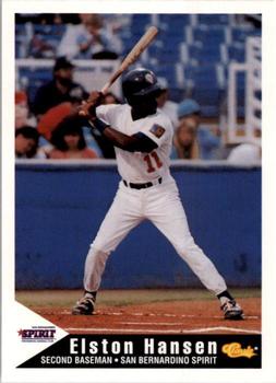
Sunday, January 1, 2017Set: 1994 Classic Best San Bernardino Spirit (Rate) “ Really nice design. Minor league cards seem to have a lot of good ones. ” -Billy Kingsley
“ Classic was always a solid set. ” -carthage44
“ Nice that classic covered the minor leagues but with these sets being 1,000 plus cards per set I'm never attempting to complete these things. ” -captkirk42
|

Saturday, December 31, 2016Set: 1991-92 Score Canadian Bilingual (Rate) “ I'm glad this set is a different color than the American! (Je suis content que cet ensemble est d’une couleur différente de celle de l’américain!) ” -switzr1
“ Look at that draft position. An all-time steal! Future MLB pitcher Tom Glavine was drafted ahead of him that year by the same team. ” -DanD
“ If my calculations are correct this is the last Card of the Day of 2016. I like it! Good scan, and look at all that info on the back! I've actually begun watching hockey a little bit... ” -Billy Kingsley
“ Nice mullet on the back photo!!! ” -carthage44
“ Not gonna lie, but Score was the biggest let down as far as return value went. Over produced and they backed/featured players that did little in their careers, ala Eric Lindros. On a plus note it is now cheaper to replace damaged or lost cards from this set then it would have been at the time of it's release. ” -Kirokyukan
“ These are not fun to sort. You have Score American, Score Canadian English and Score Canadian Bi-lingual. ” -NJDevils
“ The action picture deserves a better design. Not really a fan of the shadowed box and the dull red gradiant border especially with the photo basically in black and white. ” -Sportzcommish
“ I like the early score sets. 1991 was an OK year for them. I like the puck graphic under the player's name. I don't recall the other sports doing that with their "ball". ” -captkirk42
“ Yawn ” -DarkSide830
|


Wednesday, December 28, 2016Set: 1989 Fleer - Glossy (Rate) “ Great era from Fleer. I like it! ” -Billy Kingsley
“ The front of 89 Fleer is not one of my favourites. Cards like this one make it look he is pitching right in front of a barn door. Nothing wrong with the back. ” -rmpaq5
“ OHHHHH, GLOSSY!!! ” -carthage44
“ I always liked the 1989 Fleer set. I was glad to see them do something with the backs to make the Glossy set different from the regular set. Solid design. A shame the card (as of the day we're doing the write-ups) is missing the border on the right side. ” -vrooomed
“ Many collectors really pan this set, but it has always been one of my favorite Fleer issues.....the glossy set is beautiful, but I must say I prefer the yellow back of the regular issue vs the blue. Nice card of this former 1st round pick.... ” -tbshaw
“ Even though this is perhaps one of the most overproduced Fleer set ever, it is still one of my faves. Uh-OH is this a variant because of the "Collector's Edition"? Never mind just noticed it was the GLOSSY version. Never mind then. Still mega overproduced. ” -captkirk42
“ ugh. ” -RoundtheDiamond87
“ Ooh La La! Glossy Fleer! I'm not the biggest fan of the "prison bars" border, but otherwise I like this design. Pete Smith was an okay pitcher, in a rotation soon to be crammed with studs. ” -dilemma19
|

Tuesday, December 27, 2016Set: 2002 Fleer WWF All Access (Rate) “ FINALLY !!! THE ROCK HAS COME TO RCOTD !!!! ” -uncaian
“ John Cena trying to follow in his shoes. Being a WWE superstar and then becoming a movie star. ” -carthage44
“ A case of the card looking better in real life than a silly scan I think. At least I'm guessing the gold foil here looks cool in reality. Dwayne "The Rock" Johnson. Before he started acting I just thought of him as another Super Star Wrestler. ” -captkirk42
“ I indeed smell what's cooking. ” -Howintensive
|
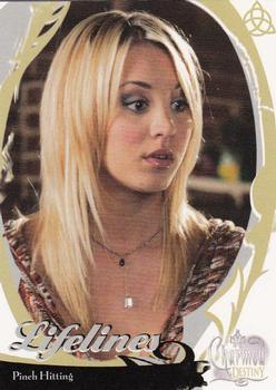
Monday, December 26, 2016Set: 2006 Inkworks Charmed Destiny (Rate) “ Hottie Alert! ” -carthage44
“ Interesting border design. I don't think it would work on a sports card. Having seen this card, I no longer need to watch the show. ” -dilemma19
“ I had no idea Penny also fought demons. Leonard is so lucky. ” -rmpaq5
“ Yay Charmed! Bonus Kaley Cuoco (Big Bang Theory) ” -captkirk42
“ At first I thought this was the Big Bang Theory. I don't recognize the show at all and have no desire to get into it, but I have to say, she is a pretty gal! ” -muskie027
|

")