
Random Card of the Day |

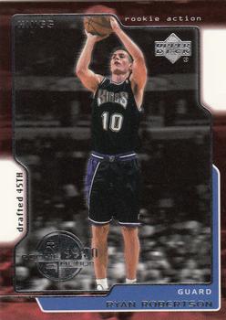
Monday, December 21, 2020Set: 1999-00 Upper Deck (Rate) “ This was the first season that Upper Deck short printed the rookie cards in their flagship NBA set, something they would continue to do until the NBA pulled the license to give an exclusive to Panini in 2009-10 season. Frustrating for those of us who wanted to complete sets. ” -Billy Kingsley
2
“ UMKAY some foil scanning pure white looking like the card is die-cut. Back is OK looking. ” -captkirk42
“ Too much going on in the design phase of the card. Give me a lot less fluff. ” -Camstone
1
“ A little noisy on the front, a little empty on the back, but I like it! ” -kents_stuff
“ Something I don't like about this. Maybe the white, maybe the lack of logo, I am not sure, but for Upper Deck, I think it isn't great. The back looks crooked. ” -muskie027
1
“ Nothing worth writing home about. Rather dull. ” -Phil
|


Saturday, December 19, 2020Set: 2004 Fleer Sweet Sigs - Autographs Copper (Rate) “ I don't like how the picture is so small. ” -muskie027
“ Reminds me of a colorblind test at the eye doctor. This time I can actually see there is something in the dots. ” -switzr1
2
“ I'm glad to see that this one has gotten scanned before it faded. My NBA example that I pulled myself has faded even with no sun or environmental exposure. ” -Billy Kingsley
“ An interesting auto. ” -Onemorepoint
“ This is an ok design. I am not a big fan of the front. A small picture of the player is above a large space for the autograph. The back is a typical back of autograph cards. ” -Brendan Barrick
“ A nice insert prize ” -kents_stuff
“ Nice looking card. A background with clouds is not something you see every day. ” -ajvlucky13
“ No much of an autograph and a bit of a goofy card, but with all that said, I'd still be thrilled if I pulled one of these while ripping open a box of these! ” -bkklaos
“ I like it, but then I'm a pro gimmick guy. Very different. I'm waiting for chunks of turf. ” -Camstone
“ I was going to praise the virtues of Upper Deck Sweet Spot autos but WHAT? Fleer? Sweet Sigs? OK I think I forgot these. I have never been a huge fan of "game used" cards of jerseys and other relics but for some reason autos from a hunk of the ball hide I don't mind too much. Usually the material used for the sig to go on is faux ball or a made for the card patch design. ” -captkirk42
“ I am trying to understand what makes this sig so sweet. Looks like he signed it while simultaneously getting a head injury. Other then that what a boring card. ” -YoRicha
|

Friday, December 18, 2020Set: 1970-71 A-1 Premium Beer Phoenix Suns Price Tabs (Rate) “ I'm not sure I would consider this a card, but it's very cool and I would collect it if I came across it. ” -Billy Kingsley
4
“ Well you can't beat that deal. ” -switzr1
4
“ Yes, Beer and sports...
” -Duke
5
“ This is a cool idea that someone should bring back. With all the "used-to-be-micro-but-getting-more-macro-everyday-brew" companies, someone could surely strike an agreement with a local team. ” -kents_stuff
“ This seems pretty interesting. Putting players on price tabs. Honestly would’ve tried picking these up. ” -mkb
“ With all the times I've fallen off the wagon, it is a surprise to me, that I've never heard of this brand. I hope this set survives the "Is this really a card, and should it be allowed" inquisition. {8o) ” -CollectingAfterDeath
1
“ Nice early 70s ephemera/memorabilia. I thought it was a matchbook at first. ” -captkirk42
“ I prefer to collect mostly standard size trading cards, but this is awesome! Fun stuff! ” -bkklaos
“ Never seen one of these before. I like it, something different. Would not want to collect these only but fun with the cards. ” -Camstone
“ Beer is Good! interesting little promo, honestly didn't know the suns have been around since 1970 ” -Thunderfoot
“ Well done. Nicely preserved. ” -cjjt
“ Looks more like a bookmark! ” -muskie027
1
|

Thursday, December 17, 2020Set: 2005 Ultra - Gold Medallion (Rate) “ Ultra's Gold Medallion parallels are my second favorite parallel concept in cardboard history (pun intended) after only the Refractors from various Topps sets. And I'm one of the few people who genuinely loves parallels. ” -Billy Kingsley
“ I have this like/dislike feeling about this card. The portrait photo on the front, and the easy on the eyes printing on the back, are good. One of the top corners being nipped off seems a bit unnecessary, and is more of an eyesore than a witty design, for this style of card. ” -CollectingAfterDeath
“ I have an appreciation for parallel sets. More of a challenge to build the parallel set than the base set. IN general, I like Topps parallels better, but the Fleer Ultra gold medallion series is a solid effort. A) gold, B) die cut [since 2000] C) clearly indicated its a parallel, for those that are card id challenged ” -abide
5
“ I dont mind this card, but the curve in the upper left hand corner is just not right. Doesn't flow. ” -parsley24
“ For some reason this has the look of a minor league card. Don't like the font used for the name. Just not fond of the card. ” -Camstone
“ I guess the gold wasn't enough to distinguish these parallels from the base, so they went die-cut too. ” -suomibear8
“ Good scan. I always liked Gold Medallion cards ” -cjjt
“ Awesome, Nick Swisher former Buckeye! He was the only reason for me to have a rooting interest in the Yankees for a couple seasons! So far I have over 100 unique cards of his. He’s a good dude in real life also; I am friends with a cousin of his ” -Brimose
“ Nice card overall, but I feel the rounded corner could have been smoothed out a bit better. The "traditional uniform font" for the name is cool at first, but after looking at a bunch of them it got old for me. ” -kents_stuff
|
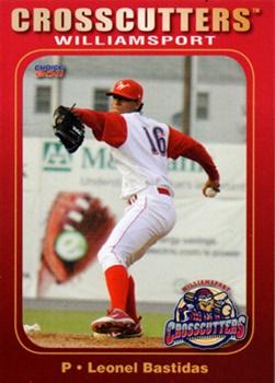
Wednesday, December 16, 2020Set: 2011 Choice Williamsport Crosscutters (Rate) “ Is that a cucumber slice in the giant glove on the wall? ” -Billy Kingsley
6
“ The back is dull, but informative. The front looks great. I'm not familiar with the Crosscutters, but that's kind of a cool name. Very MiLB, but cool. ” -kents_stuff
“ The same day we have the weird Andy Benes floating card on the front page we have this MiLB gem. This is really, really well done. I can't put my finger on one aspect that makes the whole card just a good all around design. ” -rmpaq5
4
“ Not too bad of a card. ” -parsley24
|

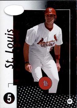
Monday, December 14, 2020Set: 2002 Leaf Certified (Rate) “ I didn't realize the Certified brand had spent time with Leaf. I know it started at Pinnacle, and ended up currently at Panini. It's not a favorite brand of mine. It's always been mirror foil backdrops, edited cutouts of players with no real backdrop, and generally small sets- 3 things I'm not a big fan of. When they are combined together...meh. ” -Billy Kingsley
“ Nice card of a nice guy who is an all-time great baseball player. I hope we can find a way for him to retire as a Cardinal. ” -kents_stuff
2
“ Nice Cardinals card that I need now. ” -switzr1
“ Nice Albert Pujols card when he was a Cardinal, his natural team in my book. ” -captkirk42
1
“ The back is so colorful that it doesnt really go with the stark front. Not a fan. ” -parsley24
“ Cardinals! And a legend at that! First ballot hall of famer for sure, although his injuries may keep him closer to 90% than the 100% he probably deserves ” -Brimose
“ Ugly card. Nothing redeeming about it. ” -georgecf
“ I'm guessing that blank white oval is just the way some foil scanned, but it cheapens the overall look of the card for me. I also don't like when a weird border pattern is given priority over a limb. Back is ok, but would be better with a player photo somewhere. ” -jackal726
“ Seeing Pujols without a beard is so odd anymore. The front is hard to read based on the scan, but I'm assuming the red is foil, which makes it stand out a little more. ” -IfbBirdsCards
1
|

Sunday, December 13, 2020Set: 1949 Smack-A-Roo (R447) (Rate) “ Not sure what this is, but doesn't look like I would collect it, even if it is old. The diamond shape would be annoying to store. ” -muskie027
1
“ Creative use of the square design...thinking outside the box for sure. ” -Billy Kingsley
1
“ WOW! Super nice card. Great condition. ” -cjjt
1
“ My first impression was, that this was a boy scouts badge, or something like that. A card cut from a different sheet, for sure. ” -CollectingAfterDeath
“ Very nice. Probably very few in excellent condition or better. ” -NJDevils
“ If you don't have the original box they came in...what a nightmare to store. Don't know why trivia game cards are even listed here. ” -C2Cigars
“ Very nice vintage non-card piece. Looks like it is felt, but I think they called these things "silks"? I need to look some stuff up then I guess. ” -captkirk42
“ not sure what im looking at but its 71 years old and looks to be in good shape and thats pretty awesome ” -Thunderfoot
“ NEAT ! I have not seen this set before, cool! ” -uncaian
“ Looks like it would be hard to stand upright in a box. ” -switzr1
|

")