
Random Card of the Day |

Wednesday, December 18, 2013Set: 2006 Bowman Heritage (Rate) “ After all those 1990s cards, where it looked like graphic designed barfed colors everywhere, the 2000s bring back simplicity. Just goes to show, they knew what they were doing back in the early days of bubble gum card design! ” -vrooomed
“ I don't know if the old Bowman set didn't have any stats on the back, but in today's game, no stats on the back of a baseball card is a cardinal sin in my book... ” -lyfestory
“ This is a nice-looking card. I'm all in favour of a retro look that actually looks vintage. The back completes the look nicely. ” -Luckynumber78
“ The current Indians uniforms are so much better than these. It's funny because the only difference is there's no sleeve braid or plaquet piping; just a simple stripe on the sleeve ends and neck. ” -jlaz10
|

Tuesday, December 17, 2013Set: 2009 Upper Deck First Edition (Rate) “ I miss Topps having some competition, but unfortunately, the hobby just doesn't have the muscle to support it. A nice looking card, but part of the First Edition/Opening Day strategy that is of questionable value and interest. ” -Dave Sosidka
“ Thank god the Mets took black out of their color scheme. When you think of the New York Mets, you think of blue and orange, not black, right? ” -jlaz10
“ Front of card is a little busy. Back would have been very nice if they thought of something to put below his limited stats. ” -NJDevils
“ More like Upper Deck Last Edition ” -volbox
|


Sunday, December 15, 2013Set: 2003 Topps Heritage (Rate) “ This design would have looked better with a top border. I like the back of the card better. ” -Billy Kingsley
“ Eeehhh how many times do I have to tell you, I'm not related to Ozzie... ” -SaveDaKid
“ i like the Heritage cards.. too bad i never bought many... ” -lyfestory
“ Nice Heritage card,back & front. ” -uncaian
“ Extremely cool card design; extremely awkward facial expression. The design on the back is sumptuous. ” -Luckynumber78
“ The Mariners uniforms are very modern, although they've been wearing them since the mid-90's. ” -jlaz10
|

Saturday, December 14, 2013Set: 2003 Donruss Estrellas (Rate) “ Stats should be more prominent on the backs of cards, not relegated to next-to-nothing at the bottom.. While it's nice to read facts and what not, stats are better than some foreign language information.. ” -lyfestory
“ Looks like he swung without moving the lower half of his body at all ” -Hollywood42
“ esteroide? tengo helado en mis pantalones!!! ” -SaveDaKid
“ The Rangers uniforms will never be as good as their Nolan Ryan-era set. ” -jlaz10
" Looks like he's playing tug-of-war with a host of unseen adversaries. " -Norb Rozek
“ How does one say "steroids" in Spanish. He also did Viagra ads. Was there any drug he didnt use? ” -NJDevils
|
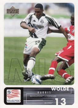
Friday, December 13, 2013Set: 2000 Upper Deck MLS (Rate) “ I think he missed the ball. Great team logo! ” -Billy Kingsley
“ The Jamaican International was one of the early stars for the fledgling MLS. He also earned 28 caps for Jamaica. I do like this set but this card does hit my one pet peeve in collecting. The kit and logo do not match, for some strange reason that bugs me and strikes me as lazy on the company's part. ” -Gunny
“ America's sport of the future since 1972!!! Where will all those little kids who used to play pop warner go, to the pitch my friend, to the pitch... ” -SaveDaKid
“ Cool card. I really like the design. Not a fan of soccer, but this is a good looking card. ” -yokonashiwa
“ Obviously a traded player, considering the Colorado Rapids kit he has on. ” -jlaz10
|


")