
Random Card of the Day |
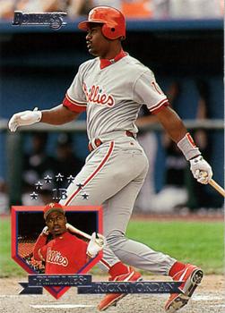

Tuesday, October 29, 2013Set: 2012 Panini Contenders (Rate) “ Take away the poor background, you have the start of a good card. But they didn't, so what you have is an ugly card. ” -NJDevils
“ I like the design on this one. Although I'm not generally a fan of cards where the player is placed over a various color background, if they are going to do it a ticket design is a good choice. ” -Billy Kingsley
“ It's a shame the latest NFL rule limits players to one helmet per season. This means the Rams won't be able to wear their LA throwbacks. ” -jlaz10
“ This is a rare case of a busy background that looks nice. The white part throws the whole thing off, though. You can barely read the writing there. ” -Luckynumber78
|

Monday, October 28, 2013Set: 1991 Horse Star Kentucky Derby (Rate) “ A Horse is a horse of course of course... ” -ThemightyOx
“ I live in Louisville and drove by Churchill Downs today and I still just don't care about the Kentucky Derby. That being said, I've never seen this before and am impressed that these cards exist. (although in 1991 they made cards of everything) ” -ray fosse's ghost
“ I can't wait to see the comments for this one. How's the design on this one? Who would have preferred an action shot? Is this a Vagrant rookie card? ” -Dave Sosidka
“ Let's all not rush out and try to corner the market on these. Actually the back of the card is pretty interesting for historical purposes. $7000 for a horse back in 1876 is an amazing price. ” -NJDevils
“ Horse cards, who knew? ” -CluelessJoe
“ In the early 1990s, they'd make a card for ANYTHING, wouldn't they? ” -vrooomed
“ I really like this card, and I don't know why as I don't care for horse racing, I feel they don't respect the horses. (I like animals more than many people) ” -Billy Kingsley
“ What a cute little horsie. ” -jlaz10
“ How exciting. ” -Hollywood42
|
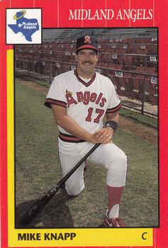
Sunday, October 27, 2013Set: 1990 Grand Slam Midland Angels (Rate) “ The minor league card sets became a great resource when I was doing logos/uniforms for minor league teams for use in Out of the Park baseball.. ” -Mike67
“ I like it. Maybe not the best color scheme, but good photography on this card. Back is clean with only a small ad. ” -vrooomed
|
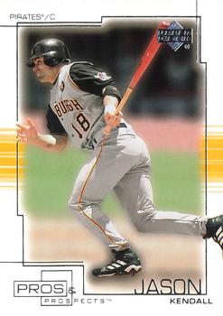
Saturday, October 26, 2013Set: 2001 Upper Deck Pros & Prospects (Rate) “ Enough with the lines on the front of the cards!!! Would have been an excellent card but someone had to pull out their Etch-a-Sketch. ” -NJDevils
“ I hate it when a foot or the bat isn't included in the centering of the picture ” -Hollywood42
“ The Pirates vest look is great, but they have to do it right. ” -jlaz10
“ Like the colors, but too much border on the front.. ” -lyfestory
|
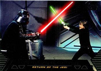
Friday, October 25, 2013Set: 2012 Topps Star Wars: Galactic Files - Duels of Fate (Rate) Card: #DF-10 Luke Skywalker vs. Darth Vader “ How awesome is this? Today (October 18th) is my birthday, and one of my cards comes up as Card of the Day! And it's an insert from my favorite Star Wars set of all time! ” -Billy Kingsley
“ One of the greatest battles in the history of film.. ” -lyfestory
“ Just like the Father/Son baseball cards. ” -vrooomed
“ The one type of non-sport cards I am ok with for Card of the Day: Star Wars ” -Hollywood42
“ One of the most epic scenes from the movie destroyed by poor acting. If luke weren't so over dramatic, I'm sure this would have been much more. Still, the original series is far better than the new ones. Hope Disney does star wars justice with their endeavor to continue the saga. It would be just sad if they dumb down the story and butcher the script. Good luck and may the force be with you... ” -Dixxy
“ As sick as I am of seeing science fiction cards on card of the day, this is one of the cooler ones featured, so far. ” -Luckynumber78
“ Of all the cards out there, Star Wars appears a lot. ” -jlaz10
|
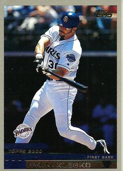
Thursday, October 24, 2013Set: 2000 Topps Traded & Rookies (Rate) “ I don't care for this Ryan Klesko. I like the young Braves prospect version better. This one is just too disappointing. Like watching Todd Van Poppel pitch for Texas. ” -ray fosse's ghost
“ Traded and Rookies? This should have been series 2. I liked it a lot better in the 90s when there would be series II issues. ” -Billy Kingsley
“ Does anyone else miss the days of the copyright line being "© T.C.G."? ” -vrooomed
“ Again, tough to differentiate the name from the bottom border. Topps has no idea of the meaning of the word "contrast". Back is very good. ” -NJDevils
“ The Padres will never look as good as the 80's brown and gold. ” -jlaz10
“ I liked the front design of this set, but hated the look of the back. ” -jupiterhill
|
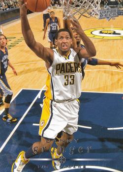
Wednesday, October 23, 2013Set: 2008-09 Upper Deck (Rate) “ Career already on the decline. But nice card ” -Young Kilo
“ The next to last Upper Deck set. Unusual in that it featured no border whatsoever. In fact, the only main UD issue with no border of any sort in basketball. It works for me but sometimes makes the name nearly disappear. Granger is a good player, one of the key players that had help the Pacers excel in recent years...if not for a bad coaching decision the Pacers likely would have beaten the Heat in the Eastern Conference Finals last year! ” -Billy Kingsley
“ So UD again plays "Hide the Name" on the front of the card. Nice back of card. Very readable. ” -NJDevils
“ Some cards the foil is just plain hard to read, as this card shows.. Nice overall cards, but the choice of foil overlays sometimes don't go too well.. ” -lyfestory
“ I was scared it would be a star trek card... ” -Dixxy
“ Simple UD design - nice front photo - clear reverse. Again, they really haven't changed their designs for what, about 15 years? ” -vrooomed
“ upper deck cards always look alike. ” -Colts12
“ Upper Deck can ALWAYS claim better photography. This facial expression is not their fault. ” -Luckynumber78
“ Woot! Home team here in Indiana. ” -koloth42
“ The Pacers current unis are nice, but not as nice as the Reggie Miller-era pinstripes. ” -jlaz10
|

Tuesday, October 22, 2013Set: 1991 Foot Locker Slam Fest (Rate) “ I bet Ken Griffey Jr. would laugh remembering when his hair looked like that... ” -ray fosse's ghost
“ I'm not sure why these are listed under Multi-sport, as they are a basketball issue...although the basketball event encompassed people from various other sports and I believe even non-sports as well. I only have one or two of the cards myself. ” -Billy Kingsley
“ This is as bad they come. ” -NJDevils
“ If you're making cards of a handsome, photogenic superstar, why use a picture like this? ” -Luckynumber78
“ Nice hair ” -jlaz10
“ "This hair, mhhmmm? You remember this hair. This hair will dominate." ” -marcbrubaker
“ What a priceless picture. If I was him, I'd make that my Christmas card. "You got me what?" ” -Dixxy
“ One word - cheap. ” -vrooomed
“ That haircut needs a shoe ” -volbox
“ Not a whole lot good to say about this card, but probably a relatively nice find for Griffey fans.. ” -lyfestory
|

Monday, October 21, 2013Set: 1994 Classic Four Sport - Gold (Rate) “ I never cared much for these multi-sport sets. I have not even catalogued the ones I have yet. ” -Billy Kingsley
“ Why did anyone think multi-sport sets were a good idea? ” -vrooomed
“ Classis Four Sport was an interesting concept. Bought several packs. Nice back of card. ” -NJDevils
“ Great player.This was a good "minor league"set.I still get the odd one in variety packs. ” -uncaian
“ It's a shame the Flames ditched their their throwback alternate uniforms for this year. Their new one is nowhere close to being this good. ” -jlaz10
|

")