
Random Card of the Day |
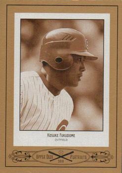
Friday, September 20, 2013Set: 2010 Upper Deck - Portraits (Rate) “ Classic looking but unnecessary. So many trees died to make this set. So many trees. ” -ray fosse's ghost
“ Don't see many cards done in a sepia tone. For a good reason I might add. I like when they do modern subjects on vintage designs, but modern designs made to look vintage generally don't work well. ” -Billy Kingsley
“ Nice use of the Polaroid design. ” -vrooomed
“ Not sure why companies try to make new cards look old. ” -koloth42
“ Way too much border, but cool sepia tones.. the back is useless.. i see some parallels doing a sepia-tone them.. its kinda cool, for now.. ” -lyfestory
“ The way the picture is colored makes it look like the true-blue Cubs helmet is red. ” -jlaz10
|

Thursday, September 19, 2013Set: 2012 Sorcerers of the Magic Kingdom - Boosters (Rate) “ I rather collect bottlecaps again. ” -volbox
“ Now that's a key card ” -Young Kilo
“ Is this card the "key" to completing the set? Sorry, couldn't resist the easy pun! ” -Billy Kingsley
“ I don't understand...do I tap this for mana? ” -UNC_Samurai
“ Seriously ?!?!?!?! ” -uncaian
“ Not familiar with this set. I'm guessing a game card. Ok, now that that is out of the way can we have the next card please? ” -koloth42
“ Disney? What is this card? ” -CluelessJoe
“ A key card? how ironic... ” -lyfestory
“ Sorcerers of the Magic Kingdom may turn out to be one of the few base sets of our times to appreciate in value over the next few decades. Unfortunately, it's somewhat hard to get. ” -Luckynumber78
“ Well now... that's different. What's it supposed to be? ” -Dixxy
“ All I can say is WHAT? Some of the things that are given cards in a set are very interesting. The key design is pretty cool, but still this card will only have value if part of the whole set. ” -yokonashiwa
“ Why? ” -Hollywood42
“ I see its a key... ” -jlaz10
|
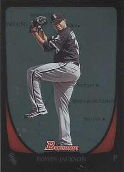
Tuesday, September 17, 2013Set: 2011 Bowman - International (Rate) “ What makes this International? Is the player from another country or was the card issued in another country? I do like the design, the Bowman designs are always classy. ” -Billy Kingsley
“ B as in Bowman. B as in Boring. B as in Blah. ” -NJDevils
“ Black-bordered cards are always tough to keep in Mint condition, more so when they have a lot of foil.. Love Bowman cards, not so much this set or parallel.. ” -lyfestory
“ When the White Sox switched to black-only piping on their road pants for this season, it marked the end of asymmetrical pant striping in the MLB. ” -jlaz10
“ I love that sleeve patch! ” -duaned99
|

Monday, September 16, 2013Set: 1977-78 O-Pee-Chee (Rate) “ I like this one. The back of the card has a cool design, and the photo is different/interesting...probably not that many cards out there where the subject is almost blocked by somebody else. ” -Billy Kingsley
“ They couldnt find a shot where someone wasnt skating right in front of the camera and blocking half the subject? ” -ThemightyOx
“ I have most of this set.It's a nice set with enough "young & old"stars to make it interesting but not to pricey.O'Reilly was a gritty player,who always played hard & could score too. ” -uncaian
“ I find it interesting that the photo used for O'Reilly's card is dominated by anotehr player. Was this really the only photo of O'Reilly available? ” -koloth42
“ That's the best shot they could of the guy? ” -CluelessJoe
“ Nice, clean card design, though the picture could have been a little better, without the guy in the foreground.. Photography has come a long way in sports.. ” -lyfestory
“ When men were men and jaws had no teeth. The back of the card is fantastic! ” -NJDevils
“ Hands down one of the best hockey uniforms ever. ” -jlaz10
“ Yo number 8! Down in front! ” -Hollywood42
|


Friday, September 13, 2013Set: 1984 O-Pee-Chee Michael Jackson (Rate) “ The King of Pop..!! didnt even realize he had a set in the mid 80s... amazing.. ” -lyfestory
“ I want this set. It needs to be mine. ” -ray fosse's ghost
“ I never really cared much for his music. Some songs were memorable, but most sounded a lot alike to me. If you get the chance to listen to Weird Al's parody of Bad, titled "Fat"...it's excellent! Now that's one of my favorites! ” -Billy Kingsley
“ He really looks like one of his zombies from Thriller on this card. ” -deporcoruña
“ This card has 3 versions. Black man Michael. White man Michael. And alien Michael. ” -Young Kilo
“ What's the difference between Michael Jackson and a grocery bag? One is white, plastic, and shouldn't be left alone with small children; and you put groceries in the other one. *rimshot* ” -wamk
“ Now THIS I can safely say... why is this on the site? He looks like a bearded lady... ” -Dixxy
“ RIP ” -jlaz10
“ The King of Pop ” -Erik_Young
“ Never heard of him. ” -DanD
“ Is that Little Richard? ” -volbox
“ Seems like a lot of wasted space on this card. If the pic was larger maybe we could see where that hand is coming from. ” -titanup74
|
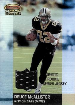
Wednesday, September 11, 2013Set: 2001 Bowman's Best (Rate) “ I always liked the Bowman's Best brand. It's one of the rarist sets to get in mix boxes, though. ” -Billy Kingsley
“ Deuce is kind of a terrible nickname but it's an upgrade on Dulymus. ” -ray fosse's ghost
“ At first glance, this is a really sharp jersey card. The way the border makes the card look too skinny is a little aggravating, however. ” -Luckynumber78
“ The Saints uniform doesn't look the same without gold pants. ” -jlaz10
“ Looks like he is creating some sort of time warp with those colors. ” -koloth42
“ the Deuce!! Nice jersey card.. ” -lyfestory
|

")