
Random Card of the Day |


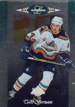
Friday, October 18, 2013Set: 1996-97 Leaf Limited (Rate) “ Hockey collectors must be rejoicing, they are getting a lot of Card of the Days lately. This one surely looks better in person, mirror foil never scans well, although this is a good one as far as mirrors go. ” -Billy Kingsley
“ These cards always had surface issues. ” -suomibear8
“ I found this set all flash, no substance.Bertuzzi,unfortunately, will be more remembered for one REALLY BAD incident,instead of his pretty great career. ” -uncaian
“ Worst. Hockey. Uniform. EVER. ” -jlaz10
“ I can see why they limited it. Blah! ” -NJDevils
“ These all-foil cards were highly sensitive to scratching. The scan doesn't show this card very well - the edges were bright at the top, and the team logo is holographic. This is a VERY nice set. ” -vrooomed
|
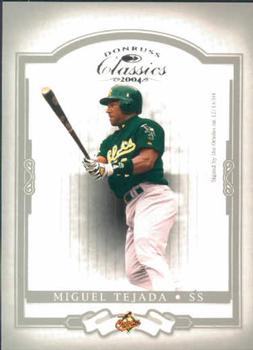
Thursday, October 17, 2013Set: 2004 Donruss Classics (Rate) “ Hmmm.. A's uniform, Orioles logo on the bottom.. Yeah, that's not confusing.. ” -Mike67
“ Now you know how he became a "Classic" ” -volbox
“ too much border.. Never really could figure out which team to sort cards like this into, O's or A's... ” -lyfestory
“ I'm still not really a fan of the A's green alternate. It looks good on the road but is too dark for home. ” -jlaz10
“ The design is sharp, but the picture is awkward and clunky. The bright colours look strange and garish on the subtle background, plus there is no such thing as a traded player whose card looks good with one uniform and another team logo. ” -Luckynumber78
|

Wednesday, October 16, 2013Set: 1994-95 O-Pee-Chee Premier (Rate) “ Front design is great. Black border on the back, ugh! All in all, this is nice looking card. ” -vrooomed
“ This could be the most boring hockey card I've seen. No action, not a good portrait, blah. ” -marcbrubaker
“ Another great design on a mid 90s Hockey card. ” -Billy Kingsley
“ One of my all time favourite Canadiens.I like this set better than previous years,it's brighter & better looking. ” -uncaian
“ The front design is slick and minimal. It does everything right, and, while unoriginal, is a nice, solid design. The back is a mid-90s mess. ” -Luckynumber78
“ is it me or is the back of the card rough on the eyes? ” -NJDevils
“ I didn't really like these Blues uniforms because the crest has a small "St. Louis" in the top. Seems a little unnecessary. ” -jlaz10
“ I am sorry for the Star Trek cards!!! OK? SORRY!!! At least it's not Pokemon or Yu-Gi-Oh! cards... At least be thankful for that. (No, I will NOT add those. Someone else can do that.) Oh, HEEEeeeyyy... A Hockey Card!! I didn't know he played for the Blues... Always thought he stuck with Montreal. ” -Dixxy
|

Tuesday, October 15, 2013Set: 1992 All World CFL (Rate) “ I like the curtain design at the top. Not something you see every day. All World seems to have had their hand in a lot more than I thought, I only knew them from two Indy Car sets until I joined the Database. ” -Billy Kingsley
“ This is an overwhelmingly Canadian picture. It doesn't do a very good job of conveying what sport this is. In fact, I had to delete a comment about hockey because some Googling told me this was a football card. Okay then. Okay, Canada. ” -Luckynumber78
“ Anyone else notice that a CFL card was printed in the USA? Nice design. ” -vrooomed
“ This guy can't be the player, can it? He looks older than me and I'm a geezer. Maybe it's the team owner? The team owner's grandfather? ” -NJDevils
“ Seem like some good '90s unis. ” -jlaz10
“ He looks like a substitute teacher. ” -DanD
|
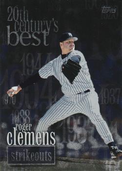
Monday, October 14, 2013Card: #472 Active Strikeout Leaders - Roger Clemens “ The concept on this card is a good one...the subject not so much. I remember seeing him on the local news all the time when he was an active player (and even now when he's not due to the controversies he's been in) and he does not come off as a very nice person. ” -Billy Kingsley
“ like him or not, he still was a great pitcher.. I still can't figure out how PEDs would help a pitcher in any way.. regardless, i would have to agree with the nature of the card.. ” -lyfestory
“ Clemens is certainly one of the 20th century's best. The 20th century's random years sprinkled about behind him are less than inspired, though. ” -Luckynumber78
“ Steroids. ” -jlaz10
|

Saturday, October 12, 2013Set: 1992 Stadium Club Dome (Rate) “ i remember all those late 80s and early 90s draft picks mostly amounting to nothing.. except for the Big Hurt anyway.. always loved Stadium Clubs' photography, but this one is not so good.. and the backs are just too confusing.. ” -lyfestory
“ What's this, a wanted poster? Topps should be able to do better but didnt. Never liked Stadium Club. The back is horrible too. Let the kid smile. ” -NJDevils
“ Is this a baseball card, or a mug shot? ” -wamk
“ Regular old minor league uniform. ” -jlaz10
“ Pokey! Man, what a great high school uniform. This guy drove me crazy though. Seemed like he always ripped the Astros. ” -marcbrubaker
|
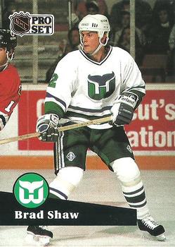
Friday, October 11, 2013Set: 1991-92 Pro Set French (Rate) “ This card came up just a few hours too late, as I missed one of these on Card-ology earlier today! I like the whale tail on the jersey. ” -Billy Kingsley
“ So many hockey cards! At least it's in French so I have an excuse for not knowing what's going on here. ” -ray fosse's ghost
“ Another hockey card. Descent image of Shaw but the card is rather plain beyond that. ” -koloth42
“ I like this set,no borders,nice backs and really, really affordable.A great set for kids to collect.It was pretty much error free, a big improvement from the year before.Shaw was a great defenseman,nothing flashy, but always reliable. ” -uncaian
“ A border would have been a nice addition to this card. ” -NJDevils
“ Oh how I miss the Hartford Whalers. ” -jupiterhill
“ Silliness: How many people called him Terry? On another note, ProSet was so terrible, it's not even worth the paper it's printed on. Sheeting a set costs more for the pages than the cards. Ouch! ” -vrooomed
“ Cue the Brass Bonanza! I miss the Whalers. ” -Gunny
“ I once bought a box of these. My French is still bad. ” -DanD
“ Best. Logo. Ever. ” -jlaz10
|

")