
Random Card of the Day |

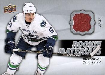
Thursday, December 10, 2020Set: 2014-15 Upper Deck - Rookie Materials (Rate) “ Cool Canucks card. I'm still not sold on trying to own a tiny piece of a shirt some dude got all sweaty in. But it's my favorite team. ” -switzr1
5
“ Maroon on a Canucks card? ” -Billy Kingsley
1
“ Event used. That is interesting. ” -parsley24
1
“ I dislike when a memorabilia card has an image that couldn't possibly match the "player worn' piece included. ” -jackal726
4
“ My collecting tastes admittedly pre-date the jersey swatch/game-used craze. That being said, there's something not right about the swatch color not matching anything on the uni in the player pic. Seems...inauthentic. ” -wjhipwell
“ Is there even a red Canucks jersey? Where did they get this from? ” -Soarin22
“ I like Upper Deck memorabilia cards, and this is no exception. ” -Brendan Barrick
“ why is it red? ” -DarkSide830
“ An OK Hockey Relic Materials Memorabilia card. I really wish cards like this would be serial numbered and cards like the random Star Wars1/1 red variant card that was today's RCotD were NOT. A swatch of cloth is rarer than a randomly created variant for a card only changing the card's background color to make the variant. ” -captkirk42
|

Wednesday, December 9, 2020Set: 1989 Wichita Wranglers Stadium Set SGA (Rate) “ What a strange card. While I normally can't stand a card where the background has been replaced that might not be the case if the players were just magically flying through the air over a bridge for no apparent reason. ” -Billy Kingsley
4
“ Is he levitating? ” -trauty
2
“ +5 internet points for being a MiLB card of a player I remember in the Bigs. ” -jackal726
3
“ Yikes. This looks like a clothing tag from a dime store pair of jeans. Horrible. Only a Score logo would make this worse. ” -parsley24
“ Minor League card of a known player. Neat. ” -DarkSide830
“ This reminds me of the video of Rush's "Time Stand Still." Just floating around for no apparent reason. ” -rmpaq5
“ Interesting a Minor League "stadium giveaway" card/set with blank backs? Nice looking. Wait did they attempt to make these "3-D"? ” -captkirk42
“ I have no idea what I'm looking at here. But he was a Cardinal at one time, and after playing he co-hosted the Saturday morning Cardinals Kids show with Fredbird, so I gotta have this. ” -switzr1
“ I hate it. On every level. The pose, the background the back??? . Just a NO from me. ” -Camstone
“ Interesting concept for the image--floating in the air like that. Not sure how I feel about that, but I think it's more positive than negative. On the other hand I hate the "89" font and dislike the font used for the name. But generally speaking it is always great to see a bona fide MLB star-to-be in his minor league years. ” -kents_stuff
“ Interesting concept. I like it. The back could have been something though. ” -muskie027
“ These are interesting, without holding it in hand, it looks like a sticker. ” -Derek McDonough
“ This is a wonderfully strange card. ” -CollectingAfterDeath
|

Tuesday, December 8, 2020Set: 2019 Topps Heritage - O-Pee-Chee Backs (Rate) “ In retrospect, learning French through the backs of O-Pee-Chee cards was not the best idea prior to a trip to France. ” -buckstorecards
16
“ Great set, great card, great player. ” -abide
“ Javier Baez, I am sure Chicago sells a few more tickets when hes playing. He has a knack for catching players off guard and taking chances when they are least expected. Always loves this 1970s Card design, one of the few I like that hey are reusing. ” -Derek McDonough
“ Worse that the girl eating ice cream. A Cub. And Baez at that. Terrible. ” -switzr1
2
“ Very nice card! ” -IfbBirdsCards
“ I like Topps Heritage. I like Topps Vintage stuff. I love the early 70s stuff as that was some of the first stuff I collected. I also like OPC stuff. Ugh but I tire of all the variants that Topps makes for everything now-days. ” -captkirk42
“ Am I the only one who thinks that Topps makes too many sets? ” -Phil
“ The perfect sports card may not exist. but with all of the features on this one..It'll do until one comes along ” -Camstone
“ Gotta get in tune with Sailor Moon
'Cause that cartoon has got the boom anime babes
That make me think the wrong thing.
Sorry makes me think of that song every time I see anything of hers ” -Shaw Racing
“ Great, basic design they had back in 1970. I don't think they have to rehash those or any others, though. But it was a great design. ” -kents_stuff
“ Decent card. Terrific set. ” -TonyZ
“ I really wish the O-Pee-Chee were more common. I think they are a nice touch. ” -DarkSide830
“ I originally didn't collect the Heritage stuff, but always liked the look. I converted and started full time collecting these in 2018. Love em! Love the concept and the look! ” -muskie027
|

Monday, December 7, 2020Set: 1994 Cardz Muppets Take the Ice (Rate) “ The Muppets are great! This card is...not. But I'd still happily collect it. Of course I have no idea if I would count it as hockey or Movie & TV... ” -Billy Kingsley
4
“ One of the weirdest NHL licensed sets ever. I have couple cards from this set. You rarely see the puck having own cards. Pro Set did one. Is there others?
"Kermit spends a lot of time handling the puck... not the Pig" :D ” -SharksAttack
“ This is a Muppets card? Would have never known ” -IfbBirdsCards
“ Handling the puck not the pig..... Who writes this stuff? ” -parsley24
“ I'm trying to find redeeming qualities for this card but... ” -Lennoxmatt
“ ? What? Oh Hockey, OH The Muppets. Then the bizarre look is OK. NEXT! ” -captkirk42
“ Umm...I don't see any Muppets. ” -switzr1
1
“ Good to know that the definition of diameter is: across ” -abide
“ It is nice to see the puck receive its own card. You can't play hockey without one. ” -Brendan Barrick
“ I l love cards with animation in them, on them, or they are animation!! That being said, "Can't stand it"! ” -Camstone
“ I think this is one of my favorite puck cards of all time. Great casual locker-room shot--much more relaxed than one of those typical action shots.
Now had NBC (I think!) had a Peter Puck series of cards back in the 70s, that would have been awesome. Anyone else remember Peter Puck fondly? ” -kents_stuff
1
|
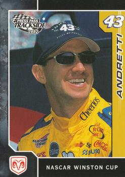
Sunday, December 6, 2020Set: 2002 Press Pass Trackside (Rate) “ A first name might be good for a common last name. Nice card though. ” -switzr1
“ Nice card of legendary Indy car driver Mario Andretti's kid. Not sure why General Mills / Cheerios is prominently sponsoring NASCAR. ” -abide
“ I think for a racing card, it looks cool. ” -muskie027
“ Auto racing needs more Andrettis, period. Indianapolis was awesome in the early 90s (and late 80s?) with John, Michael and Mario all on the track. And if I remember correctly, John was the first to run the Indy 500 in the morning and then head to Carolina or somewhere to run the Coca-Cola 600 that evening. (Is it 600? 500? Carolina? Honestly I'm not sure. I don't follow NASCAR so much, as you can tell. Sorry!) ” -kents_stuff
“ I've never been a fan of auto racing, but I guess this is a pretty decent looking card. ” -Phil
“ Everybody liked John Andretti. Sadly he passed away from colon cancer earlier this year. ” -Billy Kingsley
“ Nice card, though there is enough room to put his first name on the front. You would think an Andretti driving a Petty owned car would have a much better career than he did. ” -jupiterhill
“ This card reminds me of how much I want to see Dodge back in NASCAR ” -IfbBirdsCards
“ Nice racing card. ” -captkirk42
“ I have some racing cards, although I do not collect them. But this is a pretty nice looking card. I like when they include an image of the car the driver races with. ” -Derek McDonough
|

Saturday, December 5, 2020Set: 2009 Rittenhouse Star Trek: The Original Series Archives (Rate) “ WOOOOOOWHOOOOO STAR TREKIN Lt. Screwloose. er Sulu.. ” -captkirk42
1
“ Oh my! ” -jupiterhill
7
“ Sulu survived this mission, thanks to his gold jersey. The space monsters found his crew mates in the red jerseys more appetizing. Not enough of the red jerseys could be saved from the jowls of the space creatures to make any MEM cards. 8O) ” -CollectingAfterDeath
2
“ Sulu looks more confused than scared or threatening in this particular photo. But it's classic Star Trek (even if a 2009 issue), so I'm not complaining. ” -kents_stuff
“ I wonder if George Takei will link his facebook page to the comments made here? ” -abide
“ Great action photo. ” -parsley24
“ Scotty... oh never mind. ” -Derek McDonough
“ Hands up! ” -Brendan Barrick
|
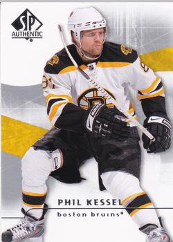
Friday, December 4, 2020Set: 2008-09 SP Authentic (Rate) “ Umm, Phil...you know high sticking another player is gonna land you in the penalty box, right? Oh, you're aware of that. Okay then, you do you, dude. ” -CollectingAfterDeath
4
“ born in the Badger state.....played college hockey as a golden rodent....awesome player ” -Tmac7
1
“ Phil Kessel is a cancer survivor. He does not look like a typical hockey player but he's actually pretty darn good. ” -Billy Kingsley
1
“ I liked the front sides of SP Authentics back in this era. I always thought the background designs and photographs were well done. But I never cared for the back sides, as they used the same photo as the front and it seemed like they wasted space. ” -kents_stuff
“ I like this card. A real background only thing that would make it better. ” -Derek McDonough
“ Nice card I like it. Despite the repeat photo on the back. ” -switzr1
“ perfect form for tossing the stick like a frisbee ” -abide
“ Hockey been a lot of it lately. SP is nice, but can be confusing due to the white background every year. ” -captkirk42
“ Phil The Thrill!! Wish the Penguins still had him; no one is better than a man who eats hotdogs out of the Stanley Cup! ” -Soarin22
2
“ I like this card. ” -Brendan Barrick
“ SPA always has the cleanest design and great card stock. ” -suomibear8
“ You cant just go from one hockey RCOTD player wearing a yellow jersey to another RCOTD player wearing another yellow jersey and expect me to realize they are on different teams.
Cool photo. Cool card. ” -parsley24
|

Thursday, December 3, 2020Set: 2019 Topps Star Wars Skywalker Saga - Red (Rate) Card: #8 Facing the Jedi Council “ Pretty cool card of cool Star Wars scene. ” -muskie027
1
“ May the force be with you. ” -abide
“ Nice layout, nice artwork, nice borders....OK by me, even if it's not my thing. ” -kents_stuff
“ I hated this scene. But I'm the guy who thinks Yoda is more annoying than Jar Jar. Card is fine, I guess. Serves it's purpose of showing a scene from the movie. ” -switzr1
“ A 1 of 1 is cool. Before disney got star Wars and made it a parody of itself this card would have been something I really wished I had. ” -Billy Kingsley
“ Anything Star Wars is awesome to me! ” -bkklaos
“ Been collecting Star Wars cards longer then sport cards...I love it! ” -Camstone
“ An OK Star Wars card. Not great.
BTW who else still looks at the bottom of the page for the "write one" link for Card of the Day? ” -captkirk42
“ Wow SN 1/1. Don't get to see those every day on RCoTD. ” -DarkSide830
2
“ For those that didn't know, Leyheewho, is the last name of Yoda. Say it out loud. ” -Derek McDonough
|

")