
Random Card of the Day |

Friday, January 22, 2021Set: 2016 Topps Allen & Ginter (Rate) “ A&G as usual nice. It has been a few years since I've even tried to collect A&G sets. I have gotten tired of the mini parallels and hunting for those. My only real beef with the sets is after the 15 or 16 years it is getting difficult to identify A&Gs by year. Many similar designs and to be honest many limitations to any designs. They need to keep them resembling the original late 19th Century A&G cards. ” -captkirk42
1
“ I think I'm over A&G base sets. Fun, novel concept for a while, but the backs are annoying, and the non-sport entries arent interesting people anymore. The insert and mini insert sets are still fun though. ” -switzr1
4
“ I don't mind Allen & Ginter, but their designs are too similar and boring each year for me to go hardcore with em. ” -suomibear8
2
“ Suggestion to those still putting out really, really old-timey cards (A&G, Goudey, etc.)--put the players in really, really old-timey uniforms. Surely you have enough pull with MLB to get something like that green-lighted. ” -kents_stuff
“ Started getting into these this year and I really like them. ” -muskie027
|
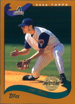
Thursday, January 21, 2021Set: 2002 Topps - Home Team Advantage (Rate) “ Why is any symbols on the front of the uni photo shopped out, or on not photo shopped in? ” -rmpaq5
“ I really like the border on the 2002 sets.. ” -NJDevils
2
“ This seems like a weird color scheme choice when you have an established "gold" variation every year. ” -jackal726
“ Base card is great. Parallel--why. ” -cjjt
“ I love parallel cards. My familiarity with them is not the best. First time I have ever seen / heard of, this parallel ” -abide
“ 2002 Topps during my semi-absence from the hobby. When I first saw them a couple of years later I hated them because I thought the overproduced years hadn't yet ended. I eventually got to like this set. Team Advantage variant. UGH. I forget what the "advantage" was for these. Also not a huge Diamondbacks fan. ” -captkirk42
“ Oof, what a rough set. Bell was a pretty good player. ” -crushnmove
“ The color of this set has always bothered me, baby poop is not a good color. ” -Corky
3
“ As a TCU player collector, this isn't one of my favorite cards, but I love seeing it pop up in the RCotD. Go Frogs! ” -jlamberth
“ Jay Bell sort of looks like that 8th-grade math teacher who tried too hard during the teacher's softball game. The one that brought his own cleats. ” -Soarin22
|

Wednesday, January 20, 2021Set: 1971 O-Pee-Chee CFL (Rate) “ Is this a politically correct team name? And Edmonton actually is not so far up in the North. You would not call people in northern part of Germany Es***os, for example. ” -Duke
5
“ Love this card. Wish I had some ” -NJDevils
1
“ He looks more like an actor playing a football player in a tv show. ” -switzr1
10
“ Awesome card. A little haevy on the bottom with the red, but overall a fantastic card. ” -parsley24
“ the duplication of the comment on the back - English / French - is interesting. didn't realize that the Canadian language laws extended to sports cards ” -abide
1
“ A nice old-fashioned card . . . Love cards from that era; they always look a bit "primitive" compared to today's . . . They have character and seem much more appealing than current cards . . . ” -georgecf
“ nice looking base design, cartoons on the back are always a plus for me, eskimos logo simple but gets the job done ” -Thunderfoot
“ I like this card. It reminds me of the 1971 Topps NFL issue. The card can use stats on the back. ” -Brendan Barrick
“ Wonderful! Go Eskimos! ” -cjjt
“ CFL! Very cool. ” -crushnmove
“ Way too much red in the lower left, and the font is very 1970s. But that doesn't eliminate the "cool" factor for me. Interestingly it does remind me of cards from my youth, but not Topps....Wonder Bread. ” -kents_stuff
“ This card is everything that any card in the history of cards should strive to be. The back should be in the trading card HOF. ” -UKboogie
1
|

Tuesday, January 19, 2021Set: 2018 Donruss - Red Foil (Rate) “ Nice car shot. I like the ones with the car more than the ones with the drivers, though I see the need for both. ” -switzr1
4
“ OK Donruss Racing card. Would be nice to have a photo of the racer, nice car. AH they do have some of the racer photos in the checklist, but not on this card. OH and it's a "Red" foil version #/299 how nice. ” -captkirk42
“ Interesting, second Donruss parallel to come up this year. Kasey was a big star for a short time, then his career kind of went sideways. Had to leave NASCAR due to carbon monoxide poisoning as a result of the exhaust fumes entering the car, only the second driver to have that happen after Rick Mast. ” -Billy Kingsley
1
“ I love Nascar paint schemes, so I really like cards like this one. ” -702tpr777
“ Is Kasey Kahne a Transformer? If not, shouldn't there be a photo of him somewhere on this card? Or should the card really be named something like "The Kasey Kahne, Farmers Insurance #5 Chevrolet" ” -kents_stuff
1
|
Monday, January 18, 2021Set: 2003-04 Topps - Factory Set (Rate) “ Good looking topps BBall set. action photos. good back. ” -parsley24
1
“ The 2003-04 Topps set was my favorite Topps flagship, but now I can't see it and not think of the flood I had back in 2015...I'll never be able to replace all the cards from this factory set due to the presence of LeBron's rookie card in it. What used to once bring me joy now brings sadness. ” -Billy Kingsley
1
“ An OK card. Don't like the all foil lettering. I can barely read the players name in "black" against the green foil I'm not sure what color it is in reality I don't recall if I have any cards from this set. Back is nice ” -captkirk42
|

Sunday, January 17, 2021Set: 2014 Upper Deck Captain America The Winter Soldier (Rate) Card: #5 Though he did not know it when they first met, Sam “ Never saw these. Very nice card. ” -NJDevils
“ I never thought it was possible, but the Marvel Cinematic Universe is now my favorite movie series ever. This isn't my favorite movie in the series, but still cool to see it come up as Card of the Day. ” -Billy Kingsley
6
“ I havent seen any Captain America movies, so I dont know this character. But I like card sets for movies, so i approve. ” -switzr1
1
“ When I was a kid, I was big into baseball cards, Star Wars, and GI Joe figures. Never comic books. So I wasn't fully into the MCU as it was coming out. But my boys are, so about three weeks ago my wife and I finally started watching them all in timeline order. We just finished Winter Soldier about two days ago, so this is a personal 'RCOTD Coincidence' card lol
By the way, I knew I probably would like the movies despite not being my thing as a kid, and so far I've been right. They are well done and almost perfect casting choices for all of the heroes and villains. ” -Brimose
“ cool card ” -crashdavis28
“ I actually geek out over the Marvel, Star Wars, etc., cards out there. This one is a bit on the boring side, but I'd take it. Nice back design helps.. ” -Camstone
1
“ Nice non-sport card. At first glance I thought it was a casual "press pass" like not in a league yet card. He is wearing a sweat shirt with a logo of somekind. OK so the logo is some kind of shield like a military academy or a fraternity. Like I said that is what I thought upon first glance before observing any details. ” -captkirk42
“ This looks more like the photo you get in a frame when you buy it from the store. ” -muskie027
1
“ This guy's a gangsta? His real name is Clarence. ” -volbox
2
|

Saturday, January 16, 2021Set: 2020-21 O-Pee-Chee - Blue (Rate) “ It is always nice to see alternate jerseys make random appearances on cards. ” -buckstorecards
3
“ Back to back OPC. But great cards on both. I dont like that they used the same photo front and back. ” -parsley24
4
“ I asked my 9 year old what she thought of this card.
"I like it.... I like it LIZOTTE"
Bad pun apple doesn't fall far from the tree. ” -jackal726
9
“ I'm a big fan of hockey cards and this one does not change my mind. Great action shot on the front and the design is attractive without getting in the way of the image. ” -Camstone
“ Nice looking card. Only complaint is the standard they used the same photo for the back and made it black & white. ” -captkirk42
“ Wow, brand new card! Just a few days away from the NHL starting up, I can't wait. I really like this year's OPC set. Great design. ” -Billy Kingsley
“ Two O-Pee-Chee cards in a row! I like this front design, only wished they found a different picture for the back ” -IfbBirdsCards
“ I like the color of the card, with blue being my favorite color. I am not a fan of the card stock for this year's O-pee-Chee issue. The issue could have been better without the back photo. ” -Brendan Barrick
“ I like this OPC hockey card too. And it's from this year. ” -switzr1
|

Friday, January 15, 2021Set: 2016-17 O-Pee-Chee (Rate) “ Nice card. I seem to always like the look of the recent OPC sets I see. ” -switzr1
1
“ A really good OPC card. Great vintage feel
” -parsley24
1
“ JVR was a ghastly minus -47 over his 6 years with the Leafs. I'd have run back to the Flyers, too. ” -wjhipwell
“ another great hockey card...under rated set....O-Pee-Chee ” -Tmac7
“ Nice OPC card. Front design reminds me of UD Collector's Choice to be honest. ” -captkirk42
“ This is a great set. I wish I had more of them! ” -Billy Kingsley
1
“ I like this card. The card has everything you will want in a card. ” -Brendan Barrick
“ Finally a card of the day that I have in my collection! ” -taxelson
|

Thursday, January 14, 2021Set: 2006 Press Pass Legends - Autographs (Rate) “ Good on card auto ” -parsley24
“ Nice autograph card. I think it is on card even cooler. ” -captkirk42
“ This is an ok card. ” -Brendan Barrick
“ Nice photo. Actually fairly rare to see an athlete smiling on a card. ” -Billy Kingsley
2
“ Nice looking autograph card ” -switzr1
|

Wednesday, January 13, 2021Set: 1996 Ultra - Gold Medallion (Rate) “ These Gold Medallions are so cool in hand but nearly impossible to get a good scan out of. ” -Billy Kingsley
2
“ This guy’s actually my old high school’s baseball coach. Very nice guy. ” -CardsThatTimeForgot
7
“ when i first saw the back of the card it looks like a daddy allen watson holding a baby allen watson ” -parsley24
5
“ I like Fleer Ultra (I don't like calling it just "Ultra"). I like some gold variants. I do not like these "Gold Medallion" variants. Not a fan of the all foil thing. Back with two different pictures from from is OK but looks a bit wasteful since there is only one line of stats, OH and the career stats to that point. ” -captkirk42
“ There's a lot going on. Too much text that blends into the background image. I like that there are multiple different images though. ” -jackal726
“ the year Fleer Ultra "gold medallion" was truly gold ” -abide
“ Pretty boring . . . nice try to showcase photos of the player, so if that's what you prefer, it is well-done in that aspect . . .
Beyond that, there's nothing . . . ” -georgecf
“ Nice strong card. Nice set, as well. Love how they get the embossing on the card without really disturbing the image.. ” -Camstone
“ Very cool medallion card of a guy I never heard of. ” -muskie027
|

")