
Random Card of the Day |

Thursday, February 15, 2018Set: 2001 Bowman's Best (Rate) “ Looks like it might be the technology used on the 2000-01 NBA set...kind of like a refractor but textured. It looks really impressive in hand but scans don't always capture it. ” -Billy Kingsley
“ I prefer the natural backgrounds ” -RoundtheDiamond87
“ The lazers are weird and out of place. ” -carthage44
“ Not much to like about this card. Hate the background. Hate the white around the player. Weird spot for the Dodgers logo. On the back the size of things doesn't make sense to me. I have never seen a card where the personal information is bigger than everything else. I could keep going and going but suffice it to say I will not be running out to get this set. ” -davidhandberry
“ Some collectors I have met in my local area go nuts over Bowman stuff. Me, I'll pass. ” -Gunny
“ There has got to be a list that someone has for players whose names sound dirty. Kind of weird graphics, not so sure about the glow. Really not sure if this was one of Bowman's "best". ” -parsley24
“ Less is more Bowman & most times better. Nice back ,not diggin the front though. ” -uncaian
“ Mr. Diggins has quite a stride. Big dude. Former 1st rounder who only appeared in 5 games in his career. As far as the card is concerned, I approve of 2001 Bowman's Best. Fun design. ” -mkaz80
“ As much as I like the front, that is how much I don't like the back except for the large number. ” -NJDevils
“ Very nice chrome-y card set. Great scan. Wouldn't mind some of these in my collection. ” -vrooomed
“ Wouldn't it be funny if the set could be named what many are probably thinking....Bowman's Worst. The funny thing is, if they just take out the computer junk and the sideways multi-colored pyramid, then focused the background in so it was an action shot, this card would actually be pretty good. Add a position marker and it would be great. ” -muskie027
“ Diggins...sounds like the name of my next dog. Come here, Diggins! ” -RoundtheDiamond87
“ Actually I pretty nice looking card for a "Bowman's Best". I usually find the "Best" like it's Topps "Finest" kin to be far from "Best" or "Finest" most of the time. This is an OK front, the background with the lasers are a bit much. Back is very plain OK so he was a rookie in 2000 and didn't play, could they have shown his Minor league stats? Or College stats at least? ” -captkirk42
“ He has more career hits 1 than wins 0. ” -kirkscards
“ Always liked the Bowman's Best. Not the usual cheap looking cards. ” -KMack
“ Great action photo. This is a case where I almost like a graphic background...almost. ” -cnangle
“ It's fine. I don't remember this set or player though. ” -switzr1
|

Wednesday, February 14, 2018Set: 1994 SkyBox Star Trek IV The Voyage Home Cinema Collection (Rate) “ Looks like they are at the Aquarium on the back. ” -carthage44
“ I enjoyed this movie, a nice fun Star Trek adventure. I had no idea these cards existed, good one! ” -Gunny
“ Not a big fan of this card. ” -olerud363
“ One of the good Star Trek movies. ” -RoyalChief
“ Nope ” -parsley24
“ Power failures always happen at the most inconvenient moments. ” -dilemma19
“ May normal size cards live long and prosper. ” -jayoneill
“ Live Long And Prosper. Except I'm not a big fan of these movie "widescreen" cards which are basically tall-boys turned on their sides. Other than my beef with oddball sizes it is a cool card set. ” -captkirk42
“ What's the over-under on member comments citing "Live Long and Prosper"? I'm going with 4-and-a-half, and taking the over. ” -kents_stuff
“ Skybox did Star Trek? Who knew? Was this an odd shaped card, it has a very long look to it. As far as a non-sport, not bad. Early Skybox always was interesting in the sport world, wouldn't have expected anything different for non-sport. ” -muskie027
|
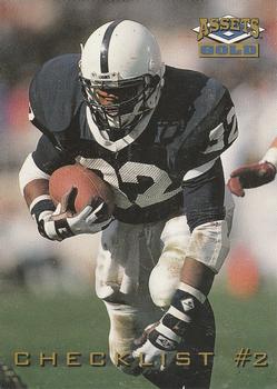
Tuesday, February 13, 2018Set: 1995 Classic Assets Gold (Rate) “ Another disappointing Bengals draft choice from the '90s. This guys supposed to be an absolute stud in the NFL. Oh well... ” -mkaz80
“ I always hated checklist cards. That being said the least despicable ones are the ones that have a player photo on them. This is Classic so I don't expect much and that is what you get. ” -davidhandberry
“ He had so much promise but injuries (ACL tear, torn rotator cuff, broken wrist and dislocated knee cap) derailed his career. ” -carthage44
“ Didnt see the "T" in the logo. Thought it was a benchwarmers parallel that i didnt have yet. ” -parsley24
“ I miss the vintage style checklists. ” -jayoneill
“ Not a fan of Classic games cards. Nice looking front. Since it is a checklist card having the player on the front identified would be nice. I miss the days of real checklist cards. Prefer them to be the last few numbered cards at the back of the set. Giving them photos on the front gets them lost in the set. ” -captkirk42
“ Bust.. ” -SFC Temple
|

Monday, February 12, 2018Set: 2011 Panini Stickers (Rate) “ Foil or black border? Who can tell with foil. Good scan, lackluster card. I don't know why card companies keep thinking a player cutout in front of some digital background is a good idea, as I don't remember encountering anyone who likes that concept. ” -Billy Kingsley
“ Thought it looked like an awesome card, then realized it was a sticker. Not a fan of stickers. I have a few in my collection but they tend to be flimsy and hard to keep in good shape. ” -davidhandberry
“ Great front. Lousy back. Remind me again...what's the card number here? ” -kents_stuff
“ The double logo is overkill. ” -carthage44
“ I do like the size of the number. ” -NJDevils
“ Actually a good looking card/sticker. I would totally put this on my mead 5 star trapper keeper in middle school. ” -parsley24
“ Nice sticker. I tend to forget that Panini started with stickers, or at least did stickers well enough that they really should stick with them. Pardon the pun. ” -captkirk42
“ I really enjoyed filling up the sticker books as a kid. Collecting stickers on their own? Not sure I'm a fan. ” -SFC Temple
“ Okay, considering it's Panini. ” -cjjt
|

Sunday, February 11, 2018Set: 1888 W. Duke, Sons & Co. Snapshots from Puck (N128) (Rate) “ This might be a record for shortest time from adding photo to making RCOTD. I see cnangle added this one less than a month ago. The print is too small for me to read, so I have no idea what this set is all about. ” -switzr1
“ Old so good, but what the heck is going on here? What is up with the waiters face? Is he a fish man? Looks like something from the X-Files. Maybe the words explain it, but I can't get them to focus in. Still, anything from 1800's looks cool. They could have a set of dog crap piles, but you put them in the tobacco setting and I think I'd like it. ” -muskie027
“ 1888? Wow! ” -jayoneill
“ OH! well, its a card. Not a very good one, but it’s a card ” -Bargunmaster
“ Not sure what this is but it looks racist. ” -carthage44
“ This is my all-time favorite Random Card of the Day. ” -Doe MG
“ Wow, a 19th century card. That makes this is my all-time favorite Random Card of the Day. ” -Doe MG
“ Yes! Finally a 19th century tobacco card. I really like the artwork in this set. I think the cards are supposed to be funny. I guess you had to be there. The images are taken from "Puck" magazine which was a satirical publication from 1871 to 1918. The scenes are a satirical representation of societal opinion and, like in this card, are often not politically correct by today's standards. ” -cnangle
“ HOLY BATMAN! What an awesome artifact. LOVE it. So wrong and stereotyping. Truly, an amazing collectible. ” -cjjt
“ Nice artwork, but I think 1880's humor is over-rated. But the concept of a tobacco card back then was novel, and kudos to those marketing folks who came up with it. ” -kents_stuff
“ I remember getting this card when I opened a couple packs back in '89. ” -NJDevils
“ Interesting vintage card, to say the least. Par for the course though at the time, I suppose. ” -IfbBirdsCards
“ Good looking historical card, kind of racist now. One of those hard cards to justify having it other than it is history. ” -parsley24
“ The 19th century cards are almost enough to get me to buy something that isn't a baseball card. This is a beautiful and fascinating card. And, of course, terribly offensive, which is a bit of a problem.... ” -Vvvergeer
“ not really sure whats going on here but the date is 1888 that alone is pretty sweet ” -Thunderfoot
“ Nice vintage vintage non-sport card. Very non PC by today's standards. ” -captkirk42
|


Thursday, February 8, 2018Set: 1998 Donruss Signature - Signature Series Century Marks Autographs (Rate) “ Neat card. From before they put both halves of a serial number on the card. I like the blue theme. ” -Billy Kingsley
“ Great card for a great player. ” -Parsons0311
“ Ooo an autograph, don't see that often on RCOTD ” -Lennoxmatt
“ One of the best Blue Jays ever ! Nice card , nice signature . ” -uncaian
“ I like this card. The only issues I have is how big the Donruss Signature logo is and his name is white on white which makes it pretty hard to see. ” -davidhandberry
“ Hall of Fame Auto? A less than crazy computerized background that doesn't overbear the player? A different picture with a nice write up on the back (not "Congratulations blah blah blah)? Wow. This is many form of all right! ” -rmpaq5
“ A Blue Jays uniform would have looked nicer, but I'd still be happy to own this card. ” -dilemma19
“ Not a lot of Roberto Alomar auto cards out there, NICE! ” -carthage44
“ This card is spitting fire..... Great looking card. ” -parsley24
“ its an absolutely lovely signature, and a nice design for an auto card, but why is "donruss signature series" the largest thing on the card? shrink that down to the corner and it would look better ” -jamestagli
“ I bet the blue on this card is fabulous in hand. Nice. ” -Doe MG
“ Nice auto card. Can't tell but it looks to be ON CARD. If so GREAT! Love On card autos. If it is a sticker well then poo. I should probably look for one of these since the O's are my second homie team. Now what I don't like about it is the diamonds all over the front not needed. OK so I don't see much of a difference if any between this Century Marks (blue), the base Autos (red) and the Millennium Marks (green) versions, except base autos seem to not be serial numbered (but doesn't tell of how many) and OH the background colors sheesh) Player name a little difficult to read and at a weird vertical. Also no team name on front. Back name should read on the horizontal not vertical rest is OK for an auto card, not great. ” -captkirk42
“ I really like these. Bold colors, solid auto's. ” -KMack
“ This would be a nice card if someone hadn't written all over it! ” -YoRicha
“ That's a Hall of Famer, for you non-baseball guys. Great card! ” -switzr1
|


")