
Random Card of the Day |


Wednesday, June 14, 2017Set: 2001 Pacific - Hobby LTD (Rate) “ The Hobby LTD markings really show up well on this scan. ” -Billy Kingsley
“ Another useless Pacific variation. ” -cjjt
“ Pacific always produced a bunch of parallels. ” -carthage44
“ Pretty cool card front and back. Pacific is usually that way, sometimes they are way out there too flashy and wild, but this design is OK. Two things I don't like about it though, the watermarking of "Hobby LTD" I thought was a watermark from whoever scanned the card. I didn't realize it was actually on the card. Then the rounded corner on the back I thought was really one intentionally rounded corner (the scan is slightly askew so it could use a better scan sometime) and thought it was odd showing the regular variant for the front and a round corner for the back. The round corner is part of the design of a regular square cornered card, difficult to tell from the scan at first. ” -captkirk42
“ I don't like the printing on the front. Otherwise, everything looks nice! ” -TradingCards964
“ I'd limit these too. ” -Sportzcommish
“ Yay! Da Bears! But are there even 99 people who'd want this card? ” -DanD
“ Not bad, not great. Hate the "Hobby" words across the card. ” -muskie027
|

Tuesday, June 13, 2017Set: 1995 Megacards Ken Griffey Jr. Wish List (Rate) “ ...that horrible moment when you realize you're tagging the ump in the face instead of the baserunner... ” -revnorb
“ Cool action shot! ” -olerud363
“ One of the better action shots I have seen on a card. ” -carthage44
“ Fun photo. Wonder who the catcher is? Incidentally, The Kid finished with 1662 career runs scored, well short of that projection but still elite. ” -Brimose
“ Incredible photo! I don't know where to look first. As for Megacards, I can't say I'm familiar with the company. But, if this is any indication of their product, it's worth further inspection. ” -mkaz80
“ Cool action shot, that is about all I can say about this one. ” -captkirk42
“ Great photograph, but the card looks like a bare Upper Deck or Topps Stadium Club. ” -Sportzcommish
“ Picture is cool, but I really don't like this. I don't get it. Let's make a set where we take a player in his prime, project his stats over a career and then make cards on stats that will never happen. Griffey missed this "projection" by 699 runs. Not even close. There could be sets of guys with 899 home runs, and 5,145 hits, and maybe even someone with 100,000 RBIs if they played one game and hit like 7 in it. Just an idea I am not really on board with I guess. ” -muskie027
“ Nice action shot ” -aussiewayne
“ Great Action Shot! ” -kirkscards
|
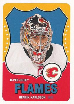
Monday, June 12, 2017Set: 2010-11 O-Pee-Chee - Retro (Rate) “ I am usually a big fan of OPC sets, not so much with this one. Like the back though. ” -Doc Floyd
“ I like these OPC retro cards. This design is new to me, but it does not disappoint. Hope to add some to my collection someday. ” -Billy Kingsley
“ Nice retro design, but a bit too much red and yellow; the borders are a bit thick especially on the bottom. ” -olerud363
“ A lot of dead space on the back. ” -CluelessJoe
“ Such bold colors in my face! ” -carthage44
“ Ugg. Horrible front. Worthless back. ” -cjjt
“ Love these Retro OPC cards. For some sets the Retro inserts are the only Non-Capitals cards I like to collect, other than vintage Hockey. ” -captkirk42
“ I like and I don't like the fact that companies are going for the "Retro" look. It's nice to be nostalgic, but it's the same as the movie industry revisiting old titles. You are saying to the people, "Well, WE'RE out of ideas!" Overall, I'm not a big fan of this set. ” -Dixxy
“ I Like the Classic Look, Think they could have done better with the photography though. ” -TradingCards964
“ The O-Pee-Chee Retros aren't bad, but I really am not a huge fan. ” -muskie027
|
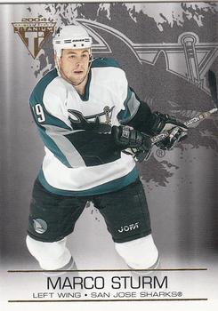
Sunday, June 11, 2017Set: 2003-04 Pacific Private Stock Titanium (Rate) “ Oh Pacific!!! Always so close but so far away!! ” -muskie027
“ Get ride of the computer generated background and the card isn't that bad. ” -carthage44
“ Steady player who contributed a lot . Not a bad set , bright with decent back. ” -uncaian
“ Not sure why, but crazy graphics behind the player seem to look better on hockey than any other sport. This isn't great but isn't terrible. ” -Brimose
“ Looks like he's playing hockey in photography studio. ” -jayoneill
“ Pacific....ugh! With that aside, I actually like the background graphics and the frosted look on the back. I don't like the front photo though. Maybe if they would have kept some of the background and used the sharks logo as an overly. Why don't they ever get my opinion before printing a card? ” -cnangle
“ Eheh design. With the Ti logo I thought it was a Topps Titanium thing, but its Pacific. Front too plain with the silver background. Back just as boring sorry folks. ” -captkirk42
“ The card has a chilling effect...oh, it's hockey, and it's cold. ” -Sportzcommish
|
Saturday, June 10, 2017Set: 2000 Future Bee Power League Dream Stadium (Rate) “ My head is spinning. ” -muskie027
“ Only two balls? Weak. ” -carthage44
“ A card with two backs! ” -Sportzcommish
“ I like that all cards are welcome in the Trading Card Database. ” -kirkscards
“ I gotta get me one of these! ” -jayoneill
“ I like the card. I wouldn't add it to my collection but it does manage to honor the game and the player. I like the ballpark picture in the background on the back side of the card. ” -cnangle
|


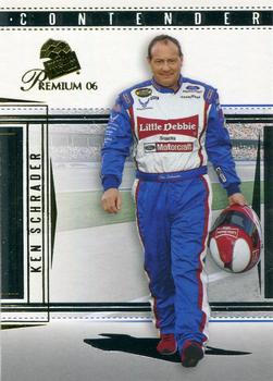
Wednesday, June 7, 2017Set: 2006 Press Pass Premium (Rate) “ Ken Schrader is one of those guys that nobody ever has anything bad to say about...and the same goes for his team on this card, the Wood Brothers, in operation continuously since 1953, NASCAR's oldest team. Founded by Glen Wood, who stormed the beach on D-Day in Normandy, and his brother Leonard, both are still with the team despite Glen crossing the 90 year old barrier (and Leonard's 88!) although their sons and grandchildren do most of the operations now. ” -Billy Kingsley
“ Kenny's doing the Saturday Night fever strut. ” -rmpaq5
“ I like the back a lot better than the front. Couldn't they have found a better pic of him? Good design otherwise. Reminds me, I need some more Little Debbies. ” -Doc Floyd
“ I was going to say The Right Stuff, but then I noticed LIttle Debbies. Then I thought of my grandkids. ” -Sportzcommish
“ Looks kind of cool. I think it has a lot of what a racing card should have. ” -muskie027
“ Not really a racing fan, but I'd at least like to see the car pictured too! ” -olerud363
“ OK racing card I guess. Don't know I don't follow racing. ” -captkirk42
“ back says 2006 will be his final season, he actually raced till about 2014 but only on a part time basis, still travels the country going to local short tracks ” -Thunderfoot
|

Tuesday, June 6, 2017Set: 1999 Pacific Revolution - Shadow Series (Rate) “ It's a Pacific! Too much stuff going on here. Which is typical for a Pacific card. ” -cnangle
“ I bet this looks really nice in hand. Not sure what to make of it based on the scan alone. ” -Billy Kingsley
“ It's ok, except for that hideous sunburst in the background. Thought he was a pitcher batting at first. ” -Doc Floyd
“ Cohesiveness was lacking between the Front-of-Card and Back-of-Card departments. The back looks like an appealing baseball card. The front as if Finley's appealing for an end to the paintball attack. ” -Sportzcommish
“ Uh, there is a lot going on here. Revolution? Shadow Series? I see neither a revolution nor a shadow on this card, but aside from that, as a SN insert, it looks kind of cool, but it also is missing something, not sure what. Overall, a slightly above average insert card. ” -muskie027
“ Steve Finley was a good player for a long time. ” -carthage44
“ Too loud, no former Buckeyes in the set, and looking at the Cardinals they're ok but not great. Zero interest in this set beyond getting those Cardinals. ” -Brimose
“ I have nothing nice to say about this card. ” -yokonashiwa
“ I think ancient aliens had something to do with the design of this card. I'm not saying it's bad...but it's definitely aliens. ” -mkaz80
“ I was in on a group break of these things a couple of years ago. In my book they are too flashy, but some collectors really enjoy them. ” -captkirk42
|

")