
Random Card of the Day |
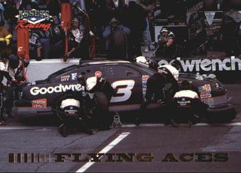
Thursday, June 22, 2017Card: #46 Dale Earnhardt's Car “ Great card...I just got my copy about two months ago. Technically this is a UER, as they listed Ricky Viers as Vier, leaving off the s on his name. I was not a big fan of Dale Earnhardt during his life, but after he was killed I realized that I missed his presence in the sport and that I was a fan and didn't really realize it. ” -Billy Kingsley
“ Props to the pit crews everywhere, I'm amazed at the speed you can service the cars, but this does nothing to inspire me to collect racing cards. ” -Sportzcommish
“ I had the pleasure of meeting Earnhardt before he died. I was working as a 20 year old at Bass Pro Shops in Springfield, MO. BPS sponsored two of his races that year, he had a BPS logo'd car, and he had come to the flagship store in Springfield for a photo op at one point. Since the store opened at 7, and the first two hours generally had few customers, he decided to wander around. He didn't even have his entourage with him. I was in the golf department, and he talked to me for nearly ten minutes about the latest clubs. Pretty spectacular moment for me. ” -Brimose
“ As an experienced Tire Guy, (Not pit crew, I might add,) I want this card. ” -Dixxy
“ Another Racing card for the RCotD that doesn't show the driver. ” -captkirk42
“ the man! interesting to see the back Andy Petree was no only crew chief but tire changer as well, dont see that anymore ” -Thunderfoot
|
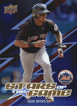
Wednesday, June 21, 2017Set: 2009 Upper Deck - Stars of the Game (Rate) “ Came on strong, flamed out quickly. That would be true for both Jose Reyes and Upper Deck. ” -Brimose
“ Upper Deck Insert? Man it looks like a recent Topps Insert. "GG"? Where does that numbering code come from? I would think it would be SG. ” -captkirk42
“ Not a star anymore. ” -carthage44
“ Not bad. Kind of a cool insert set. ” -muskie027
“ I kinda like the jagged lightning effect on the front emulated once again on the back. I'm usually not one who likes all the computer generated effects on cards, but this one works for me. ” -rmpaq5
|

Tuesday, June 20, 2017Set: 2010 Topps Prime - Retail (Rate) “ Despite the full frontal action photo the lack of a designed border to frame the card prevents me from labeling it as an elite product. It may deserve upper middle class status, but not higher. ” -Sportzcommish
“ I only collect Topps football so you think I would like this card. But how many sets does Topps issue each year?.....too many. Uninspired by this needless set from Topps. Plus, is that the best photo they could find? ” -cnangle
“ I do like Topps Prime most of the time. OK so the front looks like typical 1990s Upper Deck and the back looks like 2000s Panini. So what it is OK in my book. Getting soft in my old age I guess. ” -captkirk42
“ A real photo! A rarity on football cards of the day recently. Excellent scan as well. ” -Billy Kingsley
“ Free agent Eric Decker. ” -carthage44
“ Coincidence that this card appears so soon after Decker was released? Not quite full coincidence material, but still kind of funny. As for the card, I like the design. Haven't seen this set before, but it's sharp. ” -Brimose
“ For an action shot, it looks very posed. ” -kirkscards
“ I don't love the back, but I kind of like the front. I am not sure if a border is make or break for me, and this is a great photo. It does seem like something is missing on the front though. I would collect these if they were the standard Topps set. I am not a big fan of a company releasing 1,021 sets though. If I was around in 2010, I would have just collected the base Topps set. ” -muskie027
|

Monday, June 19, 2017Set: 1997 Action Packed (Rate) “ A one-off special paint scheme used only in the exhibition race in Japan. sadly I did not see this race as it was on TBS which I did not get at that time. I saw the final two held in Japan though. These races were a big deal? at the time as they were the first held by NASCAR not in North America since 1988, and the first in Asia. ” -Billy Kingsley
“ I used to buy Hot Rod magazine for the souped-up cars, dragsters, and funny cars, but have never been much into stock cars. Nice quality, though. ” -Sportzcommish
“ Wish I could read the back. Might be my eyesight, might be the color combo, might be the scan, or it may just be a combination of all three... but I just can't read the back... ” -Dixxy
“ Action Packed... does that mean this card has a raised feel car? If so, that's pretty cool. Overall not a bad design; clean, crisp, refreshing, (wait, sorry I got distracted) ” -Brimose
“ Take away the hideous banner at the bottom and this would be an excellent looking card. Ernie Irvan was my favorite driver when I watched NASCAR as a kid so I'm really happy to see him pop up on RCOTD. ” -ketchupman36
“ I'm so confused. ” -mkaz80
“ Action Packed. No I am not a fan no matter what sport (if these are like the baseball and football Action Packed sets). I don't mind cards of th.ick cardboard brings back some nostalgia for vintage cards but its the way it is folded that gets me. It is like a sealed cardboard stock envelope. Here is a racing card for fans who like seeing the car only. I'm sure some of the fans who follow drivers are a little ticked Mr. Irvan isn't on the card. ” -captkirk42
“ Terrible in so many ways. ” -carthage44
“ please bring back Action Packed!, never seen that hood design before though, since it says Orient espress i wonder if its from when Nascar raced japan ” -Thunderfoot
“ Not understanding the orient express part of this, I am assuming it is cause I just never really followed NASCAR. Maybe someone can explain it. The card is cool looking though. I actually think it is an awesome looking card. ” -muskie027
|
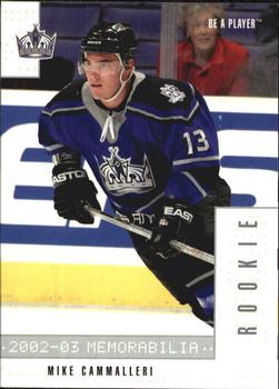
Sunday, June 18, 2017Set: 2002-03 Be a Player Memorabilia (Rate) “ The only exposure to Be a Player is on these random cards of the day and I have to say that I don't like it. They have a decent look and all, but the branding and fonts used on the front and back are what hurts it. ” -muskie027
“ I'd give it 3 out of 5 stars as it has some excellent qualities such as action picture, colors are vibrant, and bio on back. The placement of the team logo and Rookie bar take away from an otherwise appealing card. ” -Sportzcommish
“ We had one of these, I thought only a few weeks ago, but it was back on 21 March (currently on page 9 of the RCotD pages). Different card but same set. I said it there I don't like the computer printout (ticker-tape print) for the set name. Player's name needs to be more prominent. Rookie Bar should either be transparent or horizontal somewhere and much smaller if a solid block. Back is OK I guess for this type of set. I'm guessing it is the base for a relic set. ” -captkirk42
“ Be a Player maybe but they are not Be a Card Producer that is for sure. ” -carthage44
“ Nice rookie card of on of the better players of recent years. ” -DarkSide830
“ Pretty solid card. That LA Kings logo is kind of forgettable though, if I hadn't gotten into hockey recently I wouldn't have known which team it was. ” -Billy Kingsley
“ If the title says "memorabilia", it should not be a plain card. ” -NJDevils
“ Not a big fan of this set , this card is not bad. Cammalleri is a great player wish he could of stayed with the Habs. ” -uncaian
“ It's so nice that his mom is in the front row to watch him play; ” -kirkscards
|
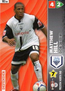
Saturday, June 17, 2017Set: 2007 Panini Coca-Cola Championship (Rate) “ The rare athlete born in the 26th month of the year. ” -Billy Kingsley
“ I'm not familiar with soccer cards at all. This looks like an MLB Showdown type of game card. Very busy front. ” -olerud363
“ I will be spending the day deciding which card is worse, this one or today's COTD "2000 Future Bee Power League Dream Stadium".........not. ” -NJDevils
“ 2nd division English football. This is like a minor league baseball card. ” -deporcoruña
“ Panini. Soccer. Meh. ” -jayoneill
“ Is this a game card? I don't understand. ” -carthage44
“ A soccer TCC? Back is very cluttered with all the teams in the league logos ” -captkirk42
|


Wednesday, June 14, 2017Set: 2001 Pacific - Hobby LTD (Rate) “ The Hobby LTD markings really show up well on this scan. ” -Billy Kingsley
“ Another useless Pacific variation. ” -cjjt
“ Pacific always produced a bunch of parallels. ” -carthage44
“ Pretty cool card front and back. Pacific is usually that way, sometimes they are way out there too flashy and wild, but this design is OK. Two things I don't like about it though, the watermarking of "Hobby LTD" I thought was a watermark from whoever scanned the card. I didn't realize it was actually on the card. Then the rounded corner on the back I thought was really one intentionally rounded corner (the scan is slightly askew so it could use a better scan sometime) and thought it was odd showing the regular variant for the front and a round corner for the back. The round corner is part of the design of a regular square cornered card, difficult to tell from the scan at first. ” -captkirk42
“ I don't like the printing on the front. Otherwise, everything looks nice! ” -TradingCards964
“ I'd limit these too. ” -Sportzcommish
“ Yay! Da Bears! But are there even 99 people who'd want this card? ” -DanD
“ Not bad, not great. Hate the "Hobby" words across the card. ” -muskie027
|

Tuesday, June 13, 2017Set: 1995 Megacards Ken Griffey Jr. Wish List (Rate) “ ...that horrible moment when you realize you're tagging the ump in the face instead of the baserunner... ” -revnorb
“ Cool action shot! ” -olerud363
“ One of the better action shots I have seen on a card. ” -carthage44
“ Fun photo. Wonder who the catcher is? Incidentally, The Kid finished with 1662 career runs scored, well short of that projection but still elite. ” -Brimose
“ Incredible photo! I don't know where to look first. As for Megacards, I can't say I'm familiar with the company. But, if this is any indication of their product, it's worth further inspection. ” -mkaz80
“ Cool action shot, that is about all I can say about this one. ” -captkirk42
“ Great photograph, but the card looks like a bare Upper Deck or Topps Stadium Club. ” -Sportzcommish
“ Picture is cool, but I really don't like this. I don't get it. Let's make a set where we take a player in his prime, project his stats over a career and then make cards on stats that will never happen. Griffey missed this "projection" by 699 runs. Not even close. There could be sets of guys with 899 home runs, and 5,145 hits, and maybe even someone with 100,000 RBIs if they played one game and hit like 7 in it. Just an idea I am not really on board with I guess. ” -muskie027
“ Nice action shot ” -aussiewayne
“ Great Action Shot! ” -kirkscards
|

")