
Random Card of the Day |
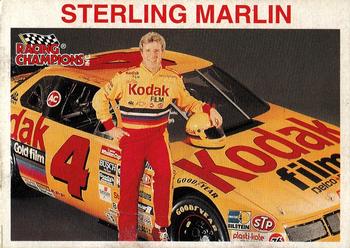
Saturday, March 11, 2017Set: 1994 Racing Champions Stock Car (Rate) “ Front is ok, but there's something weird about the back.And funny name. ” -Duke
“ Here's first for the Card of the Day...this is the 1994 card shown. The 1995 card used the half gray box with facsimile signature and a close up head shot. Sterling won the Daytona 500 in both years becoming the first driver to score his first two career wins back to back in the most important NASCAR race of the year...and remains the only one to do that to this day. ” -Billy Kingsley
“ This looks way more retro than 1995. That just be me showing my age. 1995 doesn't feel like it would have that old of a look. The back is awful. ” -muskie027
“ NASCAR fans get their cars with this series. Just for the record: I've never bought a product based on advertising in racing. ” -Sportzcommish
“ More sponsors please. ” -carthage44
“ These came with a diecast car, this was one of the first cars/cards i got. Sterling won back to back daytona 500's in 94 and 95, won a couple other races in the mid 90s then nothing till 2001/2002 where he won another handfull of races and i think was leading the points when he got hurt at kansas ” -Thunderfoot
“ Racing Champions... Sterling Marlin... I'll give this a 5 out of 4 stars. ” -UKboogie
“ Super simple Racing card. Racing fans is it possible that this is one of the cards that came with the die-cast cars? ” -captkirk42
|

Friday, March 10, 2017Set: 1991 Upper Deck - Team Logo Holograms (Rate) “ I love holograms! Always have, always will. They don't usually scan very well but this one is not bad at all. I have two from this insert but not this one. Somebody wrote their name on the back of them though, but the hologram itself is fine, so I am happy. ” -Billy Kingsley
“ Interesting and nice cotd. Good way to start a day. Looks nice when scanned but I have couple of these early UD Hologram cards from hockey and they just don't look good at hand. ” -Duke
“ Nice cards to display with lighting, not so in a binder. I used a select few - the first ones I pulled from packs - to stick on the inside of a binder where no light hits them. Regrettable. ” -Sportzcommish
“ Well they were better than gum that tasted like cardboard after 10 seconds and usually disintegrated into nothingness in the pack ” -rmpaq5
“ Ah hologram cards. When they first appeared in the early 80s as a novelty insert I loved them thought they were great, even though it is hard to see what is on them if you don't see them at the proper angle. Once holograms became more of a regular thing and foiled lettering on foil backgrounds became mainstream for the super overproduced years they lost their appeal on me. ” -captkirk42
“ I laughed when I saw this. First off, it's a non-premium insert, basically it's UD's gum like Fleer had stickers and Donruss had puzzle pieces. Second, I am actually trying to put together the full set of these to go in my 1991 UD set and I'm missing ONLY this one. One day... ” -vrooomed
“ Loved putting these stickers on my card binders. ” -carthage44
“ I really liked the 91 Upperdeck Holos. The football groundbreakers are still some of my favorite cards. ” -SFC Temple
“ Now we know for sure, RCOTD indeed is random. ” -dilemma19
“ No stats on the back ;| ” -dilemma19
“ Let's Go Mets! ” -armac
“ On the positive it's the NY Mets. On the negative it's a hologram. To paraphrase Will Rogers, "I've never met a hologram I liked." ” -C2Cigars
“ Slightly better than the hockey ones Yzerman , Hull ,Messier etc.... ” -uncaian
“ These were neat little inserts in the Upper Deck packs. I liked when they made these the same size as cards as opposed to the smaller circles or rounded edge squares from the prior years. The off-sized inserts were always annoying from a storage perspective. I'll never forget how cool the hologram stuff was when I was younger. Upper Deck did a great job as the 3D effect on these was really good. ” -muskie027
“ not much going on here, but i can say i've always like when teams are named with something to do with where they are, hence mets=metropolitans ” -Thunderfoot
“ Once I put a set together, I used to give these away to other friends/collectors/fans. Probably going to be a lot of haters for these, but these were far cooler in 1991 than the Fleer team stickers of the era. ” -hphillips
|

Thursday, March 9, 2017Set: 2001 Leaf Rookies & Stars (Rate) “ Not a bad design. Nice to see an actual photo and not just a cut out of the player over some digitally created backdrop. ” -Billy Kingsley
“ Not big into Rookies & Stars. This is OK if a bit odd design. back is a bit lacking. Ah an Anderson card I need to hunt down for my semi niche Andersen PC ” -captkirk42
“ The Rookies & Stars sets might be my favorite sets in the past 20 years! ” -carthage44
“ Classic running back pose. Look at that hole he has to run through. ” -Brimose
“ Good design--before R&S got all cut-out weird. ” -cjjt
“ I thought that was some kind of gunk on the card below the team name then I realize it's "feets" ” -NJDevils
“ Finally a football card with game background instead of digitized background. Mike Anderson, man did he have one awesome season. I like the look of this card, surprised it comes from 2001 since usually the early 2000's seem to be always on my hate list. The only complaint is the lower case first name and all capped last name. I hate playing with the caps and lower case to try to be cool. It is too gimmicky. Other than that, a solid card. ” -muskie027
“ Big fan of the Leaf R&S designs year after year. Admittedly I couldn't find a lot of them, so the few that I have pretty much only exist in my PCs, but still one of my favorite set designs. ” -jasongerman9
“ This was the start of R&S rolling out some of my favorite sets ” -Thunderfoot
|
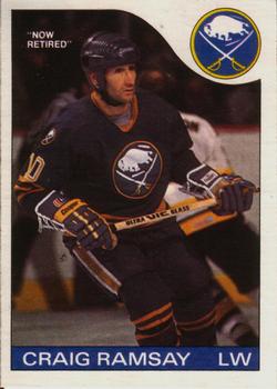
Wednesday, March 8, 2017Set: 1985-86 O-Pee-Chee (Rate) “ Cool! I am really enjoying hockey- I wish I had taken up the sport sooner. Better late then never. ” -Billy Kingsley
“ I like this one a lot. Cool retro hockey card with nice photo and design. No OPC on the front, clear name and position, big team logo and now we all know he is retired. What's not to like? ” -Duke
“ It always seems odd to me that a buffalo is always part of a Buffalo teams' logo. Shouldn't the team name be the emphasis? ” -Sportzcommish
“ One of my favourite hockey designs of the 1980s - eclipsed only by the years immediately before and after it - although this one seemed to borrow quite heavily from the 83-84 Vachon food issue. ” -bevans
“ Like this design. You don't see many players in any sport spending their entire long career with a single team these days. ” -rmpaq5
“ He looks like the guy from X-Files. ” -carthage44
“ Nice. I was going to say Vintage but mid 80s isn't, well OK technically depending on your definition of Vintage and how many years you consider vintage to be. Oh love the "Now Retired" notice. I don't think I've seen that. OPC is known for their traded "Now with ____" notes but I don't recall seeing "Retired" maybe I don't get around to OPC that much anymore. ” -captkirk42
“ Love "Now Retired" ” -cjjt
“ "Now retired". Never saw that before ” -NJDevils
“ Nice , love this set Ramsay was a mainstay in Buffalo very popular. ” -uncaian
“ Thumbs up for the "now retired" indication. ” -dilemma19
“ Methinks an airbrushing of a knee-long, white beard is appropriate here. ” -DanD
“ Retired? I thought he finished up his career in Detroit?? *checks hockey-reference* oh, that was MIKE Ramsey. Anyway, congrats on your retirement, Craig. ” -Howintensive
“ LET'S GO BUFFALO!!!!!! I am in heaven, a Buffalo sports figure as card of the day! Love the card, love the player, love the Sabres, love the Bills, love Buffalo!!!!!!!!!!! Seriously, this is a great card and design even for the non-Sabres. A solid classic from a great age of sport card designs! ” -muskie027
“ Simplicity of design, everything is there, I like it even though I don't care for hockey. Seems to be a lot of hockey and football on rcotd lately ” -hphillips
|

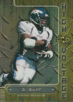
Monday, March 6, 2017Set: 2000 UD Ionix - High Voltage (Rate) “ They couldn't fit his whole first name on the nameplate? It seems a bit washed out but I don't have any of these in hand to be sure. The inserts in Ionix were usually pretty bright. ” -Billy Kingsley
“ This is when Denver was churning out a new running back just about every season. ” -carthage44
“ I guess if the design had brighter colors I might like the front. Back ugh. Did they get inspiration for the design from looking at a 3.5" floppy disk? ” -captkirk42
“ Never like any Broncos cards. Especially IONIX. ” -RoyalChief
“ What does diamond tread plate have to do with football? Or high voltage? Overall, one ugly card front and back. ” -C2Cigars
“ No sir, I don't like it. ” -muskie027
|


Thursday, March 2, 2017Set: 2006 Wheels American Thunder (Rate) “ One of the many pointless subsets Press Pass produced instead of figuring out that a NASCAR set should show the cars. I don't really miss them much, Panini is doing a decent- but not perfect-job with them...but they are not cramming multiple useless subsets down our throats so it is an improvement. ” -Billy Kingsley
“ Nice and colorful, even joyous, but it took me a second to locate the driver's name. I'm not into NASCAR so I don't recognize the face, nor the name after seeing it. ” -Sportzcommish
“ We are back to a NASCAR card of which I have no idea about. Looks good to me. Racing fans will probably scream that it doesn't show his car or any of his stats from that season. ” -captkirk42
“ I like the information about the track on the back, and how it is connected to Harvick. ” -rmpaq5
“ Must have gotten a winner in his coke bottle cap. ” -NJDevils
“ Thank goodness someone pulled a NASCAR Nation card! Oh wait, it is Kevin Harvick. This is not a knock on the foil lettering as much as it is on how the font size for these two items on the card should have been reversed. Other than that, not a bad card, and not a great one. Not sure what makes a great racing card, but I'll give this an ok. ” -muskie027
“ had to double check to see if he was holding a coke or a mr pibb ” -Howintensive
|

")