
Random Card of the Day |

Friday, March 24, 2017Set: 1993 Magic the Gathering Beta (Rate) “ I almost thought this was a religious set, then I realized it was a game card. Not my cup of tea. ” -muskie027
“ This game has been around awhile so I wonder if any of these older cards are worth anything. ” -carthage44
“ So... dude with horns? ” -Duke
“ Don't have the first clue about this game. Nice back of card design. Not much in the way of numerical stats. Playing Magic the Gathering must be like doing a word problem in math class. ” -CollectingAfterDeath
“ ugh, another card & comic shop killer ” -hphillips
“ I preferred the key master from Say Anything to the deck master. ” -UKboogie
|

Thursday, March 23, 2017Set: 2002 Topps Gallery - Heritage (Rate) “ Is he upset because Ace Ventura hasn't found the dolphin yet ? ” -uncaian
“ Not a Dolphins fan, but I absolutely LOVE this card....old school design with the painted pic make it a QB keeper! ” -tbshaw
“ I collect Marino cards, and probably would want this one, but would be less than enthusiastic when receiving it. There's just something about its similarity that bothers me. I'd prefer a replica. ” -Sportzcommish
“ Nice retro card. OK this is a "Gallery" card with a "Heritage" design. As far as retro cards go its OK. I like the recreation of the back design, but I've never been comfortable with the retro design being SO close to the original yet due to the faded or funky coloring seems like a cartoon version of the original instead of a faithful or in this case semi-faithful recreation. ” -captkirk42
“ Ehh... ” -carthage44
“ Looks like a drawing from Batman comics. ” -NJDevils
“ I equally love and hate this card. And it has nothing to do with the player, whom I agree is a legend but never played for a team I cared about, so I was always more or less indifferent to him. ” -Brimose
“ At first I got excited that a great classic card was ROTCD. Then, I looked and saw it is another of the Heritage/Reprint type things. The original card - awesome. This - not awesome. ” -muskie027
“ Wow nice card!!! ” -RoyalChief
|
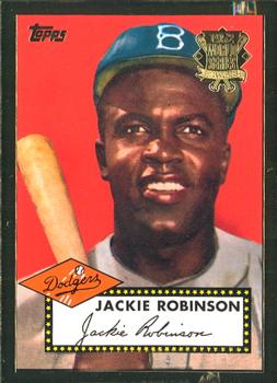
Wednesday, March 22, 2017Set: 2002 Topps - 1952 Reprints (Rate) “ I like the reprint ,except for tacky gold label . ” -uncaian
“ Who cannot love this? Some may think the bold borders are over the top, but I have always thought they have some class....goes well against the red background. Love me some Jackie Robinson! ” -tbshaw
“ Classic American icon. Classic baseball. Classic baseball card. Too bad it's a reprint. ” -jayoneill
“ Nice reprint. I don't like the logo seal (after a little search it reads "1952 World Series) Black border is nice and actually makes the background red pop some. ” -captkirk42
“ The gold foil ruins the entire card. ” -carthage44
“ Love it! And the fact that the budget conscious have access to it makes it more appreciated as long as we stay away from eBay hawks treating it as an original. ” -Sportzcommish
“ Never been a huge fan of reprints. ” -kirkscards
“ Great player, great original card, not digging the border on this one. Why mess with the greats. I don't like reprints. Let the originals stand as is!! ” -muskie027
|

Tuesday, March 21, 2017Set: 2002-03 Be a Player Memorabilia (Rate) “ Not long ago since last time Sabres card was represented as RCOTD. And 02-03 BAP Memorabilia was RCOTD at mid February. ” -Duke
“ I'm glad the Sabres didn't keep this logo. ” -Billy Kingsley
“ Front of this set could use some improvement. Rookie bar too big, should have team name at least the team logo is there. Player's name should be bigger more obvious. Font for set name looks too computerized temporary. Back player's name and team name should be much bigger card number should have better font, not the same digital font as the set name. ” -captkirk42
“ Not a bad set , just very exciting. "Goose" played 12 seasons mostly with Buffalo. Fan favorite. ” -uncaian
“ Kind of uninspired card design; I don't paricularly care for the dot matrix font. I haven't collected hockey in decades but I do remember companies like Be A Player and Between the Pipes coming and going briefly. I miss the days of Topps/OPC! ” -olerud363
“ Nice color and action pic on the front, and informative write up on back. Both sides are balanced in content and placement. I currently do not own hockey cards, but I think this is easily an above average card. ” -CollectingAfterDeath
“ I thought they shot buffaloes not kill them with sabres? ” -NJDevils
“ One game, 5:48 ice time and he gets a card. He wouldn't return to the NHL until 2005. Good thing about the card, it's a Sabres. Bad things; the ugly uniforms years and it's a stupid non-memorabilia "Memorabilia" card. ” -C2Cigars
“ Recently retired Paul Gaustad! He was a tough customer that could also win a faceoff. ” -Howintensive
“ I always thought that memorabilia cards had some you know... memorabilia. Oh well, what do I know. Since I know nothing about Hockey or the players, I have know idea if Paul Gaustad was ever a good player. ” -yokonashiwa
“ Woo hoo!!! I get to say it again....LET'S GO BUFFALO!!!! What a month for Buffalo on the RCOTD! Gaustad wasn't any Craig Ramsay, but I'll take it. I loved these Sabre jersey's when they came out, now, I really dislike them. Blue and gold baby! I believe we had one of these Be a Player cards a few weeks ago and talked about the Memorabilia stripe and what it meant. I don't like the card, but love the team! Now we need a Bill! ” -muskie027
|

Monday, March 20, 2017Set: 2000 Pacific Invincible - Kings of the Diamond (Rate) “ As Mets fan, I always cringe when I come across his cards in my team set collection. When I see his name on a team set wantlist, I think, "Do I really want this card?" He was a good player and a MVP, but not for the Mets. A painful reminder of a bad free agent signing and bad seasons in general. ” -joshthurman
“ My family loves playing cards so these or any of its ilk would ever remain in mint condirtion. ” -Sportzcommish
“ These would have been cool if you could have used them as playing cards but they are all kings so that would be fun! ” -carthage44
“ Love this set I have it and the Diamond Aces set that is similar. ” -captkirk42
“ I met Mo at a club in Columbus about 15 years ago, when clubs were still kind of cool. Big dude. Nice guy, at least during that night. ” -Brimose
“ Never could see these as collectibles. But, I love playing cards with them! The back looks like it should be NASCAR. ” -jayoneill
“ I don't like it. Makes my head spin. ” -muskie027
|

Sunday, March 19, 2017Set: 2010 Panini Gridiron Gear - NFL Nation Jerseys Combos Prime (Rate) “ Well this is cool. Rare card as RCOTD. Almost didn't see /25. Positive feelings. ” -Duke
“ Wasted space. ” -Sportzcommish
“ Tight! ” -carthage44
“ I heard some rumblings that product was being put out that was not actually game worn/used. Regardless, if true or not, I think these kinds of cards are fun & cool! ” -bkklaos
“ Nice card. I like it. I like the yellow material and it's unusual to see Panini tell you what kind of material you are getting. Usually they are much more vague than that, but I wish they did tell you. ” -Billy Kingsley
“ Cool swatches. Okay design. Horrible back. ” -cjjt
“ First I've said many times I'm not a fan of relics (game used, materials, jersey) cards to begin with. This one is just way too busy on the front. OK so where is the player's name on this front? OK it IS NOT. It is only on the back and the back is so blank it might as well be just a plain white blank back. To think I actually liked Gridiron Gear around 2006/07 or so when I first saw them, then grew very tired of them within a year or two. ” -captkirk42
“ Just odd. Nothing good to say about this at all. ” -Doc Floyd
“ As an insert, this has a great look. It's funny how I can love a design as an insert and not as a base set, and vice versa. Very colorful and not so much going on that it gives me a headache. A name somewhere would have been nice and the back leaves something to be desired, but not too bad. ” -muskie027
|

Saturday, March 18, 2017Set: 2003-04 Pacific - Blue (Rate) “ My first RCOTD selection! Finally it happened. This belongs to my own Blackhawks collection. So, of course I love this one. 5/5 ” -Duke
“ Nice blue parallel. I am one of those people that actually likes parallels. ” -Billy Kingsley
“ I would never even think it in his presence, a self-preservation thing, but I did a doubletake as I don't follow hockey, my first thought was I didn't know women played in the NHL. Nor did I realize Jocelyn was a unisex name. ” -Sportzcommish
“ Clean picture and design. Back has tons of stats. Good. Bad. One of the reasons that Pacific sucked is they had all these variations. Blue version -- okay. But could have you do something more? Like make all the white area at the bottom blue? Back of the card blue? Uggh. ” -cjjt
“ Stats show he weighs 170 lbs. Looks like a sumo wrestler with all the gear on. I am waiting for the day when a team does suit up a sumo wrestler and has him just lay in front of the goal. ” -NJDevils
“ He was the bridge goalie before the Blackhawks started to become an elite team. ” -carthage44
“ Nice card , Pacific usually had nice cards. Thibo was part of the Roy trade to the Avalanche & he won the last game at the Montreal Forum. ” -uncaian
“ If it wasn't or the Blackhawks sweater, I would swear this was a junior hockey or minor league card just based on the design. It just has that feel. Thibault wasn't bad for awhile back in the day. The photo is cool, but the bordering, name, logo, position and company logo all leave something to be desired. I do like the back. ” -muskie027
“ Nice overall design. I like it. Now the thing I don't like? This is the "blue" variant and is serial numbered. Now the reason it is the "Blue" Variant? The Foil Logo in the top left corner on the front. Not much of a variant to me. It is about as variant as when Topps uses it's vintage logo vs. its modern logo, or puts the logo on the right instead of on the left. ” -captkirk42
“ Quebec used to be a goalie factory. Can't think of any now off the top of my head besides Marc Andre Fleury. ” -DanD
|
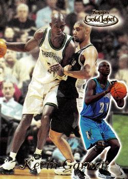
Friday, March 17, 2017Set: 1999-00 Topps Gold Label (Rate) “ I have couple Topps Gold Label hockey cards in my collection. I lile a lot. Good quality and stock. They have nice shine on them. ” -Duke
“ I love this set. Scans don't do it justice, I know because this is my scan. In hand the card is like a Refractor on steroids-it's extra thick and the background has all the colors of the rainbow no matter how the light hits it. The lettering is embossed as well. I still have not completed the base set yet, which is bad because it's only 100 cards. I did pull my first 1/1 from a single pack purchase in 2000 from this set, and the scans of that are posted here. If this set was larger than 100 cards it would have ranked in my top 10 favorites of all time. ” -Billy Kingsley
“ I have an aversion for pictures of spiders and snakes AND for ugly cards. Somebody turn the page! ” -Sportzcommish
“ I always liked Gold Label. High quality pictures and stock. Good design. ” -cjjt
“ I'm So-So on this set/concept. The cards are nice and thick. For collectors of variants it is cool that they have 3 levels/classes (at lest the Baseball had 3 not familiar with the Basketball version). Never liked the mishmash of photos on the front, the back is OK but lacking with just one year of stats. ” -captkirk42
“ The dual photos on front of card are terrible. ” -carthage44
“ One of the best big men ever, and this photo has him against the only contemporary of his that actually was better. And not by much. ” -Brimose
“ Is KG significantly taller than Tim Duncan? I wouldn't have thought so... I don't hate anything about this card, but neither is it a design I'd be excited to collect. ” -dilemma19
“ I like Gold Label a lot. Thick stock, gold foil stamping, chase parallels. Boxes of hockey aren't terribly cheap or easy to find, though. ” -suomibear8
“ Looks like he's helping an elderly patient with dementia walk. I assume this is how KG and Timmy have to get around these days. Very strange card. ” -sahal694
“ Nice thought, bad execution. It looks like a battle of giants about to all on a normal human who was caught in the crossfire. Too busy, which is hard to do on a card without a border. The back would be great with annual stats instead of the current year and career. I don't know why that is such a popular format for these companies. Card collectors like STATS!!! Give us the STATS!!!! ” -muskie027
|

Thursday, March 16, 2017Set: 2010 Donruss Elite (Rate) “ Elite card ” -Howintensive
“ I like Elite, overall. That series has featured some nice set designs through the years. This is not one of them. Tough scans, true, but let's not make excuses; the 2010 issue is ho-hum. Nothing special about the front, especially at the time. The back design is functional, with a nice overall layout. Similar layouts can be found on the backs of many Donruss (and later Panini) football releases from 08-10. ” -rolmodel12
“ Aren't you supposed to show us another Panini card beside it and ask us to spot the differences? ” -Sportzcommish
“ Another mirror foil messed with photo football card...I feel bad for you football collectors, having to deal with so many of these. ” -Billy Kingsley
“ Elite used to been an interesting set, but once Panini got ahold of it, it has become very dull. ” -cjjt
“ The last of Donruss before they dropped the Donruss from the name. ” -carthage44
“ Like some of the Elite sets. I am very bored of this one. back is OK but the mostly foil front I don't like. I think I have this card cause I have a semi PC of Flacco. ” -captkirk42
“ He looks lost. Maybe trying to find the field/stadium/his teammates behind the nebulous dark background... I appreciate the blurb on the back. I learned something new (albiet useless) today. ” -dilemma19
“ Over / under on the number of comments lamenting an action photo on a graphic background... 3.5. ” -Brimose
“ Kickers wish the goalposts were like the ones on the back of the card. ” -NJDevils
“ Another football card with a player in front of some artistic background. The ROCTD is on a roll with these lately. Not bad overall, but leaves a lot to be desired. It looks like Panini really sticks true to the design backs. Would a year by year breakdown of stats kill them? I prefer that to the most current year and career stats. ” -muskie027
“ Such an overrated QB in my opinion. At best I view him as league average, but I know others like him. I like the card ok, but I'm tired of the designed background like this. Give me a posed image on the field even. ” -Mitch
|

Wednesday, March 15, 2017Set: 1986 Fax-Pax Football Greats (Rate) “ Hmm? Pro Line predecesor? Next! ” -Sportzcommish
“ 1980s? Fax-Pax? What? Ah FOOTball aka Soccer. That is why I didn't know what the brand Fax-Pax was. ” -captkirk42
“ I guess as time goes by these might be close to be considered "vintage", but regardless, I think this is a cool set (despite the non-traditional size)! ” -bkklaos
“ Actually a nice "soccer" card. Football threw my North American mind for a sec. . ” -uncaian
“ I had to read the back to find out just what sport he played. Looks like soccer. Would have been nice to discern that from the front. I don't like this. What is he wearing and why did this picture make for a great card. Whoever came up with this, I would just like to know what you were thinking? Maybe I am missing something. I thought maybe by looking at it that this was a tribute to the great door o door salesman of the 50's or something. ” -muskie027
“ OK. Who's lookin' for a helmet? ” -deporcoruña
“ 30 goals in 33 international matches=wow! ” -rmpaq5
“ Looks like a younger, skinnier Steven Seagal. ” -suomibear8
|

")