
Random Card of the Day |
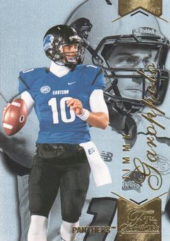
Sunday, September 4, 2016Set: 2014 Flair Showcase (Rate) “ GO JIMMY! Representing Eastern Illinois!!! ” -carthage44
“ Never heard of this guy or his team. After a quick search I see he will be the starting QB for the Patriots this year (first four games at least). Another reason I love random card of the day! ” -RoyalChief
“ The side view of that far-away eye stare down field looking for the open receiver....now that's what football cards are made of. Go Pats! ” -flcardtrader
“ In the white(silver) helmet pic, looks like Kerry Collins to me. ” -NJDevils
“ Looks OK for a College set. I'm not a huge fan of college sets. Can sort of read his name at least "Jimmy" can't tell what the foil stuff at the bottom reads.I think the team name is there and does that read "Flair Showcase"? Back is OK pretty standard for an Upper Deck product. ” -captkirk42
“ Ugly card of Jimmy who? Oh, a 2014 Draftee. A benchwarmer for New England. And of course he has 1,140 cards already. A little perspective, Johnny Unitas had about 25 cards during his entire career. ” -C2Cigars
“ Would've been better to use the back pic on the front. ” -Doc Floyd
|
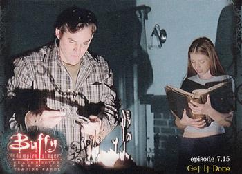
Saturday, September 3, 2016Set: 2003 Inkworks Buffy the Vampire Slayer Season 7 (Rate) “ A Buffy card with no Buffy? Certainly is a bag of tricks. ” -Doc Floyd
“ Honest to God, I said to myself "qb24" before I looked at who scanned it! Don't have any of these, never watched the show, but I love it! Keep 'em comin' "qb24"! ” -bkklaos
“ Raise your hand if you had a crush on Buffy? ” -carthage44
“ Not interesting to me, since I am completely unfamiliar with the characters, but a fan of the show would probably like it. It looks fine. ” -switzr1
“ Buffy! OK but a boring looking front image. Back is pretty good. Looks like it gives a brief synopsis of the episode featured on the card. ” -captkirk42
|
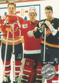
Friday, September 2, 2016Set: 1991-92 Pro Set Platinum (Rate) Card: #280 Gary Roberts / Tim Cheveldae / Trevor Linden “ Sub-par lineup. ” -carthage44
“ For all the jokes that are made about ProSet they still managed some nice cards. ” -Lennoxmatt
“ This set really dropped the ball by not having any names at all on the front...and when they do appear on the back, they are in cursive and not always easy to read...especially if you don't know much about hockey and don't know what the names you're seeing are. I was given a large stack of this set last year. The photos chosen are good, that's worth noting. ” -Billy Kingsley
“ Nice card for some kind of commemoration of an event. This is a set I'm not 100% thrilled about. I think the Platinum circle/medal on the cards in the set is too big, and if it says anything other than "Platinum" it can't be read. Odd because normally I like Pro Set sets even though they tend to be bare bones. ” -captkirk42
“ Make fun of Pro Set all you want, but this set is very easy on the eyes. ” -DanD
|
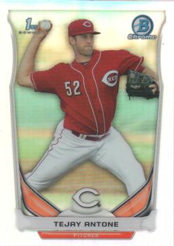
Wednesday, August 31, 2016Set: 2014 Bowman Draft - Chrome Refractors (Rate) “ I have no problem with the front, but the bar graph stats on the back are just awful. ” -rmpaq5
“ I like refractors. The 2014 Bowman design was very nice. So this card works for me. ” -vrooomed
“ I love refractors. It doesn't matter what the subject is, they are ALWAYS great. I've never heard of this guy but there are a lot of baseball people I don't know, so that probably doesn't mean anything. The back of the card doesn't make too much sense to me. You don't see bar graphs on cards very often but the labels are so small I can't make out what they are. ” -Billy Kingsley
“ The bar chart shows me that he pitched well in college. Both the player and the card design are forgettable in all respects. ” -dilemma19
“ Refractors are always very difficult to scan. ” -carthage44
“ Way too much border for this card ” -aussiewayne
“ Not much good I can say about this card. I like the front design that is about it. I DON'T like: chrome cards, Bowman Draft and Prospects, the back of the card, the numbering Bowman does with their cards. ” -captkirk42
“ Cool looking card but man these subsets are getting confusing! ” -Joshua825
|

Tuesday, August 30, 2016Set: 1964 Phillips Choice Tea Army Badges Past and Present (Rate) Card: #23 The Royal Fusiliers (City of London Regiment) “ This is freaking cool. A card and a history lesson all wrapped up in one. ” -rmpaq5
“ Way cool. This is the kind of stuff I love to find in non-sports. ” -Billy Kingsley
“ Wow. Definitely not the normal Card of the day. I like it ” -Lennoxmatt
“ Neat , it's nice to see cards that educate & look good . ” -uncaian
“ Well now, thats cool! ” -RoyalChief
“ This is cool if you are a collector of army memorabilia. ” -carthage44
“ Neat set. I like military badges and the write-up on the back is interesting. Unlike many modern trading cards, this is a worthwhile issue. ” -dilemma19
“ Oh nice non-sport vintage. I thought it was much older vintage tobacco era, but it is mid 1960s. Nice very good change of pace from Soccer CCG cards and 1990s minor league baseball and the occasional awful late 1990s early 2000s Football. ” -captkirk42
“ Love this oddball card! ” -NJdevils
|


Sunday, August 28, 2016Set: 1999-00 Upper Deck MVP - Hands of Gold (Rate) “ Overall nice looking insert. The torso insert picture though is a bit much. ” -rmpaq5
“ Was so happy to see him make the HOF. He was so dominant on the ice, when he was healthy. About 2/3 of the hits he took are illegal now. A shame they weren't then, he could've had a longer playing career. ” -vrooomed
“ Interesting insert design. Great scan for a mirror foil. Hands are very important in most sports but I didn't know there was an insert set based on them. ” -Billy Kingsley
“ Look at the inset. His hands are actually gold! Great player, nice photo, but the world would have kept spinning even if Upper Deck hadn't printed this card. ” -dilemma19
“ Hands of Gold.....meh. ” -flcardtrader
“ I thought this guy was supposed to be the next big thing? ” -carthage44
“ front isn't bad, but back is horrible, but what can you expect from Upper Deck, I'm just happy if I get something from them that isn't dinged ” -Lennoxmatt
“ UGH as in UGLY. Is his name even on the front there anywhere? I just see the vertical "Hands Gold" OH the "OF" is horizontal in the middle. This card BETTER look better in real life. The back I thought that writing was one of those hedge mazes. Upper Deck MVP is usually pretty bad but this one is worse than that. I think this takes the cake as the WORST MVP set ever. ” -captkirk42
|

Saturday, August 27, 2016Set: 2009 Press Pass - Blue (Rate) Card: #178 Michael Waltrip's Car “ Great action shot. I'm not into racing cards, but from what I have seen of them the fuel lit on the track really adds to the story of the picture, rather than a bland picture that looks like a picture of any other card. ” -rmpaq5
“ My first reaction was to look for a Montoya vs. Jet Dryer card. ” -volbox
“ Wow a surprise. Glad to see something other than a 1990s prospect rookie card or a minor league card. Really glad it isn't a soccer game card. ” -captkirk42
“ This pretty much sums up the lifespan of MWR pretty well. Started with scandal, ended with scandal, and now no longer in existence after throwing two of its drivers under the proverbial bus. 2009 is one of the best Press Pass sets and the only one they ever issued a series 2 for. The blue parallel was one per retail pack. ” -Billy Kingsley
“ Cool looking card, not sure it's a moment Mikey wants to remember though ” -Lennoxmatt
“ Sadly ,Billy Bob & Jolene realized a minute too late, putting your BBQ on the track to get closer to the action was a bad idea ! ” -uncaian
“ Nice card, something different for a change. Good old dependable randomizer. ” -NJDevils
“ Did he just hit 88 MPH? ” -DaClyde
“ Wow, great shot, would have looked a lot better border-less, but good card anyhow. ” -Doc Floyd
“ Not too hard to pick out a BK scan. ” -UKboogie
|

Friday, August 26, 2016Set: 1999 Topps Traded and Rookies - Autographs (Rate) “ Another auto popping up on Card of the Day! While not the hard hitting Jeter we saw last week, this is a solid looking card. Well framed and the auto location doesn't get lost in the picture. ” -rmpaq5
“ Is this the regular version or the Gold? Regular OK. Hard to read his name. Would like team logo. Hey it looks like he is wearing a t-shirt not a jersey. Back looks good, hard to read but maybe better in hand. ” -captkirk42
“ Nice card. Good photo (and scan) great design, a full bio and stats, which is rare to see on autograph cards. At this time period autographs were pretty tough pulls if it was anything like the NBA set. ” -Billy Kingsley
“ Great action shot, and a good solid design, front and back. Decent signature to boot. ” -Doc Floyd
“ I'm sure lots of people will say they hate the gold borders and foil, but I think it works. Complete card back, and not too crowded. I'm glad the "Certified Autograph Issue" indicator is no longer used. ” -dilemma19
“ They need to produce more on-card autos. ” -carthage44
“ My first Card of the Day! I like this set, no sticker autos. Still looking for 5 autos to complete the set if anyone wants to trade. ” -CluelessJoe
“ Cool to see an autograph as card of the day. 1999 is probably my least favorite Topps baseball design but I like cards of obscure players that I don't remember, so this one would be a nice fit in my collection. ” -switzr1
“ I really like the 1999 Topps set. I know I am stuck in the 50s and 60s but this set really appeals to me. ” -NJdevils
“ Nice clean on card auto ” -aussiewayne
|

")