
Random Card of the Day |

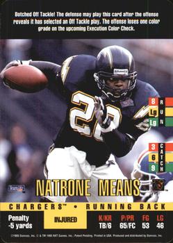
Monday, September 12, 2016Set: 1995 Donruss Red Zone (Rate) “ Hey a gaming card not from the original football. Good action shot, looks like a "normal" card. The soccer yellow card one from about two weeks ago is just above this one in my opinion. ” -rmpaq5
“ HUH !!! ” -uncaian
“ I vaguely recall this guy was a beast. Nothing noteworthy about the card design. ” -dilemma19
“ Very complicated card game. ” -carthage44
“ This sounds like a confusing game. ” -RoyalChief
“ Natrone Means- Synonymous with "Botched Off Tackle" ” -Howintensive
“ OH gees Donruss had a TCC Football game? Totally confusing. ” -captkirk42
|

Sunday, September 11, 2016Set: 2004-05 Hoops - Checklists (Rate) “ I love checklists! I miss them, too. Even when they were done this poorly by Fleer. I still love them. From 1996-2005 a checklist was my #1 most wanted card. Fleer used this same black and white design from 1998-99 until they went out of business in 2004. ” -Billy Kingsley
“ Is this our first checklist as RCOTD? That's funny. I see they didn't put the little check boxes next to the numbers. It serves its purpose. ” -vrooomed
“ Everything about the checklist being the random card of the day makes me laugh. What a boring selection. As far as checklists go, this one is bad, unless it is the scan. Usually, they provide you the little boxes, as if you are actually going to use them to check off your cards. Also, was this really black and white? ” -muskie027
“ Ummm I know COD is random. But surely we could have a no checklist filter. It's not even an interesting Checklist ” -Lennoxmatt
“ Checklists are the best but they could have put some effort into this card and not make it look like its the final graduation roster for rural school #19. ” -flcardtrader
“ If that is a checklist, where do I put my "check"? Where is the little box? Why must life be so difficult? ” -NJdevils
“ Well, technically, I think this is just a list. A checklist would imply something to check. In their zeal for a clean design, they forgot the check boxes. ” -DaClyde
“ Blah , blah , blah. ” -uncaian
“ Boring checklists. They need to put a player on a checklist to make it worth while. ” -carthage44
“ First time I've seen a checklist. Nice card, I like how they put the numbers in numerical order, it really helps :). ” -RoyalChief
“ What a treat...such greats on this list...one of the greatest hairstyles ever, Chris Wilcox...Sam "Not From This Planet" Cassell...Keith "Journeyman" Bogans...oh Lamar Odom, why Lamar, why...nothing like a good Predrag...one of the smallest guys ever, Earl "The Size Of A Pearl" Boykins...not in my house...ahhh and ends with ZaZa and that's just the front people...get out there and buy this... ” -SaveDaKid
“ What can you say? When it comes to checklists, this has got to be the most basic and boring one I've seen. They wouldn't even splurge on some color ink. ” -C2Cigars
“ A Checklist for the Random. I guess that is a new one. Didn't expect that. This is a sad case of the modern checklist. They no longer provide the little check boxes. This one doesn't even have a little logo of a picture. NO color at all. Fortunately you can tell it is basketball with the name "Hoops" the NBA in the title, the NBA logo on the back. Nothing unique about this card to make it obvious which set it belongs to, or that you should even try to keep it in your collection. ” -captkirk42
“ Well it does its job. ” -rmpaq5
|

Saturday, September 10, 2016Set: 1994-95 Upper Deck (Rate) “ Great card design. Like it in all 3 sports in my collection. ” -Billy Kingsley
“ This kid looks like he's in High School. ” -carthage44
“ Not liking the vertical lettering, but the back, like most Upper Deck backs of this era, gives a strong secondary picture and all the vitals you need. ” -rmpaq5
“ Wasn't much of a fan of this set it just was kind of blah . Boucher won a Stanley cup with Pitts. Now coaches the Quebec Remparts. ” -uncaian
“ Nice pictures--both home and away uniforms ” -cjjt
|

Friday, September 9, 2016Set: 2010 Topps Heritage - Ruth Chase '61 (Rate) “ I think this is the first Babe Ruth card to be card of the day...My baseball knowledge may be limited but he is considered the greatest of all time, isn't he? ” -Billy Kingsley
“ I don't get the meaning of this set. An apostrophe before the 61 means 1961. But Ruth wasn't chasing anything in 1961 since he'd been dead 13 years by then. This set should have been called "RUTH CHASED '61". BTW, I hate sets that have a separate card for EVERY hit, home run, completed pass, touchdown, game played, day of existence, etc. ” -C2Cigars
“ I like most things about Heritage but I don't like some of these additional made up "just because" inserts. ” -captkirk42
“ Nifty looking card. The history lesson on the back is an added bonus. ” -dilemma19
“ Babe Ruth cards are always must have in collections no matter what year. ” -carthage44
“ Nice insert set. The black and white photo super imposed on a modern background is a hit and miss thing. With this insert set I believe they hit. ” -rmpaq5
|
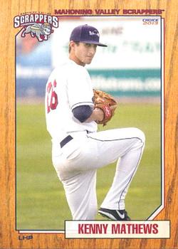
Thursday, September 8, 2016Set: 2013 Choice Mahoning Valley Scrappers (Rate) “ I like it. Minor league cards lately are better than most pro cards of the 2000s it seems. ” -Billy Kingsley
“ I have grown to love minor league card sets. They usually have a great design, as this card does. It is always interesting to look through these sets to see how hard it is to make it to the majors, as most players never make it. Also, you never know who will show up on a card as a coach or manager. As a Twins collector I was surprised to see Scott Erickson in this set. Very nice set!! ” -twinscollector34
“ Wow neat card, total 87 Topps. What exactly is a scrapper? And what does that say on the back "Scrappermania"? ” -RoyalChief
“ Nice variation on the 1987/1962 Topps themes. This team is in the New York-Penn League, which is the same league as the team a mile away from me (HV Renegades), so I may have actually seen this guy play. Nice design to the card. ” -vrooomed
“ Fantastic minor league card! Wood border on front: Check. Subtle baseball background on back: Check. Despite not signing until the second time he was drafted, this guy was still only 20 when this card was printed. Would have thought he'd still have a shot, but presently he's carrying a 6.23 ERA in A-ball. ” -dilemma19
“ Nice minor league card. Nothing bad to say. I like the faux wood background reminiscent of 1962 Topps, Actually with the lighter color more like 1987 Topps. I don't follow minor league baseball but I do collect the mascots. I have a card of their mascot Scrappy that I made a "Mascot Monday" for on my blog http://captkirk42.blogspot.com/2012/11/mascot-monday-scrappy.html I really need to do more of those posts soon. ” -captkirk42
“ I really like the wood border style cards. This is really well done for a team issue minor league set. ” -rmpaq5
“ Glad they still make minor league baseball cards. They went with the 1987 Topps look. I like it! ” -carthage44
“ Nice looking card, clean easy to read front ” -aussiewayne
“ Wow a curveball here! A set I've never seen before. It definitely pays homage to my favorite all-time set 1987 Topps Baseball, Which was the first set I ever completed by purchasing packs and trading with friends. Enough about 1987 Topps. The name is easy to read. The logo is on the front another plus. The only negative i can see other than this being posed is the Position is a bit hard to read with the black on wood grain at this resolution. It could have been an oval or something with the postion. I am shocked that the card producer is not more prominent...and I love it! The bio could of included a highlight for the players career at some level. ” -collect-a-set
|

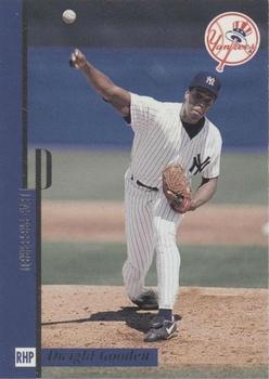
Monday, September 5, 2016Set: 1996 Leaf Preferred (Rate) “ I like the way the branding is subtly integrated into the border. Can't read the player name very easily, and would prefer to forget Doc's time with the Yankees. ” -dilemma19
“ Yankees logo looks like a cartoon thought bubble ” -Lennoxmatt
“ Could have been one of the best. ” -carthage44
“ Ironic calling this card "preferred". I know there is foil text on the front there but I'm not sure what it says. I think his name is vertical on the leftside border there mixed in with the Leaf Preferred "LP" logo. Oh wait I caught a glimpse of "Dwight" at the bottom there with that foil lettering. So the left side lettering (after doing a quick google search to look for other samples from this set) apparently says "Leaf Preferred" if you read it from top to bottom from the left hand side. At least you can read the position easily and see the team logo. On to the back... Large photo (different from front photo good), basic player info stacked up weirdly on right. One year of stats (if played Doc didn't play in 95 apparently) with career totals. ” -captkirk42
“ This is not one my Preferred designs. Blah! ” -rmpaq5
“ Seems so wrong seeing him with the Yankees. I had forgotten he played for them, Cleveland, Tampa Bay and Houston briefly to finish out his career. Never saw this set before. I like the photos and the overall design but text is difficult to read. I wonder what his career would have looked like had he been able to avoid drugs. One of the all time what might have been guys. ” -Mitch
“ A strange case Doc was. Talented, but obviously had/has a rough go of things. As much as I like strikeouts, the more recently-retired one is my favorite "Doc". I love the straight up "Did Not Play" these card companies use for seasons the players...well, did not play in. So straight and to the point. ” -DarkSide830
|
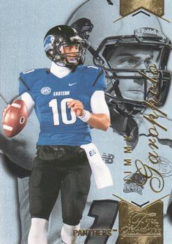
Sunday, September 4, 2016Set: 2014 Flair Showcase (Rate) “ GO JIMMY! Representing Eastern Illinois!!! ” -carthage44
“ Never heard of this guy or his team. After a quick search I see he will be the starting QB for the Patriots this year (first four games at least). Another reason I love random card of the day! ” -RoyalChief
“ The side view of that far-away eye stare down field looking for the open receiver....now that's what football cards are made of. Go Pats! ” -flcardtrader
“ In the white(silver) helmet pic, looks like Kerry Collins to me. ” -NJDevils
“ Looks OK for a College set. I'm not a huge fan of college sets. Can sort of read his name at least "Jimmy" can't tell what the foil stuff at the bottom reads.I think the team name is there and does that read "Flair Showcase"? Back is OK pretty standard for an Upper Deck product. ” -captkirk42
“ Ugly card of Jimmy who? Oh, a 2014 Draftee. A benchwarmer for New England. And of course he has 1,140 cards already. A little perspective, Johnny Unitas had about 25 cards during his entire career. ” -C2Cigars
“ Would've been better to use the back pic on the front. ” -Doc Floyd
|

")