
Random Card of the Day |

Thursday, October 13, 2016Set: 2014-15 Panini Adrenalyn XL T-Mobile Ekstraklasa (Rate) “ Good lord Adrenaline XL is obnoxious. Just way too much going on. ” -rolmodel12
“ Cool card. I wouldn't mind having some from this set. Ekstraklasa is the Polish domestic league, for those wondering. ” -switzr1
“ OK. Let the bad comments begin about the soccer game cards in 3,2,1........... ” -deporcoruña
“ Look at T-Mobile getting into the game. ” -carthage44
“ ACK the soccer (football, futball) CCG card is back! ” -captkirk42
“ They're baaaaaaack ” -SFC Temple
“ That's nice. His overall score is only 168 because his 39 green score is quite weak. I wonder what green is... ” -dilemma19
“ It's colorful, I'll give it that. Oh look, it is oficjalna. Bramkarz everyone!! Not sure what it means, but it is on the scoreboard on the back!!! ” -muskie027
“ I learn to enjoy soccer more with each passing year. I hope the soccer collectors like this set. ” -UKboogie
|

Wednesday, October 12, 2016Set: 2000 Bowman Chrome (Rate) “ Very dark. Terrific picture though, capturing the pitched ball just right. ” -switzr1
“ "The player is right underneath that small moon." "That's not a small moon, it's a space station!!!" ” -revnorb
“ This oughta be good. Can't wait to hear scanning commentary on this one. ” -Dave Sosidka
“ This Bowman chrome set is one of the ones I do not like at all. The cards scan awful and are awful in person to begin with. Back in the late 80s early 90s when the foil and chrome craze started I didn't mind to much as since at first it only on occasion and looked pretty cool (even the early low-tech hologram cards were pretty cool) but the OVER did it over the years and now most things chrome are annoying to me. I know there are some people who love all things shiny ” -captkirk42
“ As with most chrome scans, have to be careful and evaluate the design and not how the scan turns out. With that said...this isn't great. Bowman designs are usually too bland in my opinion. And having the designs of the different subsets/insert sets whatever you want to call them (Draft, prospects, etc..) look so similar to the standard is sometimes very confusing to tell what a card is just by looking at the front. ” -rmpaq5
“ Not a bad scan for a Chrome card. ” -carthage44
“ Maybe it looks nice in hand, but it's nearly impossible to make anything out on the scanned front. Back is good, albeit crowded. ” -dilemma19
“ I wonder how often he hears "Brad Baisley , the country singer ?" ” -uncaian
“ Ugh...chrome scans. ” -suomibear8
“ I'm sure this looks great in hand but the front is so hard to read on iPad ” -aussiewayne
|

Tuesday, October 11, 2016Set: 1990 Score Rookie & Traded (Rate) “ Some scanners just don't like some cards. I actually bought a new scanner to combat this problem, Epson scanners don't put these lines... usually. ” -Billy Kingsley
“ I've always liked this design. The blocks of cards in different colours, the picture on the back. Logo and nameplate well done, company name prominent but doesn't interfere with the picture. Nothing but good stuff here. ” -rmpaq5
“ Never quite lived up to his potential after hitting 32 home runs in 1987. ” -carthage44
“ It was bad enough that Score had to wreck this set by including a silly card of Eric Lindros taking BP with the Jays. Even worse was their decision to print billions of them! I like the look of these cards, and can't fathom why orange borders aren't used more often. ” -dilemma19
“ Nice and simple Score set. ” -captkirk42
“ delete ” -SFC Temple
“ Boo. ” -RoundtheDiamond87
“ Why does it look like someone put a screen over the card before they scanned it? I actually just went through some of these early Score sets about a month ago, they weren't bad. They were a decent effort for their time. Nokes had a good year or two, but is one of those players that gets forgotten until you go back and look at the artifacts from memory lane. ” -muskie027
|

Monday, October 10, 2016Set: 2007 The Wizard of Oz Collector Series II - Puzzle Card 1 (Rate) Card: #Question 5 Puzzle Card 1 Question 5 “ At first glance i was not sure what i was looking at but I think it's Toto. ” -Billy Kingsley
“ That is the most confusing set/card ID ever. ” -rmpaq5
“ Wow. If I didn't see the back of this card I might not have known it was from the Wizard of Oz. But now that I study the picture more I see it is Toto in front of the Scarecrow with Dorothy pushing him back. Ah a puzzle piece card. Very random very random indeed. ” -captkirk42
“ Toto! These puzzle cards are confusing. Fascinating trivia question on the back though... ” -dilemma19
“ What the...? Animal abuse!! Animal abuse!! It looks like poor Toto is getting the snot beat out of him. ” -C2Cigars
“ Not sure the Wizard of Oz has that appeal anymore. ” -carthage44
“ Really colorful, like the old wizard of the oz which was supposed to be black and white around its era. ” -Thomas555
“ Awwwww. My Mom's favorite movie. I believe I know this movie by heart. Thank you random card of the day....I am going to call my Mom and say I love her! However, I must say....it looks like poor Toto is getting the beat down :) ” -RoyalChief
|
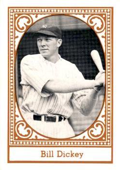
Sunday, October 9, 2016Set: 1980 TCMA All Time New York Yankees Set B (Rate) “ Somehow I kind of like it and dislike it, all at the same time. I definitely don't care for the back. Front looks like a T-205 a little bit. I'm not sure I have ever seen one of these cards before. ” -switzr1
“ Neat card, but could really have used some info on the back...like, when was he with the team? I really enjoy history based sets. ” -Billy Kingsley
“ No frills, but a decent card. ” -dilemma19
“ I'd take Thurman Munson over Dickey for New York Yankees greats at the catcher position. ” -carthage44
“ I like some of the "All Time" team cards, but this one is a bit too blah for me. ” -captkirk42
|

Saturday, October 8, 2016Set: 1999 SP Authentic - Epic Figures (Rate) “ This card looks more like a movie poster than a baseball card. ” -rmpaq5
“ I would like this insert more if the full-color image was a bit larger. Just doesn't feel "epic." I want to love it...I love SP and Maddux ” -rolmodel12
“ This one doesn't work for me. If the card us foil it's a great scan, if it's not foil it's a terrible design( but still a good scan) maybe if the background photo was full color... ” -Billy Kingsley
“ Really don't like this card setup. ” -carthage44
“ SP Authentic if it isn't all white background then it is doing weird things like making the dark shadowy background more prominent than a pretty cool "action" color silhouette in front of it. Of course the back is also blah. Definitely a card from a subset within the base set. ” -captkirk42
|

Friday, October 7, 2016Set: 1998 Multi-Ad Fargo-Moorhead RedHawks (Rate) Card: #NNO RedHawks Hit Crew (Chad Akers / Chris Coste / Johnny Knott / Darryl Motley) “ Very interesting card photo. It seems more like something you'd see in the early 90s, instead of 1998. I like it though. ” -Billy Kingsley
“ My first card of the day!! I am not a big fan of multi-player cards but I love the Fargo-Moorhead RedHawks! Back in the late 1990s I had season tickets and went to games with my then pre-teen age daughter. They are special memories! Whenever I get back to Fargo I still try to get to a game. Darryl Motley caught the fly ball that was the last out of the 1985 World Series. ” -twinscollector34
“ Just a quick follow up. Chris Coste made it to the majors as a 33 year old rookie, which is the title of his book. He caught the final pitch from Brad Lidge to end the 2008 World Series, so there are two players on this card that caught the final outs of a World Series. ” -twinscollector34
“ Not much of a hit crew since none of these guys made it to the Majors. ” -carthage44
“ The pose brings back memories of cards from the 60s. I like it. ” -CluelessJoe
“ Nice minor league card. Hmm I wonder how many times they have done multi-player cards? I don't recall seeing very many of those. ” -captkirk42
“ Over about 162 games, although maybe they weren't facing spectacular pitching, three of these guys collected 200+ hits. The other one walked 134 times, scored 141 runs and drove in 132, so he probably deserves to be part of the "Hit Crew" even if he fell a bit short of 200. ” -dilemma19
|
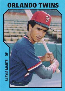
Thursday, October 6, 2016Set: 1985 TCMA Orlando Twins (Rate) “ Great scan of a nicely designed minor league card. ” -Billy Kingsley
“ Preferred ProCards MiLB sets of 1985, but this is still a solid minor league card. ” -vrooomed
“ If it is a Photo Fact card, where is the fact?? ” -rmpaq5
“ Good minor league card. Nothing spectacularly great nor awful. Never heard of Alexis Marte, but he had a decent year in 1984 (hopefully he stole some bases to make up for his empty HR column). ” -dilemma19
“ Interesting front design. Pretty good minor league card. ” -captkirk42
“ The stats on the back are all jumbled. Games played should be in front of AB's. ” -carthage44
“ Ahh...the 80's, with their neons and pastels. If they were not going to include all stats (or the usuals, anyway), I would replace AB's with RBI's. ” -rolmodel12
“ The stat line makes him look bad. He actually stole a very impressive 82 bases that year, but they left that detail out! Real nice looking minor league card by the way. ” -switzr1
“ Nice!!! Love the logo on the cap! ” -RoyalChief
“ Normally I really like minor league cards, but this one just doesn't do it for me. He almost looks like a bobble-head though. ” -Doc Floyd
|

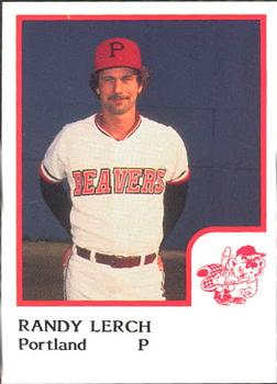
Tuesday, October 4, 2016Set: 1986 ProCards Portland Beavers (Rate) “ Great team logo! Minor League teams have the best team logos in sports, I think. ” -Billy Kingsley
“ The uniforms players are wearing on some of these 80s minor league cards that have been popping up lately as RCOTD just scream little league. ” -rmpaq5
“ Back in the Phillies organization in AAA for '85 and '86, Lerch would wind up pitching 4 more games in the bigs in '86 before being released by the Phillies (he's go on to to the Cardinals org, but called it a career after that). Never a dominant pitcher, he probably made it as long as he did because he was a tall lefty. Part of the Phillies team that won the WS in '80, but he was left off the postseason roster (probably because he wasn't that good). Traded to the Brewers in the off-season for Dick Davis. He was a decent hitter (for a pitcher) finishing with a .206 BA. ” -vrooomed
“ Nice 1980s Minor League Baseball card. A staple for the Card of the Day it seems. ” -captkirk42
“ Ho hum ...wake me when this card is over. ” -C2Cigars
“ What happened? Sent down after about 70 major league appearances? Were the Beavers affiliated with the Giants, or was he shuffled to another organization? He bats and throws "LEFTS". So there. ” -dilemma19
“ A lot of wasted space on the front of the card. ” -carthage44
“ It's decent, but a bit too much red. Back is very plain but gets the job done. ” -Doc Floyd
“ Not wild about minor league sets. Beavers, hmmmmm. ” -Kaline6
“ Nice beaver card ” -switzr1
|

")