
Random Card of the Day |

Wednesday, July 6, 2016Set: 1988-89 Pacific MISL (Rate) “ Hey, an actual card! I like the gray border. The back reminds me of Donruss. ” -Billy Kingsley
“ At least it is not a gaming soccer card. The design is simple and good, and the back is also clean. I remember going to MISL games in Detroit (grew up in Windsor right across the river) and the game in that environment barely resembled soccer. Nets embedded into hockey boards, boards to start with, and goal keepers barely had a chance as balls were usually blasted at them from a couple of yards away at 80mph plus. As you can see by this guys stats. ” -rmpaq5
“ "Hello, this is Pacific Trading Cards. How may we help you?" "Yes, this is 1985 Fleer - we'd like our design back, please. Thank you." ” -vrooomed
“ Wow , a soccer card that actually has stats.& info. Cool !! ” -uncaian
“ Ugly uniform, guy looks more like a ref, but hey this is a huge improvement compared to the other soccer cards lately. ” -Doc Floyd
“ Old school soccer, not bad. ” -carthage44
“ Hey a Soccer card that isn't one of those silly Topps Attax type game cards. This card is a stereotypical late 1980s sports card. Looks like a simple minor league card ..checking what the MISL is (I forget) Oh it's MAJOR Indoor Soccer League so OK major league not minor sorry. Front design is OK even with the frumpy color design. Minor irks it should have the team name, at least the team logo is there. Text font should be a better one to distinguish capital letters and avoid the whole "is it an "I" or an "L" thing." Back is OK I hope 45 is the card number and not his jersey number. I don't follow soccer so I don't know if goalkeepers have a specific number range like other sports often do. Rest of the back is fine for me. I do miss the cartoons on the backs Pre mid 1970s. ” -captkirk42
“ Yeah!!! Finally, a soccer card that's NOT a game. Not a bad card. Nice simple design. Don't particularly care for the gray border. ” -C2Cigars
“ Go Comets! I should have went to one of their games when they were around. At least when they were the Attack years later. ” -jupiterhill
“ Don't follow soccer, so can't comment on the player himself. I like the clean look of the back, which makes it easy to read. However, the heavy use of the color grey on the border of the front makes it seem a little plain. Nothing really pops. Perhaps a better action shot of the goalie blocking, or in an intense defensive stance would have done the trick, as opposed to a shot of him getting ready to throw the ball back out after the fact. ” -CollectingAfterDeath
|
Tuesday, July 5, 2016Set: 2009-10 Panini UEFA Champions League Super Strikes (Rate) “ More teams should wear striped jerseys. They are cool! ” -Billy Kingsley
“ If it's the most popular sport in the world , why are their cards so ugly ? ” -uncaian
“ I just clued in that these cards were probably intended for sale in multiple non-English-speaking markets, hence the emphasis on graphics and pictograms, with minimal words. ” -dilemma19
“ Just when you thought you were safe...the soccer gaming card makes its return. Actually in seriousness of all the soccer gaming cards that have popped up in the last month this is the best looking of the bunch. It isn't cluttered up, the card game info is well incorporated into the design to make this look like a standard issue card and not a game. ” -rmpaq5
“ One thing you can say about these soccer cards is that they are making the "Fievel Goes West" cards pretty appealing. ” -NJDevils
“ GOAL! yet another Soccer game card like Topps Attax for the Random Card of the Day. This is like the 4th or 5th in less than 30 days. ” -captkirk42
|

Monday, July 4, 2016Set: 1995 Donruss - Press Proofs (Rate) “ The foil-on-foil name is hard to read, but it looks good otherwise. Good photograph, nice back design, card number easy to read, and placed at the top edge to help those who sort numerically. Before anyone complains about one year of stats, be sure to notice that he had only played one year at the time. ” -switzr1
“ I liked the 1995 Donruss set, but don't think I've ever seen the Press Proof cards. ” -jupiterhill
“ The front is fine but the half only team logo kills the back. I like when jerseys have the first initial when there is more than one player with the same name on the team. In 2015-16 there were three Indiana Pacers with the last name of Hill, and not one got an initial. ” -Billy Kingsley
“ Sort of reminds me of early Stadium Club. Not the biggest fan of cards without a border. Front isn't too bad as far as layout. Can't say the same about the back. ” -Madden95
“ Too much foil, but other than that a pretty good card. Another Braves too. ” -Doc Floyd
“ The labor disputes caused me to tune out MLB for a while, so I'm not very familiar with the Braves roster nor Mike Kelly (despite his having been a first round draft pick). I wonder which other Kelly forced the distinction by first initial... ” -dilemma19
“ Not really a proof if it's just one of the first 2,000 printed. ” -carthage44
“ Yuck TOO MUCH FOIL. Back too bare. Bad year for Donruss, 96 was also a bad design if I recall. ” -captkirk42
|
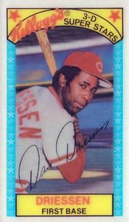
Sunday, July 3, 2016Set: 1979 Kellogg's 3-D Super Stars (Rate) “ I like these. Lenticular cards are always fun. ” -Billy Kingsley
“ These were awesome. Still have a couple somewhere, wish I had took better care of them because I recall having quite a few at one time. Real shame they don't put stuff like this in cereal as often as they used to. About the only way I'll buy it, especially nasty old Cornflakes. ” -Doc Floyd
“ I learned something new today! Figured Driessen just rode shotgun to a couple of world championships with the big red machine, but it seems he made a decent contribution ” -dilemma19
“ I love food issue cards . ” -uncaian
“ Always nice for a kid to get something in a box of cereal. ” -NJdevils
“ I might be in the minority here, but I have a real fondness for the old Kellogg's 3-D cards. A trip down my childhood memory lane! ” -cckeith
“ Cool cereal box cards. ” -carthage44
“ Boy, do these bring back memories! I know I have some in a box I haven't gotten to yet! Love it! ” -bkklaos
“ Oh I ate my share of Frosted Flakes to get these. Then i saw you could buy the whole set rather inexpensively. ” -Kaline6
“ Kellogg's have always been my favorite! ” -cjjt
“ Not sure i've ever seen any of these in person. Wondering if they are taller than standard card size. Quite a bit of info on the back for a Kellogg's card. I like it. Not sure why but i do. Maybe because it's soooo...funky. ” -Madden95
“ Love the Kellogg's 3-D cards from the 70s. Dan Driessen is one of those payers that before the overproduced years I started naturally getting from every year so he was one of the guys I used to "super collect" back before it was a thing. Now-days however I'd probably find I only have 3 or 4 of his cards Not sure as I haven't checked specifically for his cards in a while. ” -captkirk42
“ Cool card. Would like to pick this set up. ” -yokonashiwa
“ Seriously, I want more cards like this today. I would buy boxes of Cap'n Crunch if food manufacturers were "allowed" to make cards again. Damn you Topps Monopoly!!!!! ” -rmpaq5
|
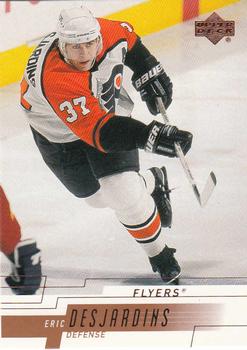
Saturday, July 2, 2016Set: 2000-01 Upper Deck (Rate) “ Really solid D-man. Loved watching him play with my team. As for the card design, I actually like it. ” -vrooomed
“ Nice design. The UD flagships were always usually pretty good. Great scan too. ” -Billy Kingsley
“ Nice design, and good action shot. Cool name too. ” -Doc Floyd
“ Nice set, nice design. Desjardins played strong where ever he played , just a great defenseman. ” -uncaian
“ This is a rather nice design...could be improved by placing the team logo in the bottom left. ” -rmpaq5
“ Nice job by Upper Deck and this set getting all the important hockey stats on the back. ” -carthage44
“ Overall not bad. Don't care for the stats on a slant. The backs of cards should be simple, straight-forward, and easy to read. Save the fancy graphics for the front. ” -C2Cigars
“ Simple and straight forward card. Can't say I'm a fan of the brown though ” -Lennoxmatt
“ Here is an Upper Deck design that is the reverse of most of them in that you can read everything and they have the team name (logo would be nice oh its on the back) but the design stinks. Back would be OK if they got rid of the silly design from the front with the gold blocks. ” -captkirk42
|
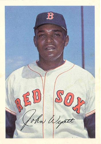
Friday, July 1, 2016Set: 1967 Boston Red Sox Picture Pack 2 (Rate) “ I'm not to the point of truly appreciating a front only photo being considered a baseball card. Maybe someday. However,I think it's a great photo and with great placement of the signature. ” -Madden95
“ I really wish teams would put out simple team made sets, postcards, etc... still. With the Topps monopoly are they even allowed to? ” -rmpaq5
“ does this count? ” -wax_house
“ Is this even a card or licensed? Looks like it might be a stadium hand-out. Oh well, looks OK I guess. ” -Doc Floyd
“ Vintage Coolness. At first I thought this was a 1970s TCMA card. Picture pack huh? Guess the dimensions are larger than standard cards? I think there should be some way of indicating the card size here on the RCotD. ” -captkirk42
“ They should have left the facsimile off so someone would get a real autograph on this picture card. ” -carthage44
“ Well, that's totally not boring in the least. ” -DarkSide830
“ Its a decent card, BUT the guy looks a bit too focused ” -Xg200
“ Love these colorful and underappreciated issues. ” -Dave Sosidka
|

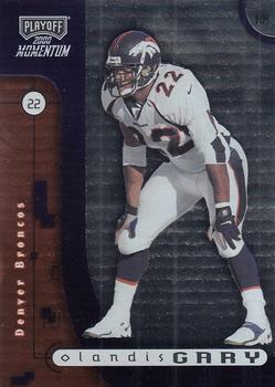
Wednesday, June 29, 2016Set: 2000 Playoff Momentum (Rate) “ These don't do it for me. The digital theme, lower case given name, no team logo and.. what seems to be my pet peeve... no narrative on the back. Talk to me, give me stories!!! ” -SFC Temple
“ Had a great rookie year then faded into obscurity. ” -carthage44
“ Fancy overpriced foil, dull and boring, that's about all I ever got out of Playoff. ” -Doc Floyd
“ Ugly. HATE cards where the player is superimposed on a computer generated background. ” -pistonfan
“ Front is dark and cold. I like that the player's face is discernible in the back photo. ” -dilemma19
“ Can't really say I like this card ” -switzr1
“ 2000 did Donruss own Playoff at this point? Front I'm guessing the hideousness of the backbround is chrome foil not scanning right? Really ugly card it is close to the team colors almost but not quite. UGH it IS supposed to be the team colors double UGH. Moving onto the back: Portrait photo way way too big as are the bars for his vitals. Only one year of stats? UGH it is the total CAREER stats. Yucky set. ” -captkirk42
|
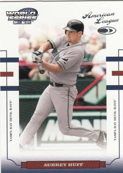
Tuesday, June 28, 2016Set: 2004 Donruss World Series (Rate) “ Didn't Tampa Bay play their only World Series in 2008? I don't like a World Series set with cards that have nothing to do with the World Series. Maybe I am just missing something here. ” -switzr1
“ I'm glad my parents didn't name me Aubrey. ” -Billy Kingsley
“ Donruss clearly took a lot of grief for their black-bordered '85 and '87 sets, and the "bold color" approach of the early 90s, but they may have swung too far toward the all-white design. I remember Huff as consistent but not exceptional. ” -dilemma19
“ I wish whoever uploaded this would have taken 30 seconds to straighten and crop these images. ” -carthage44
“ This is OK, seen Donruss do a lot worse. Good action shot. ” -Doc Floyd
“ For some reason this reminds me of the SPx cards. Hey an early 2000s card where you can read the entire front. This must be some kind of exception. No foil? Wait is that American League and the Donruss logo in foil? Back is OK for what the set is, actually should have post season stats for the player ” -captkirk42
“ Why? ” -RoundtheDiamond87
“ This card is just too busy. ” -NJDevils
“ I can't stop switching the view from front to back - it produces a fine bat swing. ” -Thomas_Kava
“ Not sure what i notice more. Clean or cluttered. ” -Madden95
|
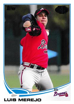
Monday, June 27, 2016Set: 2013 Topps Pro Debut (Rate) “ I love minor league cards, but hate the fact Topps uses the same design as their "normal" set. Would be great if they would "cheapen" it up and use designs like the 80s and 90s minor league sets. ” -rmpaq5
“ Nothing but the best. ” -RoundtheDiamond87
“ Is it a RC? Is it not a RC? ” -switzr1
“ Merejo in this shot reminds me of Steve Avery. There must have been some early-90s card (of which I possessed hundreds of copies) with Avery at a comparable point in his delivery... Not a huge fan of the "sea turtle" design, but at least it was a different look. ” -dilemma19
“ Love the minor league cards. ” -carthage44
“ Oh, cool. I just picked up some 2016's on Saturday. Better than the 2013's. ” -DarkSide830
“ For the most part I like the design of the '13 Topps Baseball, but don't like the foil for the Topps logos.When will these card companies understand that foil lettering is bad and gets harder to read the older one gets? Plus it makes scanning cards a bigger pain. Hmmm not much of a career had Tommy John Surgery (2013-14), released from Braves last year. Looks like Luis is a Jr.? His dad played for the Angels late 80s to 1990. ” -captkirk42
“ Nice looking card, no doubt it's Topps that's for sure. From a NL team too, what's not to like? ” -Doc Floyd
|

")