
Random Card of the Day |

Sunday, January 17, 2016Set: 2006 Bowman Chrome (Rate) “ I'm OK with the overall design, but I'm not a chrome fan and I hate the fact that Bowman is mostly for Prospects now. ” -captkirk42
“ Browns, sorry I have to laugh, HAHA! ” -carthage44
“ Let's just crank out as many different sets as we can. Maybe someone will even buy them! ” -dilemma19
“ Poor coaching wasted this talented player... Same old song and dance with my Brownies. ” -SFC Temple
“ Decent enough looking card. I'm sure I don't have any of these. ” -switzr1
“ Okay design, but I always felt that Bowman Chrome were always a little too dark. Too difficult to see clearly. ” -cjjt
|

Saturday, January 16, 2016Set: 2006 SAGE HIT - Design for Success Green (Rate) “ Why is he in a glass? There's gotta be a record somewhere for more whitespace in a regular card. ” -volbox
“ Very magical, looks like he's appearing from the swirling smokish stuff...why? Two thumbs down on this one, front & back. ” -Kaline6
“ These HIT cards are starting to grow on me. ” -RoyalChief
“ Weirdest front EVER. ” -DarkSide830
“ I just added this card on New Years! Nice!!! ” -carthage44
“ Is that a votive candle and you are supposed to light his helmet? Certainly the card was not designed with success in mind. ” -NJdevils
“ No sir, I don't like it. -Mr. Horse from Ren & Stimpy ” -jupiterhill
“ Awesome!! Football players and "will it blend", together at last on a trading card. Never heard of this set, but the back suggests this design was a winning entry in a contest. It would be cool to see your design on an actual production card... ” -dilemma19
“ UGH Never been a fan of HIT because it is all College. Sure I'll get guys who are on my Homie teams or the guys who I PC but out of that I hate this stuff. That aside the front is so-so all white designs don't often work well this one doesn't what is with the squares? Back is OK but since they are all college guys even if they did put stats on the back they wouldn't take up much room. ” -captkirk42
“ What the...???? I'm at a loss for words. Or more correctly, too many negative words to choose from. ” -C2Cigars
|

Friday, January 15, 2016Set: 2011 Topps - Super Bowl Legends (Rate) Card: #SBL-XI Fred Biletnikoff “ An otherwise fine card except the lack of a number. That is one of my "pet peeves" in the hobby. ” -Billy Kingsley
“ No frills, just a solid card. I don't mind that no particular element stands out. Not the greatest photo, but quite reasonable if it was the best available shot taken during Super Bowl XI. ” -dilemma19
“ Nice Insert card. I love Super Bowl cards. Ah back when the Raiders were real beasts. ” -captkirk42
“ I hate the Raiders, but Biletnikoff was one of the greatest. Just look at them hands...no gloves and still reeling them in. Oh, sweet card as well. ” -RoyalChief
“ at first glance I thought this was a ProSet from early 90s ” -NJdevils
“ Topps have always made an effort to include legends into their sets. ” -carthage44
“ Haven't seen these before, but I like it. Good looking photo, presumably taken during the game in the description. I like commemorative sets like this, and the design is good too. ” -switzr1
|

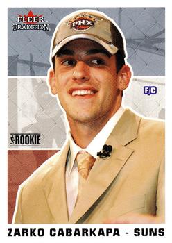
Wednesday, January 13, 2016Set: 2003-04 Fleer Tradition (Rate) “ Of all the more than 2000 NBA players with cards, this is the second one of his to be Card of the Day. (both of which were my scans) This one features a photo taken at the NBA Draft superimposed over a generic street ball photo. The veteran players in the set got much better cards. He played only three years in the NBA, and then retired due to injury. ” -Billy Kingsley
“ Nothing traditional about this lazy design. ” -carthage44
“ I get that he's a draft pick so there aren't any pictures of him in the team uniform, but this card is basically empty, front and back. "Destiny"?!? That was the best blurb Fleer could come up with? ” -dilemma19
“ Ah a love/hate retro card. What I love about Fleer Tradition is they usually used regular old fashioned raw cardboard and a modified older design. OK this guy is a rookie so he has no pro stats but couldn't they have listed his college years? Maybe some kind of bio. The back looks a bit blank. This is where the old style of having a cartoon on the back helped. Another "hate" is the wearing a suit/tie with modern ball cap is more recent years tradition looks very odd in a retro set. ” -captkirk42
“ For some reason the back of this card cracks me up. No college or NBA experience, yet it was his destiny. LOL ” -RoyalChief
“ And the award for worst back in the history of sports cards goes to.....the envelope please..... ” -NJDevils
“ I just never really cared for a suit and tie on a card. One of the least informative card backs I've ever seen. Spelling his name in Scrabble will yield many points. ” -Kaline6
“ It is my "destiny" to own this card someday. ” -switzr1
|

Tuesday, January 12, 2016Set: 1999 Topps Chrome Archives Star Wars (Rate) Card: #9 Ben Kenobi Rescues Luke! “ I never got any cards from this set except the promo. Still not sure what I was thinking! ” -Billy Kingsley
“ I am so tired of all this Star Wars garbage. ” -carthage44
“ Help us Obi-Wan....you're are only hope. ” -RoyalChief
“ Nice card. Of course the original 1977 card would be better, but whatever. Great card for those who love Chrome stuff. ” -captkirk42
“ how romantic ” -dilemma19
“ What if the Sandpeople had killed Luke at the beginning of Star Wars? None of the other stuff would have happened. Thanks, Ben! ” -switzr1
“ I love this set, want to complete it but it's hard to find now! ” -Joshua825
“ Luke,I feel a great disturbance in the force !!!! Beware the Jar Jar Binks!!! I like earlier Star Wars cards,this one not so much. ” -uncaian
|
Monday, January 11, 2016Set: 1984 O-Pee-Chee Gremlins (Rate) “ Gremlins!! I so wanted a Gizmo when I was a kid. It is fun to introduce this to my kids and watch them light up when seeing it. ” -RoyalChief
“ One of my favorite "Christmas " movies.Not a bad set either. ” -uncaian
“ Love the 80's movie cards! ” -SFC Temple
“ Another nice Non-Sport card. Not a very exciting picture subject though. ” -captkirk42
“ My kids collected these and have passed them along to me....nice of them. ” -NJdevils
“ Excellent blurb, but not the best translation into French. ” -dilemma19
“ I really hope these are valuable because they are sweet! ” -carthage44
|


Friday, January 8, 2016Set: 1989 Score Baseball's 100 Hottest Players (Rate) “ I love the sets like this from the "junk wax era". The base sets were a dime a dozen. Not many insert sets, and those cards were abundant too. But if you liked and bought these kind of sets, you at least got to see different pictures of the top players and prospects of the day. Nowadays, a player of Cone's caliber would get about 300 cards a year. ” -switzr1
“ ... Good ole score embracing the quality color cards that includes color photos on the front and back. Though it's a bland card design, they helped change the look of the back of sports cards of the future. ” -jefferies9
“ Cone was a very solid pitcher for a long time. He doesn't get the credit that he deserves. ” -carthage44
“ These are so nostalgic. Brings back great memories for me. Wish he stayed with the Royals longer. Would love to get this set again. ” -RoyalChief
“ At first glance I thought this was a Minor League card. LOL. Nice card for an insert set. If it was for a regular base set it would be severely lacking. ” -captkirk42
|

")