
Random Card of the Day |
|
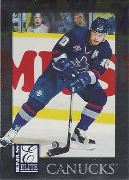
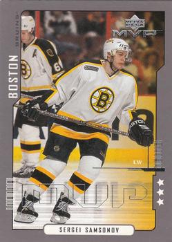
Monday, January 4, 2016Set: 1997-98 Donruss Elite (Rate) “ ... Well designed card layout all the way around. Not a "busy" card and the back has enough info to cover the basics. ” -jefferies9
“ Is this guy's name anywhere on the front of the card? Can't tell if it's by the team name or not. Might just be a poor scan. ” -carthage44
“ The Russian Rocket ! This set is alright,I just find cards that don't have write ups kind of boring. ” -uncaian
“ Definitely a solid set. Hard to find boxes of this nowadays. Also, a very condition-sensitive set. ” -suomibear8
“ not a big hockey fan but nice action photo..seeing fans behind glass in action photos are fun ” -mzentko
“ More picture, less border please ” -Lennoxmatt
“ Nice card for the end of the Junk Years 1990s. Having the player name on the front would be nice. ” -captkirk42
“ My all-time favorite hockey player. Not real crazy about the design (is his name even on the front in all that foil?), but I would still like to have a copy of this one. ” -switzr1
|
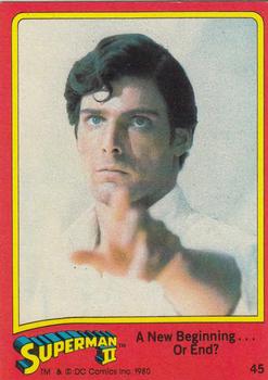
Sunday, January 3, 2016Set: 1980 Topps Superman II (Rate) Card: #45 A New Beginning ... Or End? “ The second Superman movie made, of 6, it was the last one worth watching, and even at that I wouldn't say it's great. Cards are not bad for movie cards. ” -Billy Kingsley
“ Love these old movie sets. I want the puzzle on the back! I so prefer Christopher Reeve's Superman over what I see in the Superman vs Batman trailer. ” -armac
“ ... Get that camera out of here before I melt your face off with my eyes!! ” -jefferies9
“ SUPERMAN! Excellent Non-Sport Standard Topps card. ” -captkirk42
“ I loved this movie...even with all the plot holes. We miss you Christopher Reeve! Gotta get me these cards someday. ” -RoyalChief
“ No super hero movie's for me except the new movie coming out Deadpool which looks sweet. ” -carthage44
“ My favourite Superman,wish they had put more thought into the next movie.This is a nice set. ” -uncaian
“ It's a Bird! It's a Plane! It's Superman! Looks like he's trying to hypnotize me, I am getting very sleepy...I like some movie card sets, don't have many. ” -Kaline6
|
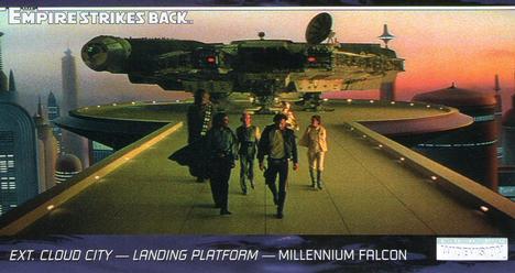
Friday, January 1, 2016Set: 1995 Topps Widevision Star Wars: The Empire Strikes Back (Rate) Card: #90 Ext. Bespin's Cloud City - Landing Platform - Millennium Falcon “ Empire Strikes Back spoiler alert! They walk around many corners! ” -switzr1
“ I have no idea what this is since I have never seen these movies. ” -carthage44
“ Nice front pic, but the back is sort of unusual. Can't wait to see the new movie! ” -DarkSide830
“ ... Fun movie cards for collectors of any generation. ” -jefferies9
“ As much as I love Star Wars cards, I never cared for Widevision based on the fact I couldn't find pages for them. Still nice looking regardless. ” -Joshua825
“ Epic! ” -RoyalChief
“ Not a fan of the "Widevision" cards. No matter the subject. Nice card other than that. ” -captkirk42
|


Wednesday, December 30, 2015Set: 1985-86 O-Pee-Chee (Rate) “ The force is strong in this one... ” -switzr1
“ I liked these. Still do! ” -vrooomed
“ This was the best picture? Really? Get your stick out of the picture! ” -Howintensive
“ Topps, O-Pee-Chee...all good. Looks like Rich wants to kick some... ” -Kaline6
“ Is that Adam Sandler? ” -RoyalChief
“ ... Aside from the stick that is blurred in the image, not a bad 80's image. ” -jefferies9
“ I miss the true cardboard cards. Yeah their corners dinged easily but they just had that smell of goodness! ” -carthage44
“ loved it when the sutter bro's all played on w/ them. like the card but looks like he's holding a light saber. ” -tonym
“ simple design, interesting that no brand is on front ” -mzentko
“ Might be better to use a light sabre than a stick. ” -NJDevils
" Any relation to HOF'er Bruce? " -ToppsBawlyn87
“ Clean and simple. See what can be done when the company logo isn't cluttering up the front of the card? ” -dilemma19
“ My reaction exactly, Mr. Sutter, my reaction exactly. ” -lxnlxn
“ Cool design...one I've never seen before. ” -Billy Kingsley
“ Kinda plain front, but better back. Nice pic as well. ” -DarkSide830
|
Tuesday, December 29, 2015Set: 2000-01 Upper Deck MVP - Third Star (Rate) “ Upper Deck and its famous flood the market with tons of UD products. Boring issue yet again. ” -jefferies9
“ Nice simple design. OK overall. If I were to complain about something it is the large MVP "banner" across the bottom is not needed nor is the weird lines that make it look like some kind of 1970s take on what futuristic computer fonts would look like. ” -captkirk42
“ Don Cherry would say.. Beauty, but as a Habs fan I can't approve of Boston. Don't care for the edges that look like barcodes ” -Lennoxmatt
“ Not a bad card. Didn't need such a huge MVP though, takes away from a good photo. ” -NJdevils
“ Not a bad design considering the era. ” -carthage44
|
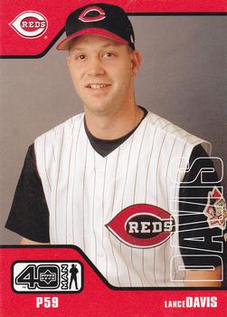
Monday, December 28, 2015Set: 2002 Upper Deck 40-Man (Rate) “ ... Boring card with same photo on the back... and over 900 cards is way too many! ” -jefferies9
“ A valiant effort Upper Deck, but the world does not need more sets populated mostly by players no one knows or will ever know. Let Bowman take care of that angle. Generally nice design though. The company logo doesn't need to take up so much space, but it is otherwise original and interesting but not over the top. ” -dilemma19
“ The transparent name is not necessary. ” -carthage44
“ Another nice back to basics card from after the junk years. ” -captkirk42
“ I like the design, and would not mind a new try at a similar concept with today's players...although I don't think there would be enough demand to do it every year ” -mzentko
“ Not familiar with this card but I like cards with good logo placements. However I am not a fan of the early-mid 2000's obsession in baseball with adding black to uniforms. Royals had a phase during this time as well. ” -RoyalChief
|


")