
Random Card of the Day |


Friday, June 19, 2015Set: 1996 Bowman's Best (Rate) “ I've never heard of a high school principal also being the head coach of the football team. I found that much more interesting than I would have found his stats. The front is another story though. I don't understand why his name goes in front of his legs, but COWBOYS goes behind them. Looks awkward. Maybe a Cowboys logo in the corner would have worked better here. ” -switzr1
“ Bowman's Best? UM No TOO MUCH CHROME Why does chrome and shinny have to be "best"? Also where are the stats? This was a regular set no? Not a fan of this design. Don't recall if I have any of these cards. ” -captkirk42
“ Nice scan for a chrome card. ” -carthage44
“ What do you call Stepfret for short? Step? Frettie? ” -jackal726
|

Thursday, June 18, 2015Set: 1990 Fleer Canadian (Rate) “ Fleer's 10th consecutive entry in the baseball card market was pretty dismal. Beyond the terrible graphics (do we really need part of the picture to pop over the top border on every card?), the card stock was thinner than previous years and the quality control wasn't there - if you open a pack of these cards, no two cards are going to be the same size. The only difference from what I have seen between the US and Canadian versions is where it was printed and the fact that it says so on the Canadian version. Not really sure what the need was for the different version. ” -vrooomed
“ LOVE IT!!! ” -carthage44
“ The Cubs would have looked good in pullover pinstripes had they not worn sansabelt pants. The thick blue stripe across the middle does not go well with the overall look. ” -jlaz10
“ Used to have most of this set back in 90/91 then foolishly started trading away tons of stuff when I got back into the hobby in mid2000s. Back in 91 or 92 (the last few times I went to a local card show) one of the sellers had grab bags I think for $1 and $5 (or maybe $1 and $2) that were simply paper lunch bags filled with 50some cards, or more for the higher price and these 1990 Fleers were most of what was in those bags. I remember getting several Baseball and I think one or two football bags. ” -captkirk42
“ Something other then Topps ? I like it :). The " vital signs" on the bottom don't qualify as "saber stats", but it is still a nice touch. ” -engine614
“ Easier on the eyes than what Topps had offered that year! ” -Shane715
|
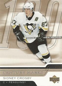
Wednesday, June 17, 2015Set: 2006-07 Upper Deck - Century Marks (Rate) “ Great insert set design and relevant stat(s) on the back. ” -vrooomed
“ Not a bad looking card.One of the best players in the world,just wish he had a better supporting cast. ” -uncaian
“ I like when insert sets actually have a criteria instead of some silly adjective that barely fits half the players in the set. ” -wax_house
“ meeehh. OK design. I think for a card celebrating 100 goals for the season the photo should be a celebration pic, or an action shot of the player shooting. ” -captkirk42
“ Upper Deck in the mid to late 2000's really struggled. ” -carthage44
“ Ah, the odd transition period with the modern Penguins design before Reebok EDGE. The Pens are one of the few teams who look better after the league-wide redesign. ” -jlaz10
|


Saturday, June 13, 2015Set: 1978 Topps Burger King Detroit Tigers (Rate) “ This is one of those GREAT cards - Morris didn't have a solo card in the 1978 Topps set - he was on a card with 3 other players. That's what makes this card so special, as it's his first Topps card by himself. This occurred in a few of the Burger King sets from 1977-1980. (PS: I collect Morris, and don't have this card - I would love to add it to my collection!) ” -vrooomed
“ Cool some Vintage (or almost vintage depending on what year you draw the lines). Back in the day I LOVED the 78 set. Didn't have any Burger Kings or Coke versions. I just wish they would have made it easier to identify the different versions other than the card number. If I recall there were only a handful of the teams that had Burger King releases. ” -captkirk42
“ Regardless of the team or player, DEFINATELY one of my favorite " vintage " sets. ” -engine614
“ Nice 70's card.loved when he played for the Blue Jays. ” -uncaian
“ I would go to Burger King if they gave away these cards! ” -carthage44
“ Yet another reminder of why the biased, antiquated Hall of Fame voting/selection process needs to be revised, refined and if I had my way, reinvented completely. ” -Id8jlb8666
“ The Tigers are the only team to have belt loops, not belt tunnels. ” -jlaz10
“ I love it. Never had a Burger King card, but I love the 1978 Topps design. Great card! ” -switzr1
|

Friday, June 12, 2015Set: 1995-96 SkyBox Impact (Rate) “ Impact was used only once in the NBA, in 1999-00. I didn't know the name had a legacy in the world of cards until I joined the Database, now several years ago. It turns out I tend to like the sets using that name in other sports more than I like the design of the NBA release. This is no exception. ” -Billy Kingsley
“ Not a huge fan of this design. Like Skybox in general. Hate designs with the foil/leaf lettering like this one. Very Difficult to read them in real life can't read them online. Also no stats even though he is a rookie there should be either his last minor league stuff or college if this was the base card. ” -captkirk42
“ This was okay nice front pictures kinda blah backs though. Great defenceman won 2 cups with the Aves. ” -uncaian
“ There were much better product options that year. Of course, there were worse too. At least these generally had very nice photography. ” -vrooomed
“ What's up with no stats on the back of the card? Really dislike that. ” -carthage44
“ When sinks in that this guy is a 2-time Stanley Cup Champion, it really cheapens the idea of being a Stanley Cup Champion. ” -wax_house
“ For the '90s, this was a great sweater. The Avs tried to modernize it in the EDGE template, but I think they need to go to a simple striping pattern with their colors. ” -jlaz10
“ I will guess that maybe his name is in that stripe on the side. I do like the back. I sort cards by player, so lack of stats doesn't bother me. There's always another card of the same guy close by with stats. ” -switzr1
“ Didn't like the design of anything SkyBox. A totally useless set in my opinion. ” -suomibear8
|
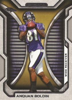
Thursday, June 11, 2015Set: 2012 Topps Strata (Hobby) (Rate) “ Hate the computerized backgrounds. ” -carthage44
“ I always found this set to be interesting. The back ground looks like a garage or storage shed door. The think I hate about this set is the variations/short prints and no way of knowing which you have at first when getting them second hand. If you get them from the packs you usually know, but most of my cards I get second hand now days. ” -captkirk42
“ I do not really like this card. It's like they couldn't think of what to do, so they just made up some silly background. A real photo would have been much better. ” -Billy Kingsley
“ Has to be from preseason practice. No knee pads and only crew socks. ” -jlaz10
“ One of those sets where the hobby and retail base cards are not the same. Which makes this set a zero in my book. Even if Anquan does appear to be making a catch on the Death Star. ” -switzr1
|

")