
Random Card of the Day |
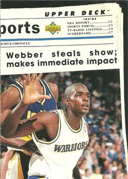
Monday, May 11, 2015Set: 1993-94 Upper Deck Special Edition (Rate) Card: #207 Golden State Warriors “ I love the mock newspaper. It would be funnier to me if the picture showed him calling a timeout. ” -armac
“ I don't usually comment basketball cards, but this design is so awful that I have to say... awful. ” -Duke
“ Love the design, I've never seen this card before. ” -jupiterhill
“ UGH! Looks too much like a newspaper scan (both sides). Very lazy design. ” -captkirk42
" Fun little subset design and a nice photo of Webber. " -MyckKabongo
“ Nice back for info. Good way to teach the young'uns. ” -NJDevils
“ This is one of the few 1990s sets I generally don't care for. The design is "meh" and the cards almost always feel greasy, right out of the pack. The team subset is the best part of the set, which this card is from. It is historically important as it was the first NBA set with a level two parallel- a term I use for a second, harder to pull parallel. It was the first Upper Deck NBA set with any parallel at all, in fact. ” -Billy Kingsley
“ Looks like an actual newspaper, nice work Upper Deck. ” -carthage44
|
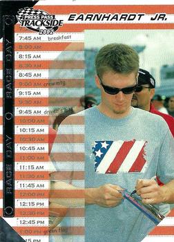
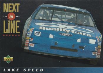
Sunday, May 10, 2015Set: 2002 Press Pass Trackside (Rate) “ One of many pointless subsets Press Pass was so fond of...they couldn't figure out that a NASCAR set should show cars, but we got subsets about driver's "star signs" and the like. Most of Dale Jr's cards from 1999 through 2007 were also severely damaged by censorship; this one is not. Dale Jr. is one of my all time favorite drivers so that was especially frustrating for me. ” -Billy Kingsley
“ YAWN... ” -SFC Temple
“ It annoys me when Jr. or Sr. is included as part of someone's last name. His last name is Earnhardt, not Earnhardt Jr. If he is married, his wife's last name isn't Earnhardt Jr. His kids last names aren't Earnhardt Jr. It's Earnhardt. This bugs me because I am a Jr. myself. Sorry for the rant. ” -switzr1
|
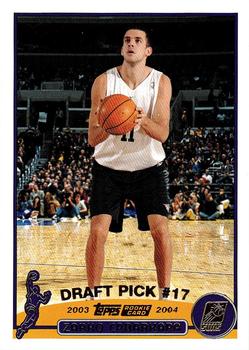
Saturday, May 9, 2015Set: 2003-04 Topps - Factory Set (Rate) “ I'm not too big on college uniform cards. Good thing this one tells which pro team drafted him. I don't like the undrafted ones much. Actually this is a kind of ugly card ” -captkirk42
“ The 2003-04 Topps Factory set was different from the pack released set in several ways. Aside from the fact that there were more cards in the set, it also featured gold foil to the normal set's silver. Quite a few photos were changed, although unfortunately most of the changes were done digitally, not actual new photos, although there are some of them. Also, some of the Topps logos on the back bottom of the card had their colors changed, with no rhyme or reason that I can tell. Also, several of the Chicago Bulls had the team logo on the back changed text color. This card is one that is different from the base card, but it's not particularly good, as they digitally created it. The shot is from Summer League, but the background was added from a regular season game. The set was released in the week before Christmas, if they had waited until later in the season it would have been much better- they could have used real photos instead of lousy photoshop jobs. ” -Billy Kingsley
|

Friday, May 8, 2015Set: 2012 Topps Allen & Ginter (Rate) “ Played his summer ball for the Danville Dans. I go to lots of Dans games. ” -switzr1
“ I love this set, slowly collecting it,its crazy how divers it is. ” -uncaian
“ As much as I love A&G, haven't been getting it much lately. It seemed to start sometime around that year 2012. I think the biggest reason is there is just SOOOOOOOOO Much product out there now days. It is much like it was back in the "Junk Wax" days, except instead of Billions and Billions of copies of a single card they are only making a handful, but they are making billions of these short printed handfuls by making 100s of parallels of the base card. Plus they are making dozens of sets. So in someways we are in a sort of second "Junk Wax" era. ” -captkirk42
“ When's the last time Topps had an original design thought? Did they fire all their graphic design artists? ” -C2Cigars
“ As a Phillies fan, I can not stand this guy. As a card collector this set as well as GQ are by far my favorites of the "speciality" sets. ” -engine614
“ Allen & Ginter always leave more to be desired. ” -carthage44
“ The Phillies uni looks great in these styles of cards, but it would be a nice touch to be depicted in an early 1900's uniform. ” -jlaz10
“ One of my favorite sets, love the inserts and minis! ” -Joshua825
|
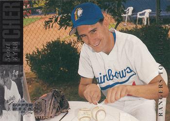
Thursday, May 7, 2015Set: 1994 Upper Deck Minor League (Rate) “ Wow, that's, umm...I've got nothing! Pass the salt? ” -Billy Kingsley
“ Rookie Hazing- CAUGHT ON A BASEBALL CARD ” -Howintensive
“ You know you are in hard times in the minors when you have to resort to eating baseballs... ” -cckeith
“ LOLOL....I don't want to hear any more complaints about silly TCG cards after seeing this.... LOLOLOLOL ” -SFC Temple
“ I hope someone out there likes this card. Back photo is fine. ” -NJDevils
“ Doctoring baseballs! (Or, this guy lives, breathes, and EATS baseball.) ” -vrooomed
“ Cutting the baseball, classic photo HAHA! ” -carthage44
“ Just cooking up some fun. Gotta love minor league cards, even from the big brands. Upper Deck had great photographers. ” -marcbrubaker
“ Was going to make a joke about low pay in the Minors and eating but everything sounds so nasty or would be interpreted that way. ” -captkirk42
“ That Scott Eyre is such a kidder ” -jackal726
“ Minor leaguers are paid so poorly, some resort to eating the cowhide off baseballs. For pennies a day, you can help these young men, but please, call now! ” -DaClyde
“ What the heck is he doing? ” -cynicalbuddha
“ This card is weird on different levels.... ” -Joshua825
|

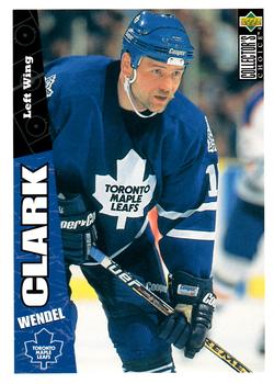
Tuesday, May 5, 2015Set: 1996-97 Collector's Choice (Rate) “ It seems weird to me, learning about hockey, that they wear blue and not red. Apparently I just associate Canada's flag with the maple leaf that much. ” -Billy Kingsley
“ Maple Leafs legend. Got chance to play briefly with the Blackhawks, but these are his true colors. Set is OK... well, at least much better than 1995-96 Collector's Choice. ” -Duke
“ WENDEL!!!!! Best Youtube video ever- Wendel Clark- ALL HEART! ” -Howintensive
“ Quickly becoming a hockey fan....just watched game 7 Islanders/capitals... BRUTAL!! ” -SFC Temple
“ Part of one of the most popular Leaf teams along with Gilmour,Joseph,the great Pat Burns etc.Tough guy who could score.I liked this set it was affordable & looked good. ” -uncaian
“ One of these over produced sets that I have a love/hate reaction to. I like the cartoon guy on the trivia question. Overall design is good. Now do I go for the entire set still? (I have a bunch in a couple of boxes from some blind bulk rate box buys) Or just make sure I have my Caps set complete? ” -captkirk42
“ Collector's Choice have always been very kid friendly cards. ” -carthage44
“ Never had the hockey cards, but hated the design of these of the football cards I had. ” -jupiterhill
“ I like this set. The focus is on the picture. Easy to see who the player is, and his team and position. Easy-to-read card number on the back. Most Collector's Choice sets were good in my book. ” -switzr1
|

")