
Random Card of the Day |
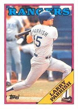
Tuesday, March 24, 2015Set: 1988 Topps - Collector's Edition (Tiffany) (Rate) “ Topps Tiffany... OPC backing with Topps on the front. ” -Mike67
“ 1988 Topps - looked similar to 1966 Topps. ” -vrooomed
“ He was a Man's Man!!! ” -carthage44
“ Tiffany cards? What no Debbie Gibson cards? *RIMSHOT* Seriously back in the day when Tiffany cards were the rage sure I was into them, but now-days **Yawn** Not so much. I do like the '88 Topps design. Basic and simple. ” -captkirk42
“ Topps' most boring design since 1966. This is practically its own Heritage design. Aside from the errors that were briefly popular (Murray, McGwire, Leiter, Comstock), this set had little to recommend it to collectors. The Tiffany set is just putting lipstick on a pig. Why did my 12-year-old self buy so friggin' many of them? ” -DaClyde
“ The Rangers old roads lacked red, a color that they overcompensated for in their 1994 uni set. ” -jlaz10
“ LP was a favorite when I was a kid watching the Expos. Nice player. And as I said with the last Tiffany card...I like the nice clean back. ” -armac
|
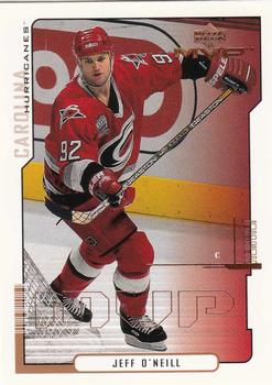
Monday, March 23, 2015Set: 2000-01 Upper Deck MVP (Rate) “ Not a huge fan of MVP, or at least the early ones. I liked the Collector's Choice brand it replaced (In basketball) better. With that said, I'm about 20 cards away from having the complete run from 1999-00 through 2003-04. ” -Billy Kingsley
“ Really dislike the bar codes on these cards. ” -carthage44
“ Great player always played hard. ” -uncaian
“ Solid product, especially considering it was "low-end". ” -vrooomed
“ The 'Canes had some good sweaters, but their new design is so much better. ” -jlaz10
“ This guy is familiar. I know the name, but I know nothing of what this guy's done. Your prototypical obscure former player. ” -Howintensive
|

Sunday, March 22, 2015Set: 2011 Topps Gypsy Queen - Mini Red Gypsy Queen Back (Rate) “ That may be the smallest card number in history. ” -Billy Kingsley
“ Half the people love these, the other half loathe these. In this case, I'm part of the latter. What IS that on the back?! ” -vrooomed
“ A BIG pass on the Gypsy Queen sets. ” -carthage44
“ I don't like this design as much as some of the other recent Gypsy Queen mini sets. I do like the choice of picture though. Don't seem to see many pictures of a first baseman covering the bag on cards, especially from this straight-on angle. ” -switzr1
|
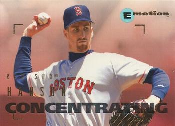
Saturday, March 21, 2015Set: 1995 SkyBox E-Motion (Rate) “ Not a fan of the design. And he is concentrating on "How long are they going to make me hold this pose?" ” -switzr1
“ My local card shop had a box of the NBA release of Emotion, and I passed it up, going instead for whatever new release was new at the time. When I decided to go back and get it, it had sold out. This was 2002 or 2003. I still regret it, and I still need more than I have of the set. In fact, of all the 1994-95 NBA releases, it's the one I have the least of. ” -Billy Kingsley
“ These were very cool. Each player had a different word that described them. ” -carthage44
“ I can't find "Hanson Concentrating" in the data base. Might be rarer than Honus Wagner. ” -NJdevils
“ So having a picture of the same guy in the same motion on the back may not have been the best idea. ” -jlaz10
“ Mid-90s slop. ” -vrooomed
“ OK design only issue is it's a red sox card. ” -MAS23
“ siamese twins ” -volbox
“ I don't know anything about this set but I like what seems to be the different looks of the curveball on the front and back of the card. ” -armac
|
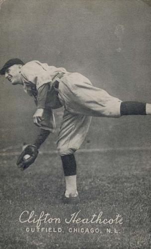
Friday, March 20, 2015Set: 1923-24 Exhibits W461 (Rate) “ Wow. Clean design, nice (fake?) action picture. Feels like a foggy baseball field in the middle of nowhere. ” -volbox
“ Wow...that's huge. And old. Is it really what fits the concept of a trading card, or is it something different that's included here because it's similar? I really don't know. Always cool to see old stuff though! ” -Billy Kingsley
“ Why does make smile when I see a "plain" black & white card ? It shows you can have a great product without a bunch of bells & whistles. ” -uncaian
“ Nice! I want one. :) But make it a Phillie. ” -vrooomed
“ SUPER COOL!!! ” -carthage44
" I was the starting pitcher for the Chicago Cubs in a DoubleHeader against the St. Louis Cardinals the other starter was Max Flack. In between the two games I was traded to the Cardinals for Max then I would learn I would start Game #2 the pitcher for the Cubs was Max Flack. " -WALKIN' BASEBALL ENC
“ In the early 20's, they experimented with a sport that combined baseball with karate. ” -bplay24
“ I like those socks! Very football-style, compared to the NFL. ” -jlaz10
“ Never heard of these, but even with a blank back...classic! Love it! ” -bkklaos
“ As old as this card is, the Cubs hadn't won a World Series for over 15 years! Great photo of a guy that was traded in the middle of a doubleheader and played for both teams that day. ” -armac
“ Look how old this card is. And think; the last time the Cubs won a World Series, Clifton Heathcote was ten years old. ” -switzr1
|
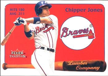
Thursday, March 19, 2015Set: 2001 Fleer Tradition - Lumber Company (Rate) “ Typical early 2000s Fleer insert. Not bad, but not spectacular either. Knowing Fleer, there is a version where the circle the team logo is in is replaced by a piece of bat relic. ” -Billy Kingsley
“ Future HOFer? I say yes. Not a bad design and layout for an insert card. Numbering for the set should be xxLC instead of LCxx. ” -vrooomed
“ The Lumber Company insert has been around for a while and I have always enjoyed them. ” -carthage44
“ The Braves have some of the best pant designs in the league, given that their braid goes around the belt tunnels as well. ” -jlaz10
“ I saw Chipper at a bowling alley near where I work. The alley put 2 lanes worth of special needs kids next to him. Given his reputation at the time, I expected him to immediately bolt. He signed something for every one of those kids, took a couple pictures, then bolted. I've been a fan ever since. ” -jackal726
“ Eww. Not much in the design department on this one. Looks like pulled icons out of a hat and tossed them on red construction pater and said "New design done!" ” -koloth42
|
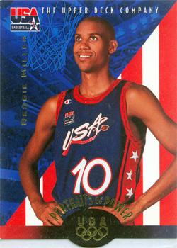
Wednesday, March 18, 2015Set: 1996 Upper Deck USA (Rate) “ These cards were cool but the die cut bottom led to a lot of damaged cards- at least for 12 year old me. I stood my cards on end in plastic cases at the time and they would flop over sideways, making them stick out and leading to the top corners getting damaged. It never dawned on me to store them upside down, or even put them in a different box. In fact, they remained in the same plastic case until 2011, when I finally got them out of there and into the white 900 count boxes I prefer to keep the majority of my collection in. ” -Billy Kingsley
“ Great to see my favorite player featured, but I HATED this set because the bottom isn't straight, so they don't stand upright in a box. Terrible idea. ” -switzr1
“ Boom, baby!! ” -cckeith
“ Only pro basketball player with skinnier arms than me. ” -NJDevils
“ One of the best pure shooters EVER! USA, USA, USA!! ” -carthage44
|

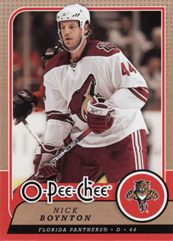
Sunday, March 15, 2015Set: 2008-09 O-Pee-Chee (Rate) “ Wow, I look at this card and realize just how long ago it was that he played his junior hockey with the Ottawa 67s. ” -armac
“ Really like this set. I had commented in the past how I didn't care for the card back, but now that I have some in my collection, that's a different story. ” -Billy Kingsley
“ Very nice card. Good photo. Again, looks like they forgot the color ink cartridge on the back. ” -NJdevils
“ Oh Canada! ” -carthage44
“ Nice standard hockey look. Hope it's on nice card stock. ” -vrooomed
“ I like this set overall,two things though no write up on back & way too many cards ” -uncaian
“ Shouldn't the brand logo be smaller than the player name and team name? Just my opinion I guess. ” -cckeith
“ I like most of this card. Not too flashy. Nice design. I like that his head extends beyond the border. But I wish the OPC wasn't bigger than his name. This really detracts from the appearance of the card. ” -switzr1
“ This would be a nice looking card if it wasn't for the huge OPC logo and the bare bones design on the reverse. ” -Id8jlb8666
|

")