Random Card of the Day


Thursday, February 12, 2015

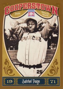
Set: 2013 Panini Cooperstown (Rate)

Card: #17 Satchel Paige


“ Cool card. Vintage theme though modern. A player even I have heard of/know about. ” -Billy Kingsley

“ I guess MLB doesn't own the Negro League license... ” -jackal726

“ New card of a legend...still love it! ” -bkklaos

“ Negro League unis were some of the best. The color raglan sleeves, color belt loops, and pants numbers are all innovations not seen today. ” -jlaz10

“ Love the stories I've read about Paige! ” -Joshua825

“ Quick Quick!! We've run out of players somehow!! WE NEED TO RETRO IT!!! Honestly, all these retro sets... are they trying to educate young collectors on legends, or fill binders with worthless cards because they're replicas with no real appreciating value? That said... gonna look into this set and get educated... and fill a binder. COMPLETION COMPLETION!!!! ” -Dixxy

“ I liked these Cooperstown sets. Makes it possible to own a card of some of the HOFers that Topps doesn't generally use in their sets, without spending big bucks on their actual vintage cards. ” -switzr1


Wednesday, February 11, 2015

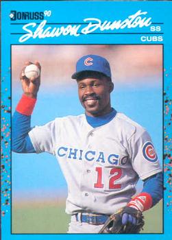
Set: 1990 Donruss Best of the NL (Rate)

Card: #112 Shawon Dunston


“ So bad but so good! ” -carthage44

“ Never been a Cubs fan, but I always liked Shawon Dunston ” -jackal726

“ Worst back of card for a Major League set, worse than minor league sets. Good job on front photo. ” -NJdevils

“ Not a bad looking card for 1990. A little information under his stats, and we would be good. ” -engine614

“ I had so many 1990 Donruss it wasn't funny. But hardly ever saw this blue set for some reason.... ” -Joshua825

“ The script is way too small on this jersey. Make it taller and it's not half bad. ” -jlaz10

“ Shawn Dunston presents Baseball 101: "This is a baseball." ” -armac

“ Shaaaa-wahn! I watched him throw oh so many balls into the second row. Did a four year old girl play with crayons on the edges of this card? She should have used the big blank space on the back, instead. ” -Vvvergeer


Tuesday, February 10, 2015

Set: 1993 Stadium Club (Rate)

Card: #306 Jonathan Hurst


“ Stadium Club usually had nice photography. I didn't always like the design, but you could expect good pictures. This design is actually pretty good, though the foil is hard to read in a scan. I always liked the rookie card on the back, except in basketball sets where Topps didn't make cards for a long time and almost everyone had 92-93 Topps shown as their RC. ” -switzr1

“ MOM!!! Giant-Man stepped on Three Rivers Stadium again!!! ” -revnorb

“ I have the hockey version of this set.I like the baseball better .Nice. ” -uncaian

“ The RC shown on the back was nice, except for the rookies - they were comical - especially when the SC card was the RC. Always loved the photography on Stadium Club. The 1993s are affordable now. Collation in boxes is rough. My son and I opened several, and still had to buy singles to complete the set. ” -vrooomed

“ To me, 93 Stadium Club and Fleer Ultra were a big letdown from their 92 editions. ” -volbox

“ I do like how these Stadium Club cards would show the players first Topps card on the back. ” -carthage44

“ Looking back, the Expos should have kept their racing stripe jerseys up until their last day. They were a lot better than these. ” -jlaz10

“ I liked the 1991 set design the best. This one....meh ” -suomibear8


Monday, February 9, 2015

Set: 2002-03 Upper Deck Mask Collection (Rate)

Card: #53 Chris Osgood / Garth Snow


“ I don't get it. Is the B&W photo over his shoulder his backup, waiting for him to mess up so he can get in the game? Seems like an odd set concept. ” -switzr1

“ I just got my first cards from this set yesterday! (1/31, but that's still yesterday for me) Now I know that the wording isn't just poorly done, it's holofoil and doesn't scan with the intensity it has in hand. Not sure if I got this card or not, I'm on a bit of an overload, as I got so many hockey cards in the mail yesterday. Over 1000...still working on counting them! ” -Billy Kingsley

“ Nice subset,I especially like the commentary on the back. ” -uncaian

“ The Islanders had a string of unfortunate uniform looks through the '90s and '00s, but at least they kept the blue and orange in this sweater. ” -jlaz10

“ Ozzie with the Islanders. He looks all wrong without the winged wheel on his chest! (Nice card.) ” -vrooomed

“ OZZY!!!! I'm glad the Wings took him back ” -Howintensive

“ A set with some great value to it. One of the more creative UD sets from the early 2000's. ” -suomibear8

“ I forgot that Osgood went to the Isles. I generally like multi-player cards like this. ” -armac


Sunday, February 8, 2015

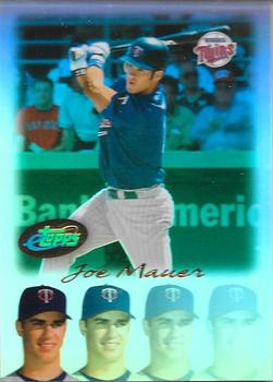
Set: 2004 Topps eTopps (Rate)

Card: #43 Joe Mauer


“ Normally, I LOVE eTopps, however, not a fan of the Warhol-esque repeating and fading Maurers on the bottom. ” -vrooomed

“ Im not into "etopps", and regardless, NOT a fan of this card by a long shot. 4 heads on the bottom, a Topps logo almost mid card ( ruining the the picture). Please tell me what there is to like here? ” -engine614

“ I really liked the idea of eTopps, but it couldn't withstand the speculator market I guess. ” -jackal726

“ Nice BP jersey, obviously in spring training. ” -jlaz10

“ Never understood and therefore never liked eTopps. ” -carthage44

“ Going, going, going, gone. ” -koloth42

“ 4,888 ! how limited is that really ? ” -uncaian

“ Glad I never got into these. ” -NJDevils


Saturday, February 7, 2015

Set: 2002 Upper Deck (Rate)

Card: #740 Curt Schilling


“ Never like the checklists with a player on the front. Give me the old fashioned ones with 88 or so players on it. Would also cut down on the number of useless cards. ” -NJDevils

“ At least they started making checklists more appealing by putting players on the front rather than just a checklist of the players in the set. ” -carthage44

“ Miss the little boxes on checklists. ” -vrooomed

“ The D-Backs would look great in their current set, but original colors. There's just too much going on here with vest, pinstripes, and two-color outline/drop shadow. ” -jlaz10

“ I thought it was a Rockies card ” -volbox

“ I like checklist cards with a player on the front. It is also nice that they still say something about the player on the back along with the checklist. ” -armac

“ Never been a big fan of the uniform colors of the Diamondbacks. ” -JimStaub


Friday, February 6, 2015

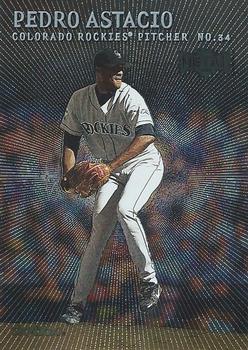
Set: 2000 Metal (Rate)

Card: #65 Pedro Astacio


“ A fan of the Metal. Would like to see some sort of border and have a bio on the back. ” -SFC Temple

“ Loved this design. The scan doesn't capture the metallic printing process well. I finally completed the NBA design with this set in 2013. Wish they had kept Metal going. ” -Billy Kingsley

“ I'm sure this card looks better in person, but still I like it. I guess the psychedelic front mixed with the faux metal back combined for a 60's/70's feel on the front and a modern (at the time) back. ” -vrooomed

“ With his stance & the graphics,it looks like someone had beans for breakfast.Shiny doesn't always mean nice .Good looking back though. ” -uncaian

“ Nice scan for a card that is very difficult to scan. I need one of those scanners. ” -carthage44

“ To me, Metal & Metal Universe had some interesting things to bring to collectors. They made it different. ” -JimStaub

“ It looks odd for a Rockies jersey not to have the MLB logo on the back, but for their first 7 years they didn't. ” -jlaz10

“ Not good. Definitely not good. I don't have any of these but I hope they look better in person. ” -NJdevils

“ Yeahhh. I remember this set. That is about all I have to say about this. ” -switzr1


Thursday, February 5, 2015

Set: 1997 Playoff Absolute Beginnings - Chip Shots Black (Rate)

Card: #49 Lake Dawson


“ Meh. Not a fan of poker. ” -Billy Kingsley

“ I love the oddball stuff. ” -SFC Temple

“ Poker chips/football cards! Yes and yes!!! ” -carthage44

“ What a bad concept. Openly promoting and associating gambling with football. Proof the hobby is no longer intended for kids. I can't believe the NFL and NFLPA approved this. ” -C2Cigars

“ Can't complain about creativity with inserts/parallels, other than not having any sleeves to properly showcase them. I guess I can complain after all! ” -jackal726

“ Looks like a puck, they should do that for hockey cards. How about exchange cards for players on pucks? That would be a tough set to display. ” -CluelessJoe

“ 'Cause nothing says football like Poker Chips. ” -jlaz10

“ With no 1997 Browns to collect I wasn't even aware these existed. I guess trying to get poker chips isn't that different than some of the other inserts I've seen. ” -armac

“ Poker Night! ” -JimStaub

“ Storage and/or display for these types of things is always challenging. Also a great indicator that kids are no longer a factor in the hobby. ” -Id8jlb8666


Wednesday, February 4, 2015

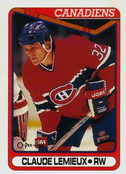
Set: 1990-91 O-Pee-Chee (Rate)

Card: #451 Claude Lemieux


“ True playoff performer. One of those players you hate unless he is on your team. ” -armac

“ great design! ” -Billy Kingsley

“ "I can't believe I shook his frigging hand!" - Dino Ciccarelli, following the playoff series where Lemieux had smashed Kris Draper's face into the boards in front of the bench (Avs/Red Wings). ” -vrooomed

“ Did an excellent job when with the Devils. A fine player. ” -NJDevils

“ Actually got to meet Claude nice guy,nasty player. ” -uncaian

“ I had a "Screw Lemieux" t-shirt when I was a kid. ” -wax_house

“ Is it wrong that I prefer the "rough" card back with no picture? ” -SFC Temple

“ As much as I hate the Habs, I've got to love their sweaters. ” -jlaz10


Tuesday, February 3, 2015

Set: 1993 Studio (Rate)

Card: #44 John Burkett


“ IN YO FACE!!! Literally. ” -carthage44

“ My gut reaction to Studio is that they are cheesy, but I can't deny that I want them anyway. ” -jackal726

“ Never was a big fan of Studio. Therefore, in my efforts to stay positive in RCOTD, the photography used in these sets was top-notch. It really did make the other companies take notice and force them to use better photos (like Stadium Club, for high-quality action shots). ” -vrooomed

“ I like the logo-emblazoned turtle neck, but interesting coloration. Normally the background would be stitched in white, but it's left black in this case. ” -jlaz10

“ - Zoom in on that logo. More. More. I said more!!!!! That face too on the back. - But sir, a part we'll be missing. - No prob, that's what we call concept. ” -JimStaub

“ Personally, I loved the Studio sets when they came out! ” -bkklaos

“ The design of the set is nice. Professional pic and the team logo in the background is cool. ” -grim25

“ Love the dig at bowlers in the last line on the back. ” -armac

Page:


Copyright © 2024 Trading Card Database LLC
Designated trademarks and brands are the property of their respective owners.