
Random Card of the Day |

Tuesday, January 13, 2015Set: 2013 Choice Vermont Lake Monsters (Rate) “ Cool team logo. They talk about this team often on the Albany news broadcasts when I am in Lake George, NY. (about 45 minutes from Vermont) Great card design, too. A lot of times I like the minor league designs better than the big league sets. ” -Billy Kingsley
“ Sweet scan! ” -carthage44
“ The back is lackluster, but the front is pretty sharp. ” -jackal726
“ Lake Monsters? Is the team mascot Nessie? ” -Joshua825
“ Lake Monsters...love it! I'm now a (distant) fan! ” -bkklaos
“ His cap looks like a first base man plastic cap. Just like John Olerud. ” -JimStaub
“ Nice clean design. Reminds me of a BBM set from Japan. ” -DaClyde
“ Nice looking set. I like the uniform. I like the team name too. I would collect these ” -switzr1
“ The Lake Monsters had a great minor league set before they jumped on the kid-friendly bandwagon. ” -jlaz10
“ Just about as nice a MiLB card as you can get! Full-bleed front, with name, postion, uni #, team logo, and small manufacturer logo. The reverse has an actual card number (many MiLB sets surprisingly lack them), college stats!, and draft info. Only thing I'd like to see on these, somewhere, anywhere, is the MLB affiliate's name. (BTW, it's the A's.) ” -vrooomed
|
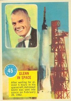
Monday, January 12, 2015Set: 1963 Topps Astronauts (R709-6) (Rate) “ I hope he wore that bow tie when he ate his 3-D fried egg on Mercury. ” -switzr1
“ Normally I don't trust a guy with a bow tie but John Glenn is a total badass. Went into space at 77 years old as a member of the U.S. Senate. You got my vote pal. ” -Id8jlb8666
“ Cool! I've been a fan of space exploration for my whole life- probably due to my love of Star Wars- my first memory of anything in life is watching Empire Strikes Back. I need to find some of these cards for my collection. I like how Topps used a continuation design for it's 1969 Man on the Moon series, of which I just got my first two cards of in December. ” -Billy Kingsley
“ Awesome! Dixxy uploads all the "good stuff"! ” -bkklaos
“ Bow ties are cool! ” -koloth42
“ Aging myself, but I actually remember this! ” -BOBSCARDZ
“ I'm a sports card collector but this is just plain cool! ” -carthage44
“ This is a set idea that I think would be great if they did again with autos and GU space suits! I once worked for Charles Bolden, 4 time shuttle astronaut and now NASA Director. Great man! ” -CluelessJoe
“ The back makes the card for me. Fry an egg on Mercury. Made my day! ” -JimStaub
“ Great set. I don't know how I missed collecting these when I was a kid. I wonder if it was selective distribution? ” -NJdevils
“ John Glenn: An American Hero ” -jlaz10
“ You just have to love that bowtie! ” -Joshua825
|

Saturday, January 10, 2015Set: 1984 O-Pee-Chee Michael Jackson (Rate) “ One of the greatest entertainers ever and an even better human being. R.I.P Michael. ” -Id8jlb8666
“ I guess the interesting facts about Michael were used on cards 1-30? This sounds more like name-dropping. ” -switzr1
“ ummmmmm ! ” -uncaian
“ What do the Phillies and Michael Jackson have in common? They all wear only one glove for no apparent reason. :) ” -vrooomed
“ I am ashamed to admit that I have these cards. There, I am totally ashamed. ” -NJDevils
“ Definitely a baseball card. ” -jlaz10
|


Thursday, January 8, 2015Set: 2003 Fleer Patchworks (Rate) “ One of the best pitchers of all-time. ” -carthage44
“ Nice looking card. I like the way that Fleer, in its latter years, had the year beneath the Fleer logo on the back. Always makes sets easier to identify without looking for a copyright date in the small print. ” -switzr1
“ First ballot Hall of Famer ” -Young Kilo
“ Remember when Pedro grabbed Don Zimmer by the head and gently dumped him on the ground when Zimmer charged the mound? Well... Pepperidge Farm remembers. ” -Id8jlb8666
“ The good days of Boston baseball. ” -jlaz10
|

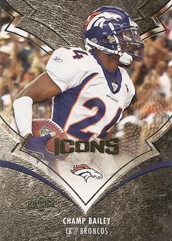
Monday, January 5, 2015Set: 2008 Upper Deck Icons (Rate) “ One of my favorite sets of all-time! Also, one of the best "bang for your buck" boxes that you could purchase. For about $50-$60 per box you would get two jersey cards, one autograph and two lettermen patch cards with a chance of getting an auto lettermen. ” -carthage44
“ Interesting texture design. I like it. ” -Billy Kingsley
“ Nice, solid card. Hits all required points...Team logo, short narrative, stats... My preference is to have a borders though.. ” -SFC Temple
“ Don't like the card design, don't like the picture angle. ” -CluelessJoe
“ The front design is some kinda of nice but I think the picture of the player ain't using enough space on the card. ” -JimStaub
“ The Broncos road uni set is still too navy-heavy in relation to their orange home uniform. ” -jlaz10
“ This is an ugly card ! ” -uncaian
“ Hey I've been off the site for a few months with a move to a new town...came back just in time to catch one of my scans! Sweet! ” -bkklaos
|

")