Random Card of the Day


Monday, February 9, 2015

Set: 2002-03 Upper Deck Mask Collection (Rate)

Card: #53 Chris Osgood / Garth Snow


“ I don't get it. Is the B&W photo over his shoulder his backup, waiting for him to mess up so he can get in the game? Seems like an odd set concept. ” -switzr1

“ I just got my first cards from this set yesterday! (1/31, but that's still yesterday for me) Now I know that the wording isn't just poorly done, it's holofoil and doesn't scan with the intensity it has in hand. Not sure if I got this card or not, I'm on a bit of an overload, as I got so many hockey cards in the mail yesterday. Over 1000...still working on counting them! ” -Billy Kingsley

“ Nice subset,I especially like the commentary on the back. ” -uncaian

“ The Islanders had a string of unfortunate uniform looks through the '90s and '00s, but at least they kept the blue and orange in this sweater. ” -jlaz10

“ Ozzie with the Islanders. He looks all wrong without the winged wheel on his chest! (Nice card.) ” -vrooomed

“ OZZY!!!! I'm glad the Wings took him back ” -Howintensive

“ A set with some great value to it. One of the more creative UD sets from the early 2000's. ” -suomibear8

“ I forgot that Osgood went to the Isles. I generally like multi-player cards like this. ” -armac


Sunday, February 8, 2015

Set: 2004 Topps eTopps (Rate)

Card: #43 Joe Mauer


“ Normally, I LOVE eTopps, however, not a fan of the Warhol-esque repeating and fading Maurers on the bottom. ” -vrooomed

“ Im not into "etopps", and regardless, NOT a fan of this card by a long shot. 4 heads on the bottom, a Topps logo almost mid card ( ruining the the picture). Please tell me what there is to like here? ” -engine614

“ I really liked the idea of eTopps, but it couldn't withstand the speculator market I guess. ” -jackal726

“ Nice BP jersey, obviously in spring training. ” -jlaz10

“ Never understood and therefore never liked eTopps. ” -carthage44

“ Going, going, going, gone. ” -koloth42

“ 4,888 ! how limited is that really ? ” -uncaian

“ Glad I never got into these. ” -NJDevils


Saturday, February 7, 2015

Set: 2002 Upper Deck (Rate)

Card: #740 Curt Schilling


“ Never like the checklists with a player on the front. Give me the old fashioned ones with 88 or so players on it. Would also cut down on the number of useless cards. ” -NJDevils

“ At least they started making checklists more appealing by putting players on the front rather than just a checklist of the players in the set. ” -carthage44

“ Miss the little boxes on checklists. ” -vrooomed

“ The D-Backs would look great in their current set, but original colors. There's just too much going on here with vest, pinstripes, and two-color outline/drop shadow. ” -jlaz10

“ I thought it was a Rockies card ” -volbox

“ I like checklist cards with a player on the front. It is also nice that they still say something about the player on the back along with the checklist. ” -armac

“ Never been a big fan of the uniform colors of the Diamondbacks. ” -JimStaub


Friday, February 6, 2015

Set: 2000 Metal (Rate)

Card: #65 Pedro Astacio


“ A fan of the Metal. Would like to see some sort of border and have a bio on the back. ” -SFC Temple

“ Loved this design. The scan doesn't capture the metallic printing process well. I finally completed the NBA design with this set in 2013. Wish they had kept Metal going. ” -Billy Kingsley

“ I'm sure this card looks better in person, but still I like it. I guess the psychedelic front mixed with the faux metal back combined for a 60's/70's feel on the front and a modern (at the time) back. ” -vrooomed

“ With his stance & the graphics,it looks like someone had beans for breakfast.Shiny doesn't always mean nice .Good looking back though. ” -uncaian

“ Nice scan for a card that is very difficult to scan. I need one of those scanners. ” -carthage44

“ To me, Metal & Metal Universe had some interesting things to bring to collectors. They made it different. ” -JimStaub

“ It looks odd for a Rockies jersey not to have the MLB logo on the back, but for their first 7 years they didn't. ” -jlaz10

“ Not good. Definitely not good. I don't have any of these but I hope they look better in person. ” -NJdevils

“ Yeahhh. I remember this set. That is about all I have to say about this. ” -switzr1


Thursday, February 5, 2015

Set: 1997 Playoff Absolute Beginnings - Chip Shots Black (Rate)

Card: #49 Lake Dawson


“ Meh. Not a fan of poker. ” -Billy Kingsley

“ I love the oddball stuff. ” -SFC Temple

“ Poker chips/football cards! Yes and yes!!! ” -carthage44

“ What a bad concept. Openly promoting and associating gambling with football. Proof the hobby is no longer intended for kids. I can't believe the NFL and NFLPA approved this. ” -C2Cigars

“ Can't complain about creativity with inserts/parallels, other than not having any sleeves to properly showcase them. I guess I can complain after all! ” -jackal726

“ Looks like a puck, they should do that for hockey cards. How about exchange cards for players on pucks? That would be a tough set to display. ” -CluelessJoe

“ 'Cause nothing says football like Poker Chips. ” -jlaz10

“ With no 1997 Browns to collect I wasn't even aware these existed. I guess trying to get poker chips isn't that different than some of the other inserts I've seen. ” -armac

“ Poker Night! ” -JimStaub

“ Storage and/or display for these types of things is always challenging. Also a great indicator that kids are no longer a factor in the hobby. ” -Id8jlb8666
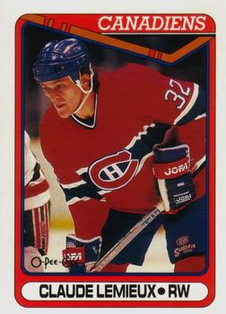

Wednesday, February 4, 2015

Set: 1990-91 O-Pee-Chee (Rate)

Card: #451 Claude Lemieux


“ True playoff performer. One of those players you hate unless he is on your team. ” -armac

“ great design! ” -Billy Kingsley

“ "I can't believe I shook his frigging hand!" - Dino Ciccarelli, following the playoff series where Lemieux had smashed Kris Draper's face into the boards in front of the bench (Avs/Red Wings). ” -vrooomed

“ Did an excellent job when with the Devils. A fine player. ” -NJDevils

“ Actually got to meet Claude nice guy,nasty player. ” -uncaian

“ I had a "Screw Lemieux" t-shirt when I was a kid. ” -wax_house

“ Is it wrong that I prefer the "rough" card back with no picture? ” -SFC Temple

“ As much as I hate the Habs, I've got to love their sweaters. ” -jlaz10


Tuesday, February 3, 2015

Set: 1993 Studio (Rate)

Card: #44 John Burkett


“ IN YO FACE!!! Literally. ” -carthage44

“ My gut reaction to Studio is that they are cheesy, but I can't deny that I want them anyway. ” -jackal726

“ Never was a big fan of Studio. Therefore, in my efforts to stay positive in RCOTD, the photography used in these sets was top-notch. It really did make the other companies take notice and force them to use better photos (like Stadium Club, for high-quality action shots). ” -vrooomed

“ I like the logo-emblazoned turtle neck, but interesting coloration. Normally the background would be stitched in white, but it's left black in this case. ” -jlaz10

“ - Zoom in on that logo. More. More. I said more!!!!! That face too on the back. - But sir, a part we'll be missing. - No prob, that's what we call concept. ” -JimStaub

“ Personally, I loved the Studio sets when they came out! ” -bkklaos

“ The design of the set is nice. Professional pic and the team logo in the background is cool. ” -grim25

“ Love the dig at bowlers in the last line on the back. ” -armac


Monday, February 2, 2015

Set: 2010 Topps Prime - Bronze (Rate)

Card: #57 Montario Hardesty


“ Hardesty may have gotten hurt somewhere when I scanned this card. Too bad he couldn't stay healthy, there were high hopes for him. ” -armac

“ I like the design for the most part, I'd prefer a team name over a helmet on the front. The back looks a tad plain but its acceptable. ” -jupiterhill

“ Solid design. Clear, full photography is a plus, and the design at the bottom that contains his name and position doesn't detract. Personally I would rather have had his team, instead of his position, under his name, but you can't win them all I suppose. ” -Billy Kingsley

“ Classic Browns look, even in the Reebok-era. ” -jlaz10

“ This looks like the Blue Angels decided to do a surprise flyover during practice ” -jackal726


Sunday, February 1, 2015

Set: 1989 Score (Rate)

Card: #465 Todd Burns


“ Not sure what Score was thinking when they used this design to follow up their inaugural set. I wish they had left out the inner colored border. This set was not popular, at all. ” -DaClyde

“ 1989 Score ... nice + set .. many ERRs/VARs...double ++ set. ex.Paul Gibson classic obscene error! ~BOB~ ” -BOBSCARDZ

“ Score's second attempt at a large set. I liked the design and for the most part, the numbers on the reverse were in the same spot - just a few exceptions. Looking now, the photography could have been crisper, but I always liked Score's write up on the reverse. ” -vrooomed

“ Such a simple design but when you are over producing your product, what else would you expect? ” -carthage44

“ For being as "plain" as it is, I actually like this card. Simple and to the point with a good amount of information on it. ” -engine614

“ I like simple, uncluttered designs that dedicate most of the card space to the player's image. ” -C2Cigars

“ Two-in-one stirrups. Ugh. ” -jlaz10

“ I don't think his cap could be smaller, doesn't fit his head. ” -JimStaub

“ What were they thinking leaving Griffey JR. out of this set? Not sure if it was because they had to or not. But even the mass produced Donruss on flimsier card stock sells better (but not much) than Score on better stock. Alas, there's always the update set for the card companies to play "catch up" with (and make a few more bucks). ” -bhk5150


Saturday, January 31, 2015

Set: 1991 Ultra (Rate)

Card: #217 John Franco


“ Fleer's entry into the "premium" market resulted in one of the most boring sets they ever produced. It was hot, very briefly in 1991, but a year later it was quickly headed for the bargain bin (much like OPC Premier). ” -DaClyde

“ Former Mets captain and Mets Hall of Famer. Always love seeing the racing stripe uniform! ” -armac

“ This design was used in baseball and football, but NBA didn't get Ultra until the next year. I wonder why that is? Not really liking the back design, but the front is very good. ” -Billy Kingsley

“ The only thing good about this set is the 4 different photos (3 on the back). Other than that, very poor. ” -carthage44

“ These cards (Ultra, baseball, football) always felt a bit flimsier to me. Maybe a cheaper stock. ” -NJDevils

“ I thought this was a great set when I was a kid. Kinda bland to me now, but not bad. ” -suomibear8

“ I actually chased this card for a while. Had it, but it was damaged (came out of the pack that way). Had the whole set, but was missing this card in good shape. Had a good condition one off to the side. Took about 20 years before I finally got the good one in the set! Now, the damaged card resides in a game my son and I play. :) ” -vrooomed

“ The racing stripe Mets! ” -jlaz10

Page:


Copyright © 2024 Trading Card Database LLC
Designated trademarks and brands are the property of their respective owners.